Energy Efficiency Supply Curve
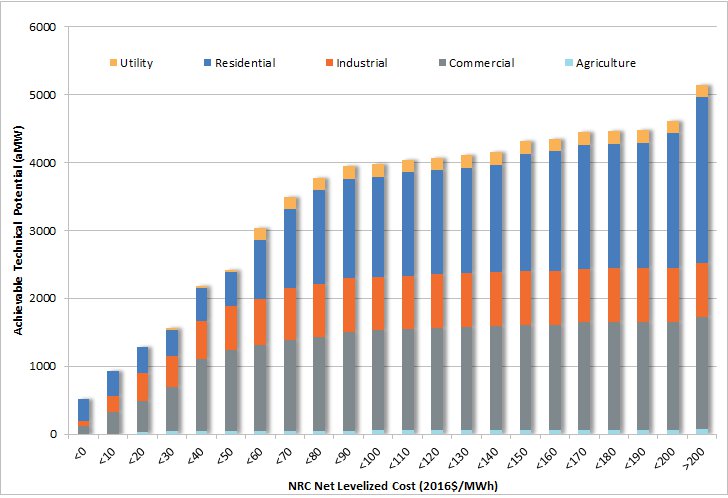
The energy efficiency supply curve below shows all energy efficiency available through 2041, differentiated by sector by cost bin. The figure below shows 5,144 average megawatts[1] of achievable technical energy efficiency potential available by 2041. The supply curve is used to compare energy efficiency to other electricity resources, providing an amount of efficiency available at increasing costs and can be used to meet future projected demand. The supply curve is developed through a compilation of thousands of measure permutations, each with individual savings and cost. Details on the savings by sector can be found here. [2]
Energy Efficiency Supply Curve, Differentiated by Sector

In addition to the energy savings, efficiency measures also provide capacity savings. These savings are estimated based on the savings shape over the year. The savings shapes provide a relative impact of the energy savings during either winter or summer peak hours compared to the rest of the year. For example, whereas savings from efficient air-source heat pumps would have peak impacts for a winter-peaking system, savings from efficient residential air conditioners do not. The 5,144 average megawatts in 2041 of efficiency saves 9,105 megawatts of summer peak and 8,594 megawatts of winter peak. The peak and energy savings are both included as data in the resource strategy analysis.
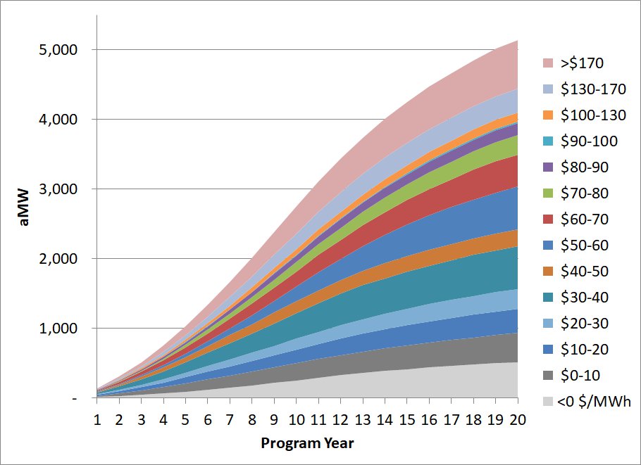
Not all the efficiency is available right away. This figure provides the potential available each year over the 20-year planning horizon, differentiated by 14 levelized cost bins provided to the resource analysis. More details on how the levelized cost is calculated is available here.
Efficiency Supply Curve by Year, Differentiated by Levelized Cost

[1] All savings reported are at generation busbar (net of line losses).


