


Overview
The Council’s GENESYS model has been using historical modified streamflows for its simulation of the operation of the hydroelectric system to assess adequacy of the regional power supply. However, for this Power Plan, the Council has decided to use data from three of the 19 climate scenarios developed by the River Management Joint Operating Committee (RMJOC). The RMJOC climate scenario data include modified streamflows. Two comprehensive reports on the RMJOC climate data are available in RMJOC report I and RMJOC report II and details of the climate scenario selection process are available in climate scenario selection. Since streamflows play such a significant role in power generation, differences between historical streamflows and streamflows from the three selected RMJOC climate scenarios are analyzed in the following sections. Several of the sections also reference the RMJOC climate scenarios from Summary of the RMJOC Climate Scenarios.
Trends in Historical Streamflows
According to the Bonneville Power Administration, the 2020 Level Modified Streamflows are historical streamflows that would have been observed if current irrigation depletions (as of year 2018) existed in the past and if the effects of river regulation were removed (except at the upper Snake, Deschutes, and Yakima basins, where current upstream reservoir regulation practices are included). However, the 2020 Level Modified Streamflow set was published recently in October 2020 and the associated hydro-regulation rule curves, also required for hydro-regulation studies, are not yet available. Thus, as input into GENESYS, the Council’s regional adequacy model, the Council continues to use the 2010 Level Modified Streamflow set, which has irrigation depletions as of 2008. For brevity, historical streamflows in subsequent sections, unless otherwise stated, refer to the 2010 Level Modified Streamflow data.
The historical streamflow set consists of 80 water-years of daily streamflows from 1929 to 2008 at many sites of interest throughout the Columbia River Basin, including at all hydro projects modeled in GENESYS. By definition, a water-year begins in October and ends in September of the following year. For example, the 1987 water-year begins on October 1, 1986 and ends on September 30, 1987. For the same water-year, the annual volume and monthly pattern of streamflow measured at stream gauging stations in different sub-basins, for example, Mica and The Dalles (TDA), can be vastly different. Nevertheless, streamflow at The Dalles, which is located near the mouth of the Columbia River, is commonly used to classify a water-year (i.e., a critical or low-flow year or a high-flow year) for the entire Columbia River Basin.
Because the historical streamflow record spans 80 years, it is worthwhile to investigate whether streamflows have fundamentally changed over time, that is, if trends in the volume and pattern of streamflow are observable. Thus, in Figure 1, TDA streamflows for the first 30 water-years, from 1929 to 1958, are compared with those for the last 30 water-years, from 1979 to 2008.
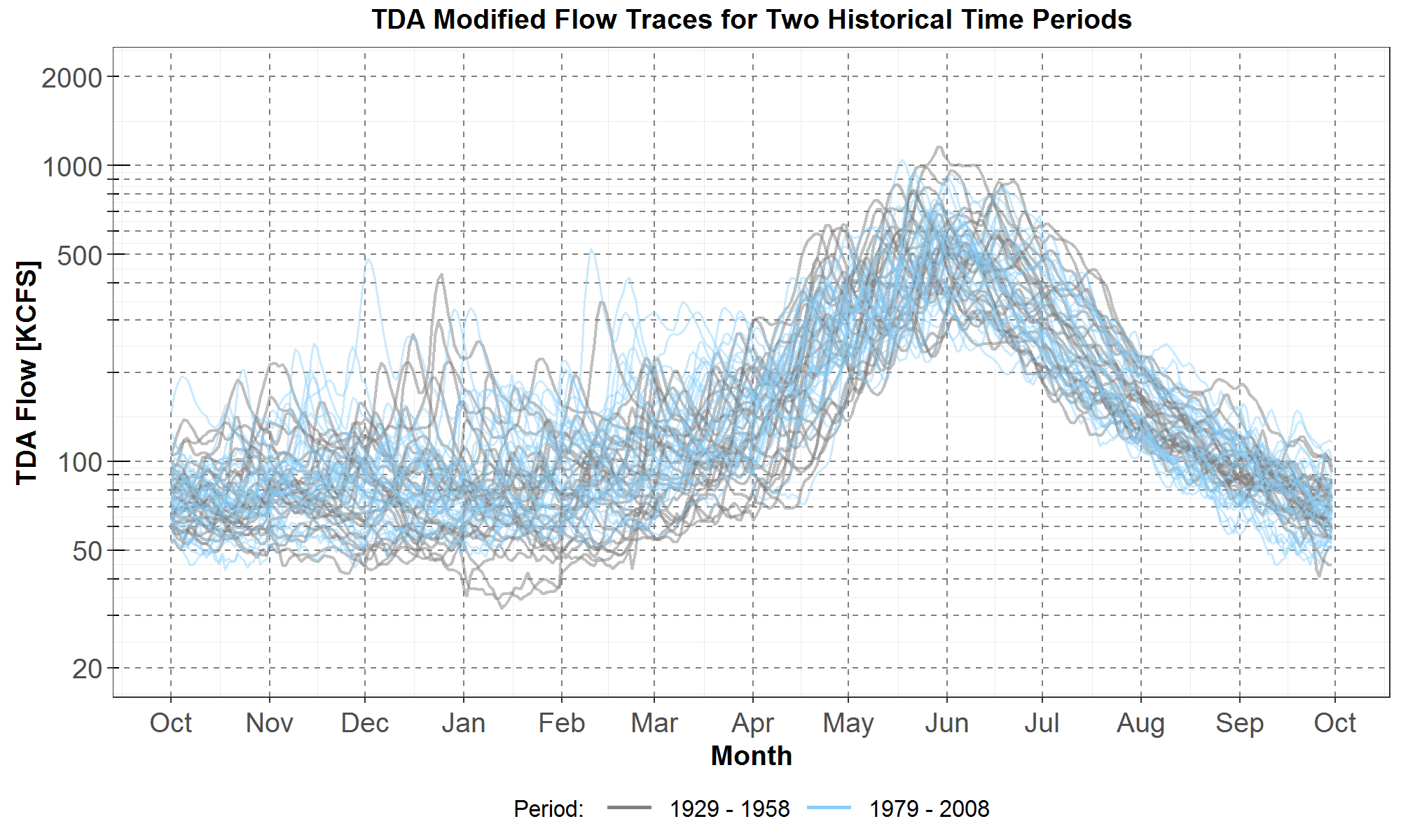
Figure 1: Comparisons of TDA daily streamflows between the first 30 years, from 1929 to 1958, and the last 30 years, from 1979 to 2008. Streamflows for the historical first 30 years and last 30 years are plotted in gray and light blue curves (or traces), respectively. On the x-axis are the months from October to the next September for a water-year. The TDA flows in thousand cubic feet per second (KCFS) are plotted along the y-axis in log scale.
The plots in Figure 1 are called trace plots because streamflows for the 60 water-years are plotted separately in 60 traces. Furthermore, the traces are plotted in log scale so that visual comparisons are easier for streamflows with both large and small magnitudes. However, visual comparison of the 60 traces remains difficult because of the high amount of overlap. Nevertheless, the trace plots are still useful since they do allow for an easy visual scan for outliers, that is, streamflows with significantly different monthly magnitudes and shapes. The streamflow traces for the first 30 years (in gray curves) and the last 30 years (in light blue curves) look similar at a glance, except for two gray traces, representing water-years 1930 and 1937, which have very low streamflows in January. Furthermore, there is a hint that flows for the last 30 years (in light blue curves) might be slightly higher from January to April.
Beside the trace plots in Figure 1, two other types of plots are presented to compare TDA streamflows between the historical first 30 years and last 30 years.
First, Figure 2 shows the envelope plots, in which streamflows for the first 30 years are represented in the gray area while those for the last 30 years are represented in the light blue area. For each set of streamflows, the envelope data are obtained by extracting the maximum and minimum streamflow for each day over all 30 years. In addition to the envelope plots, the average daily streamflows are also plotted in Figure 2: the yellow dashed curve for the first 30 years and the blue dashed curve for the last 30 years. Also, the yellow and blue squares represent the spring maximum of the corresponding average streamflow.
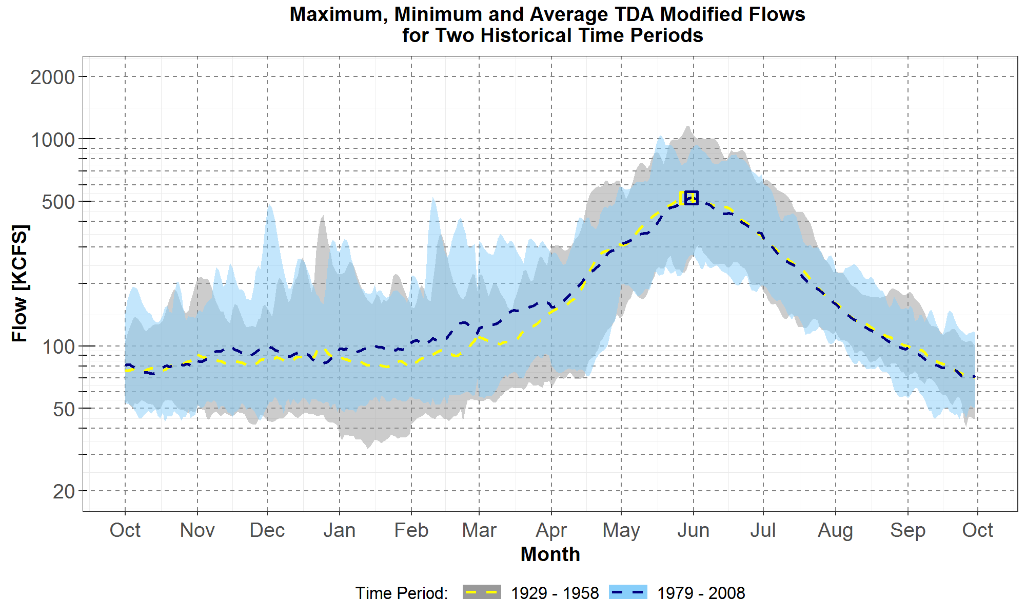
Figure 2: Comparisons of maximum, minimum and average TDA daily streamflows between the first 30 years, from 1929 to 1958, and the last 30 years, from 1979 to 2008. Envelopes for the historical first 30 years and last 30 years are plotted respectively in gray and light blue areas. Averages for the first 30 years and last 30 years are plotted in the yellow and the blue dashed curves respectively. The spring maxima for the averages are indicated by the yellow and blue squares. On the x-axis are the months from October to the next September for a water-year. The TDA flows in thousand cubic feet per second (KCFS) are plotted along the y-axis in log scale.
The envelope plots in Figure 2 show less data than the trace plots in Figure 1, but they allow for easier comparisons of the monthly shapes of the maxima and minima. For example, for most days from November to mid-April, streamflows for the last 30 years (in the light blue area) have higher maxima and minima than those for the first 30 years (in the gray area). Moreover, comparing the two dashed curves shows that, for most days from November to mid-April, the average streamflow is also higher for the last 30 years (in blue) than for the first 30 years (in yellow). For example, for January 15, the difference is 18.7 KCFS higher or +23% (relative to the average streamflow for the first 30 years).
Another interesting observation is the spring maximum of the TDA average streamflow. In Figure 2, the spring maxima for the averages are plotted as squares, in yellow for the first 30 years and in blue for the last 30 years. The spring maximum for the historical last 30 years occurs one day later than the maximum for the first 30 years. The difference is however too small from which to draw any conclusion about temporal shifts between the two historical periods.
In summary, between historical water-years 1929 to 1958 and 1979 to 2008, there appears to be a trend for higher flows at TDA from November to April. This trend is consistent with a portion of the climate change signal analyzed in RMJOC report I (see Figure 49 where historical data from 1976 to 2005 were compared with climate scenario data from 2020 to 2049). However, the RMJOC climate trend of lower flows at TDA for the summer months is not present for the two sets of historical data. In addition, the trend of an earlier temporal shift in the spring maximum streamflow is also not evident. Therefore, analysis of Figure 2 suggests that a portion of climate change impacts, namely the higher November through April streamflows, is already present in the historical streamflow data.
The next type of plot to be presented is the box-and-whiskers plot, which for simplicity is abbreviated as the boxplot and illustrated in Figure 3, and a description of which is as follows. The boxplot allows for quantitative comparisons of distributional statistics such as the 25th, 50th (the median) and 75th percentiles. The grey box in Figure 3, which starts from the 25th percentile at the bottom and ends at the 75th percentile at the top, contains the central 50% of the population of the distribution. The length of the box is defined as the inter-quartile-range (IQR) and is used to delineate outliers (if any) which are those data that lie beyond one-and-a-half times the IQR from the box.
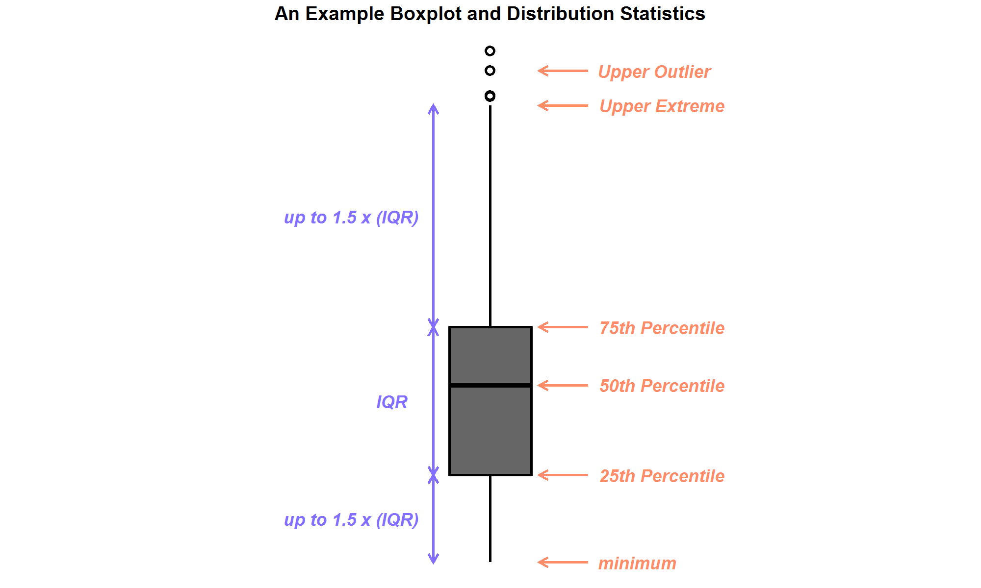
Figure 3: An example box-and-whiskers plot, or boxplot, with upper outliers shown.
Figure 4 presents comparisons of the monthly distributions of TDA daily streamflows in boxplots. Data for the first 30 years and last 30 years are plotted in the gray and light blue boxplots, respectively.
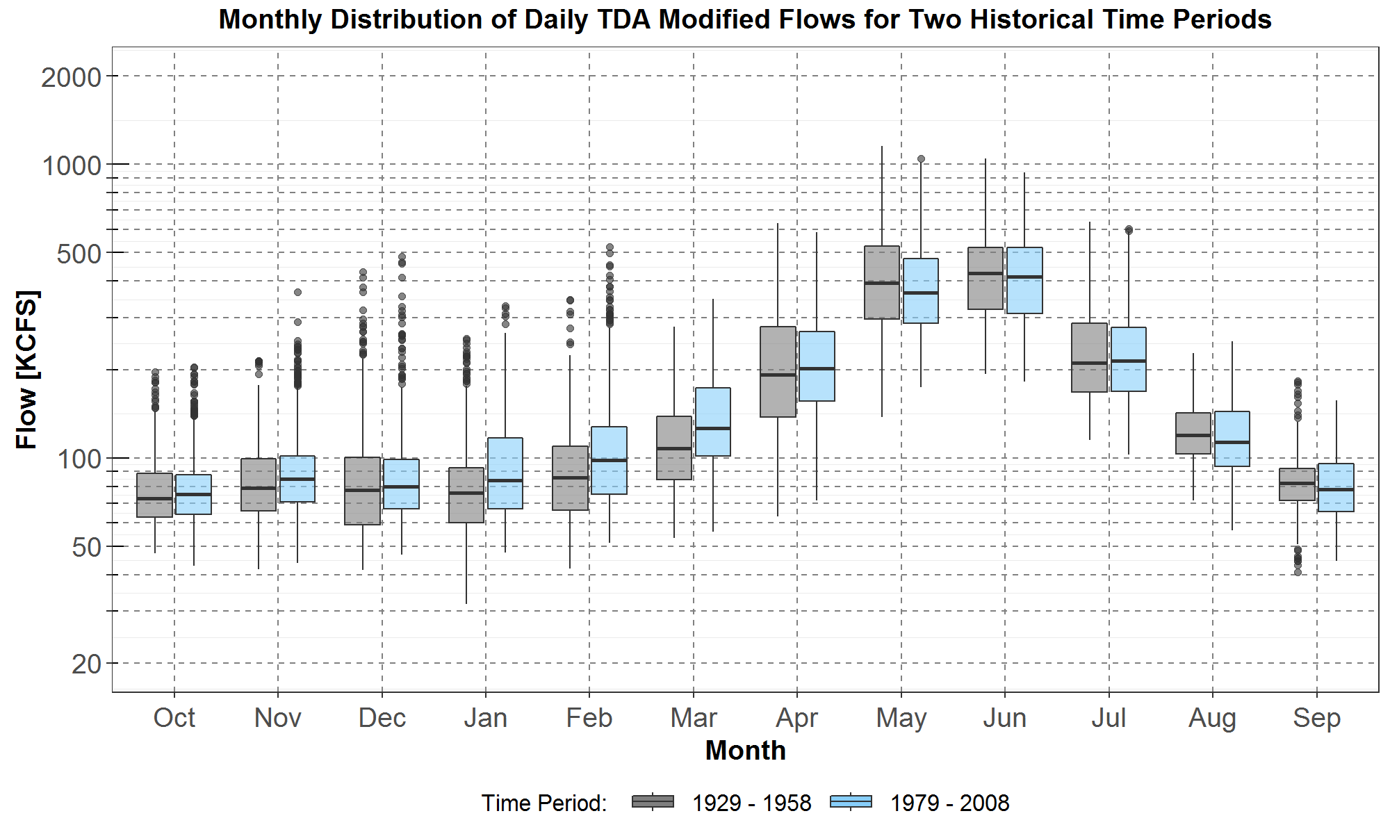
Figure 4: Boxplot comparisons of monthly distributions of TDA daily streamflows between the historical first 30 years, from 1929 to 1958, and the last 30 years, from 1979 to 2008. Data for the first 30 years and the last 30 years are plotted respectively in gray and light blue boxplots. On the x-axis are the months from October to the next September for a water-year. The TDA flows in thousand cubic feet per second (KCFS) are plotted along the y-axis in log scale.
The side-by-side boxplot statistics allow for easy quantitative comparisons of the monthly distributions for the two sets of historical streamflows. However, comparisons of monthly shapes in terms of boxplots are more difficult than those comparisons in terms of envelope plots as presented in Figure 2.
In Figure 4, for November to March, most of the boxplot statistics (outliers, whiskers, median, 25th and 75th percentiles) show that streamflow is generally higher for the last 30 years. Furthermore, by comparing just the median, the higher streamflow for the last 30 years takes place over a longer period, from October to April. As for the summer months from June to August, the monthly distributions for both historical streamflow sets are similar.
Thus, the plots in Figure 4 support the observation in Figure 2 that the RMJOC projected climate-driven trend of increasing flows for October to March (or April) is present in the historical data. On the other hand, the trend of decreasing flows for summer months is not evident in the historical data.
An analysis of the more recent 2020 Level modified TDA flows (not shown here) also supports a similar trend of higher flows for the last 30 years (now from 1989 to 2018) for November to April. However, the 2020 Level flows also suggest the climate-driven trend of decreasing flows for the summer months, from June to September, which is not evident in the 2010 Level flows. Furthermore, for the 2020 Level flows, the average TDA flow for the last 30 years has a spring maximum occurring 8 days later than that for the first 30 years, in contrast to occurring just 1 day later for the 2010 Level flows as previously presented.
Nevertheless, in subsequent sections, it is the 2010 Level historical flows that are used for comparisons with the forecasted climate scenario (modified) flows which were calculated using the same 2010 Level irrigation depletions.
Trends in Climate Scenario Streamflows
The RMJOC climate scenarios selected for study in the Power Plan are A, C and G listed in Table 3 in Summary of the RMJOC Climate Scenarios. Details on the scenario selection methodology are available in climate scenario selection write-up.
For climate scenarios A, C and G, their TDA modified streamflows are also analyzed using the three types of plot: the trace, the envelope and the boxplot presented previously in Figures 1, 2, and 4, respectively. The analyses involve comparing historical streamflow for the last 30 years, from 1979 to 2008, with the three sets of climate scenario streamflows for the next 30 years, from 2020 to 2049. Similar analyses have already been done in RMJOC report I for the No Regulation – No Irrigation (NRNI) streamflows, for a slightly different set of historical water-years and presented in different types of plots. Nevertheless, it is expected that climate trends for the TDA streamflow analyzed in the following sections are consistent with those presented in RMJOC report I.
Trends for Climate Scenario A (CanESM2 GCM)
In Figure 5, the 30 light blue traces are the historical daily TDA flows from 1979 to 2008 and the 30 peach traces are climate scenario A (CanESM2 GCM) daily TDA flows from 2020 to 2049.
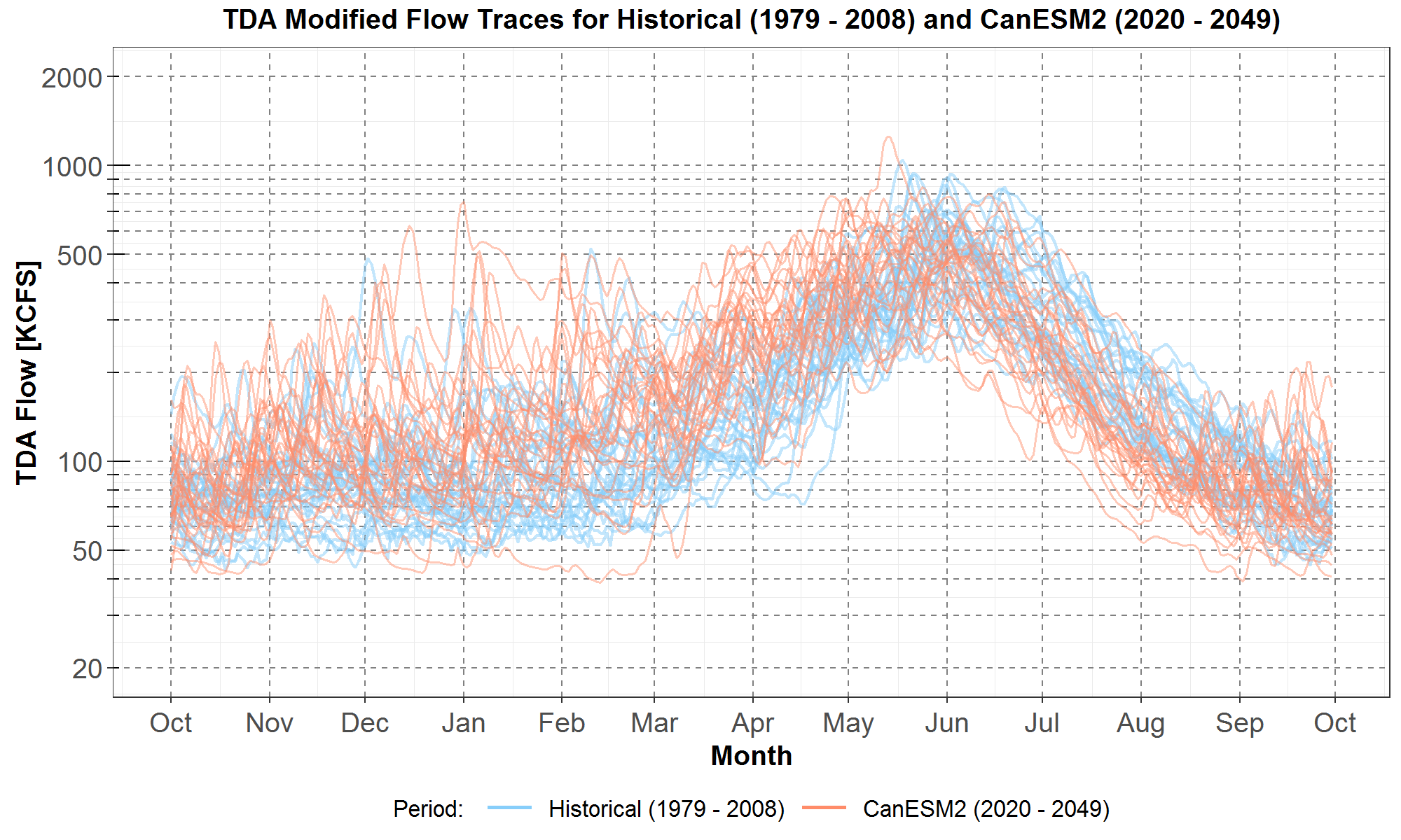
Figure 5: Comparisons of TDA daily streamflows between the historical last 30 years, from 1979 to 2008, and climate scenario A (CanESM2) for the next 30 years, from 2020 to 2049. The historical streamflows are plotted in light blue while the climate scenario streamflows are plotted in peach. On the x-axis are the months from October to the next September for a water-year. The TDA flows in thousand cubic feet per second (KCFS) are plotted along the y-axis in log scale.
It is easy to see that as a distribution, from October to April, the 30 peach climate traces are generally higher than the 30 light-blue historical traces. However, there are still one or two climate traces below the minimum historical traces for December to March. On the other hand, for the three summer months from June to August, the distribution of climate traces is lower than the distribution of the historical traces.
Next, the envelope plots and the averages for the climate and historical traces in Figure 5 are presented in Figure 6, along with the squares indicating the spring maxima of the averages.
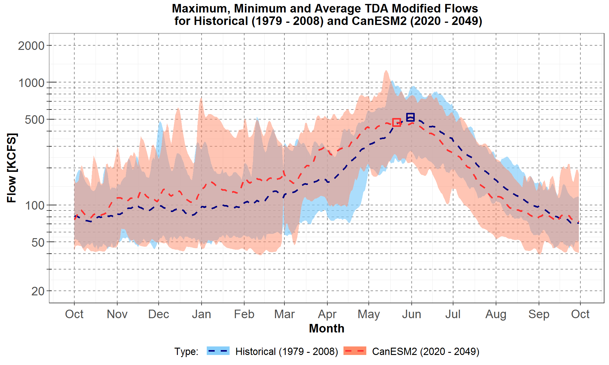
Figure 6: Comparisons of maximum, minimum and average TDA daily streamflows the historical last 30 years, from 1979 to 2008, and climate scenario A (CanESM2) for the next 30 years, from 2020 to 2049. The historical and climate scenario envelopes are plotted respectively in the light blue area and peach areas. The historical and climate average are plotted in the blue and red dashed curves respectively. The spring maxima for the averages are indicated by the blue and red squares. On the x-axis are the months from October to the next September for a water-year. The TDA flows in thousand cubic feet per second (KCFS) are plotted along the y-axis in log scale.
The envelope plots and averages in Figure 6 show that for most days from October to mid-May, the climate scenario streamflows, represented by the peach area and red dashed curve, are generally higher than the historical (last 30 years) flows, represented by the light-blue area and blue dashed curve. In contrast, for the summer months June to August, the climate scenario streamflows are generally lower than the historical flows.
Furthermore, the spring maxima of the average streamflows in Figure 6, plotted in the blue square for the historical data and red square for the climate data, show the climate scenario maximum occurring 10 days earlier, on May 21. It is worthwhile to analyze this shift in more details as follows. The average streamflow for scenario A in the red dashed curve has contributions from all 30 climate (peach) traces in Figure 5. There are 16 (among 30) climate traces where the dates of their spring maximum flows are earlier than May 21, with an average about 17 days earlier. On the other hand, there are 11 historical (light blue) traces where the dates of their spring maximum flows are earlier than May 21, with an average about 7 days earlier. The earlier shift of the climate spring maximum flow is consistent with the findings in RMJOC report I.
Lastly, the monthly distributions of the daily TDA streamflows for the historical last 30 years, in the light blue boxplots, and the CanESM2 next 30 years, in the peach boxplots, are presented in Figure 7. Since the boxplots are rather compact, the monthly distributions for the historical first 30 years are also included and plotted in the gray boxplots.
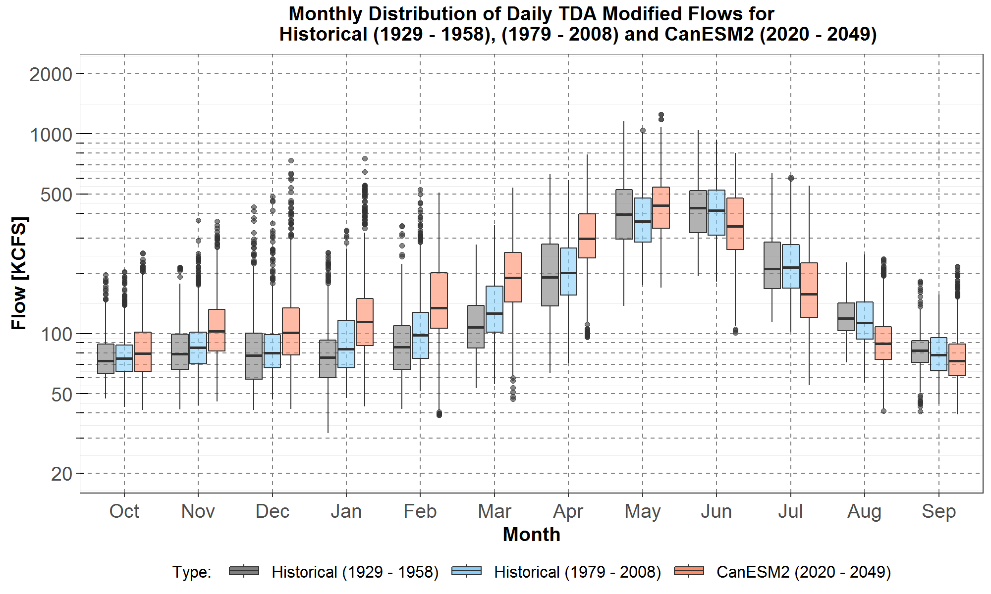
Figure 7: Boxplot comparisons of monthly distributions of TDA daily streamflows among the historical first 30 years, from 1929 to 1958, the historical last 30 years, from 1979 to 2008, and climate scenario A (CanESM2) for the next 30 years, from 2020 to 2049. Data for the historical first 30 years and last 30 years are plotted respectively in gray and light blue while the climate data are plotted in peach. On the x-axis are the months from October to the next September for a water-year. The TDA flows in thousand cubic feet per second (KCFS) are plotted along the y-axis in log scale.
Since the 51-year gap between corresponding years for the historical first 30 years (1929 to 1958) and last 30 years (1979 to 2008) is larger than the 42-year gap between corresponding years for the historical last 30 years and the climate next 30 years (2020 to 2049), then it is evident from Figures 7 that for October to April, the trend of increasing flows, according to most boxplot statistics, is accelerated in climate scenario A. It should be noted that although the trend stops in May because streamflow for the last 30 years is lower than that for the first 30 years, streamflow for scenario A nevertheless is higher than those for both historical periods. For numerical comparisons, Table 1 lists differences between the medians of the three distributions of streamflows.
Table 1: Monthly Differences (in KCFS) between the Medians of the Three Distributions in Figure 7
| Month | Median(last 30)- Median(first 30) | Median(Scen A)- Median(last 30) |
| Oct | 2.2 | 4.4 |
| Nov | 5.9 | 17.7 |
| Dec | 2.1 | 20.9 |
| Jan | 7.9 | 31.0 |
| Feb | 12.4 | 36.7 |
| Mar | 18.2 | 64.5 |
| Apr | 9.5 | 97.8 |
In Table 1, for October to April, the values in column 2 represent the increase in median streamflow between the historical last 30 years and the first 30 years, and the values in column 3 represent the increase in median streamflow between scenario A and the historical last 30 years. Since for every month the value in column 3 is always greater than that in column 2, and the time gap between the historical first 30 years and last 30 years is larger than the time gap between the historical last 30 years and the scenario A years, then it follows that the trend of increasing (median) streamflow (for October to April) has accelerated. However, the magnitude of the trend is much smaller for October than for the other months and thus might not be significant.
Conversely, for scenario A, the trend of lower summer flows compared to those for the historical years is also evident in Figure 7, for June to September. For example, the difference in median streamflow is -70.0 KCFS for Jun, -56.4 KCFS for July and -24.0 KCFS for August. And as a ratio relative to the median flow of the historical years, the decrease is rather significant: -17% for June, -26% for July and -21% for August. For September the decrease is smaller.
Trends for Climate Scenario C (CCSM4 GCM)
Next, Figures 8, 9 and 10 present the trace plots, envelope plots and boxplots, respectively, comparing TDA streamflows between the last 30 historical years and the scenario C (CCSM4 GCM) years from 2020 to 2049. Although the streamflow magnitudes, monthly shapes and monthly distributions are different between scenarios C and A, they both generally show the same climate trends relative to streamflows from the last 30 historical years, as discussed below.
In Figure 8, it is evident that, for the 30 peach climate traces, its distribution from November to April is higher than that of the 30 light-blue historical traces. However, there are still one or two climate traces below the minimum historical traces for March and April. In contrast, for the three summer months from June to August, the distribution of climate traces is lower than that of the historical traces.
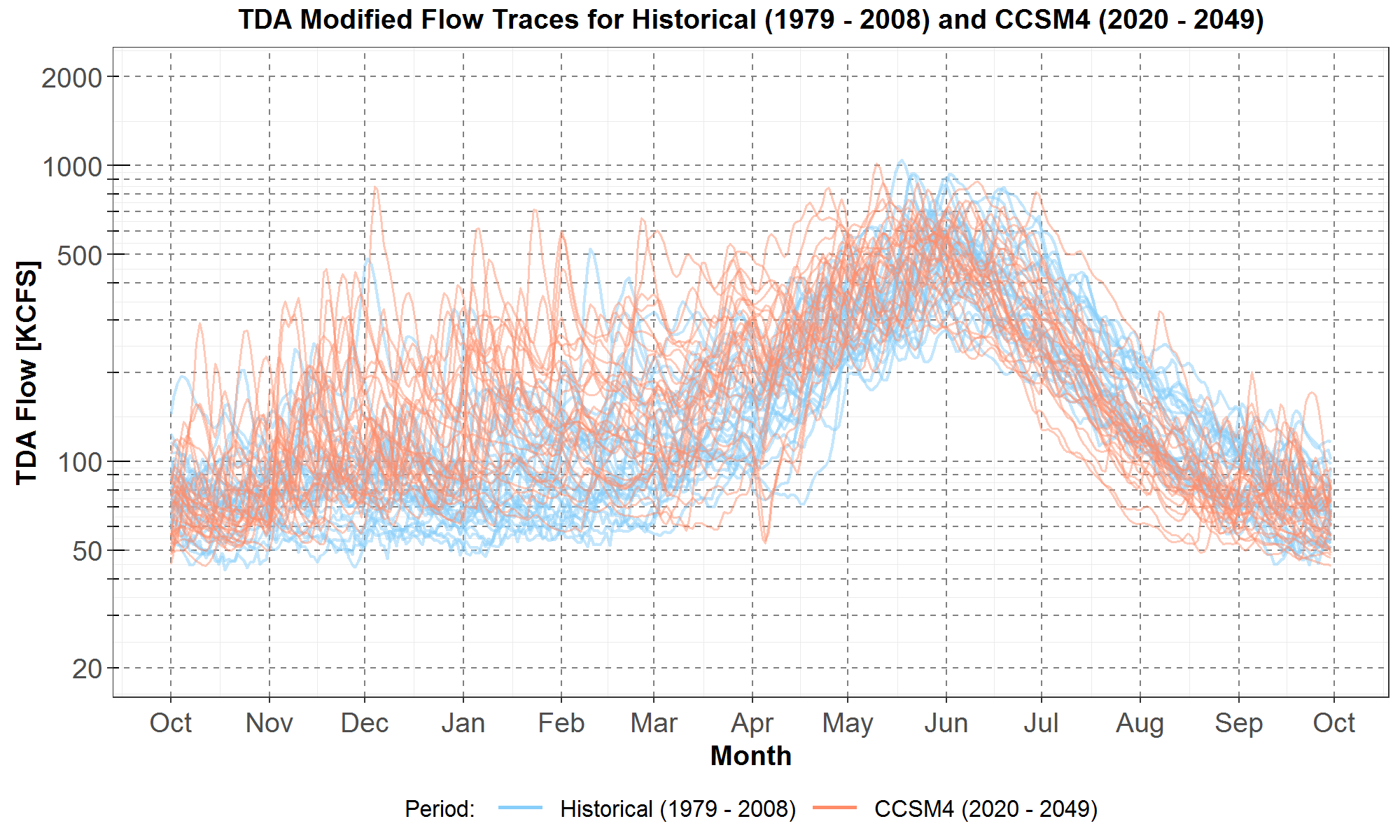
Figure 8: Comparisons of TDA daily streamflows between the historical last 30 years, from 1979 to 2008, and climate scenario C (CCSM4) for the next 30 years, from 2020 to 2049. The historical streamflows are plotted in light blue while the climate scenario streamflows are plotted in peach. On the x-axis are the months from October to the next September for a water-year. The TDA flows in thousand cubic feet per second (KCFS) are plotted along the y-axis in log scale.
Next, Figure 9 presents the envelope and average (in the dashed curves) plots. They show that, from November to May, the climate scenario streamflows, represented by the peach area and red dashed curve, are generally higher than the historical flows represented by the light-blue area and blue dashed curve. The opposite is observed for June to August, where the envelope and dashed curves show that the climate streamflow is lower than the historical streamflow. In addition, the spring maximum of the climate average, in the red square, occurs 9 days earlier than the spring maximum of the historical average, in the blue square. These observations are nearly identical to those from Figure 6 which compares scenario A streamflows with historical streamflows.
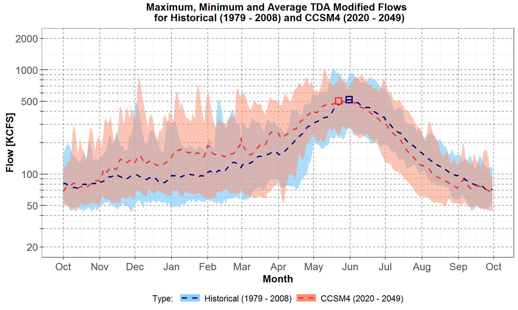
Figure 9: Comparisons of maximum, minimum and average TDA daily streamflows the historical last 30 years, from 1979 to 2008, and climate scenario C (CCSM4) for the next 30 years, from 2020 to 2049. The historical and climate envelopes are plotted respectively in the light blue area and peach areas. The historical and climate average are plotted in the blue and red dashed curves respectively. The spring maxima for the averages are indicated by the blue and red squares. On the x-axis are the months from October to the next September for a water-year. The TDA flows in thousand cubic feet per second (KCFS) are plotted along the y-axis in log scale.
Finally, Figure 10 shows the monthly boxplot distributions of the daily TDA streamflows for the first 30 historical years, the last 30 historical years, and the CCSM4 years from 2020 to 2049, plotted in the gray, light blue and peach boxplots, respectively.
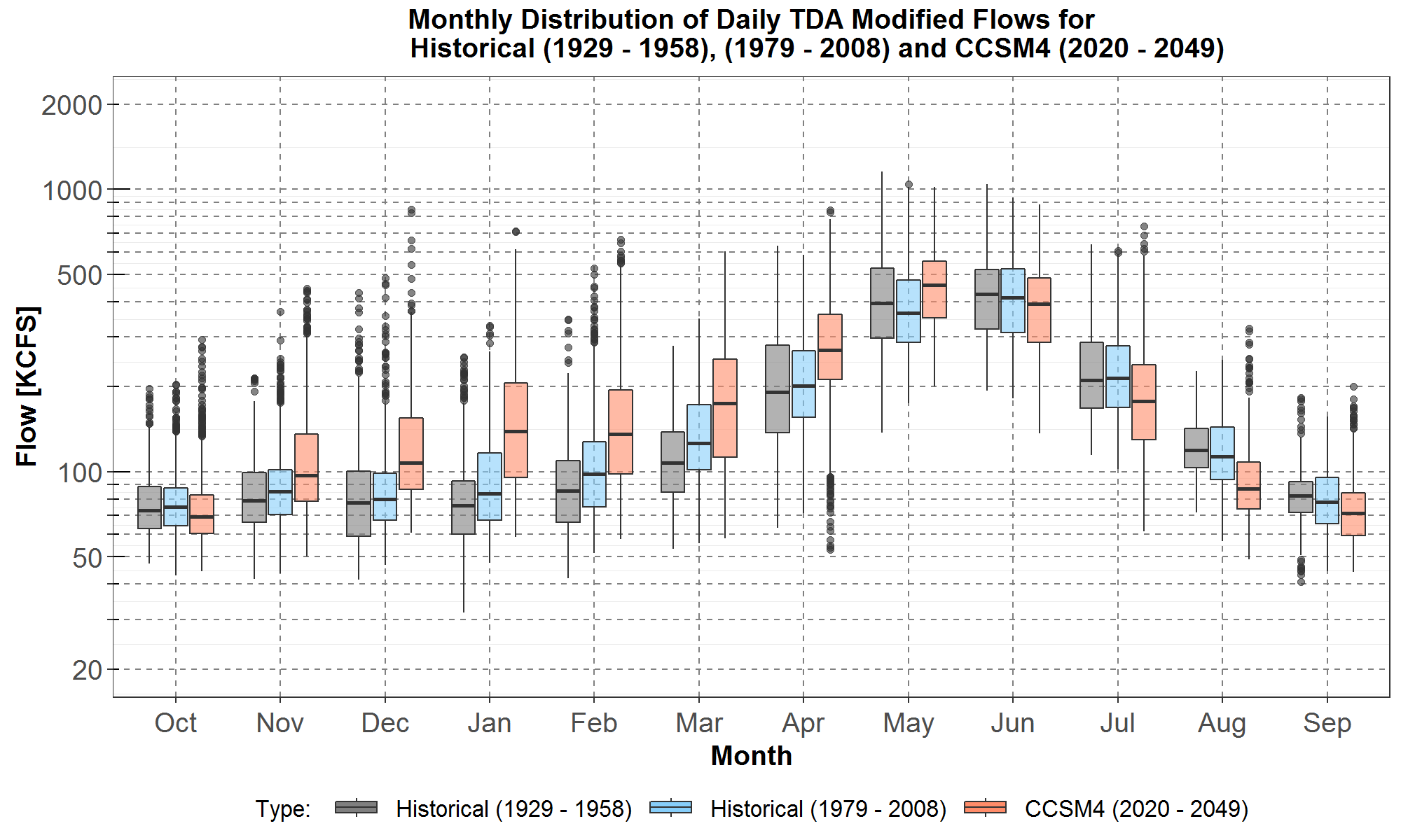
Figure 10: Boxplot comparisons of monthly distributions of TDA daily streamflows among the historical first 30 years, from 1929 to 1958, the historical last 30 years, from 1979 to 2008, and climate scenario C (CCSM4) for the next 30 years, from 2020 to 2049. Data for the historical first 30 years and last 30 years are plotted respectively in gray and light blue while the climate data are plotted in peach. On the x-axis are the months from October to the next September for a water-year. The TDA flows in thousand cubic feet per second (KCFS) are plotted along the y-axis in log scale.
Boxplot statistics in Figure 10 also indicate that the increased flows in the November to April period is accelerated between the two historical periods and the scenario C (CCSM4 GCM) period. Furthermore, the trend also stops in May, as was the case for scenario A, because streamflow for the last 30 years is lower than that for the first 30 years. However, May streamflow for scenario C is still higher than those for both historical periods. Table 2 lists differences between the medians of the specified time periods. This accelerated trend was similarly observed and discussed in detail previously for scenario A (CanESM2 GCM) in Figure 7 and Table 1.
Table 2: Monthly Differences (in KCFS) between the Medians of the Three Distributions in Figure 10
| Month | Median(last 30)- Median(first 30) | Median(Scen C)- Median(last 30) |
| Nov | 5.9 | 12.3 |
| Dec | 2.1 | 27.4 |
| Jan | 7.9 | 55.0 |
| Feb | 12.4 | 37.8 |
| Mar | 18.2 | 48.4 |
| Apr | 9.5 | 67.9 |
In addition, Figure 10 also shows the trend of lower median summer flows for the June to September period for the climate data (peach boxplots) compared to the historical last 30 years (light blue boxplots). For example, the difference in median streamflow is -21.6 KCFS for June, -36.4 KCFS for July and -26.1 KCFS for August. And as a ratio relative to the median flow of the historical years, the difference is: -5% for June, -17% for July and -23% for August. For September, the decrease is smaller.
Trends for Climate Scenario G (CNRM GCM)
Lastly, Figures 11, 12 and 13 present the trace plots, envelope plots and boxplots comparing TDA streamflows between the last 30 years of the historical data and the 2020 to 2049 period for scenario G (CNRM GCM).
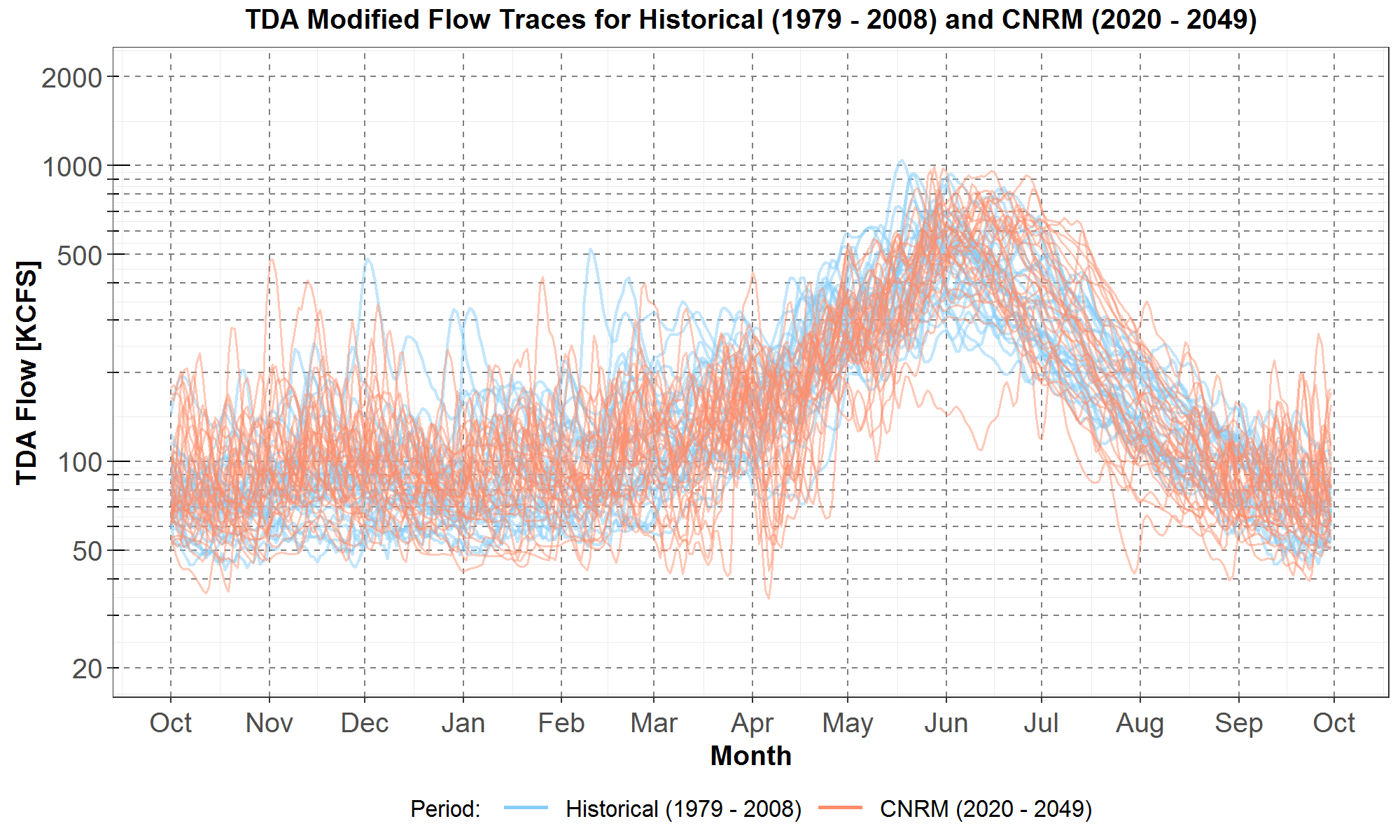
Figure 11: Comparisons of TDA daily streamflows between the historical last 30 years, from 1979 to 2008, and climate scenario G (CNRM) for the next 30 years, from 2020 to 2049. The historical streamflows are plotted in light blue while the climate scenario streamflows are plotted in peach. On the x-axis are the months from October to the next September for a water-year. The TDA flows in thousand cubic feet per second (KCFS) are plotted along the y-axis in log scale.
Unlike the clear trends for scenarios A and C presented in Figures 5 and 8 respectively, in Figure 11, the 30 peach traces for scenario G do not suggest an obvious increase in streamflow for November to April, nor any decrease for June to August. There are however a few climate (peach) traces with low flows for March and April.
Next, the envelopes and averages for the climate and historical traces in Figure 11 are plotted in Figure 12, along with the squares indicating the spring maximum average flows. The historical envelope and average are in the light-blue area and blue dashed curve while the climate envelope and average are in the peach area and red dashed curve.
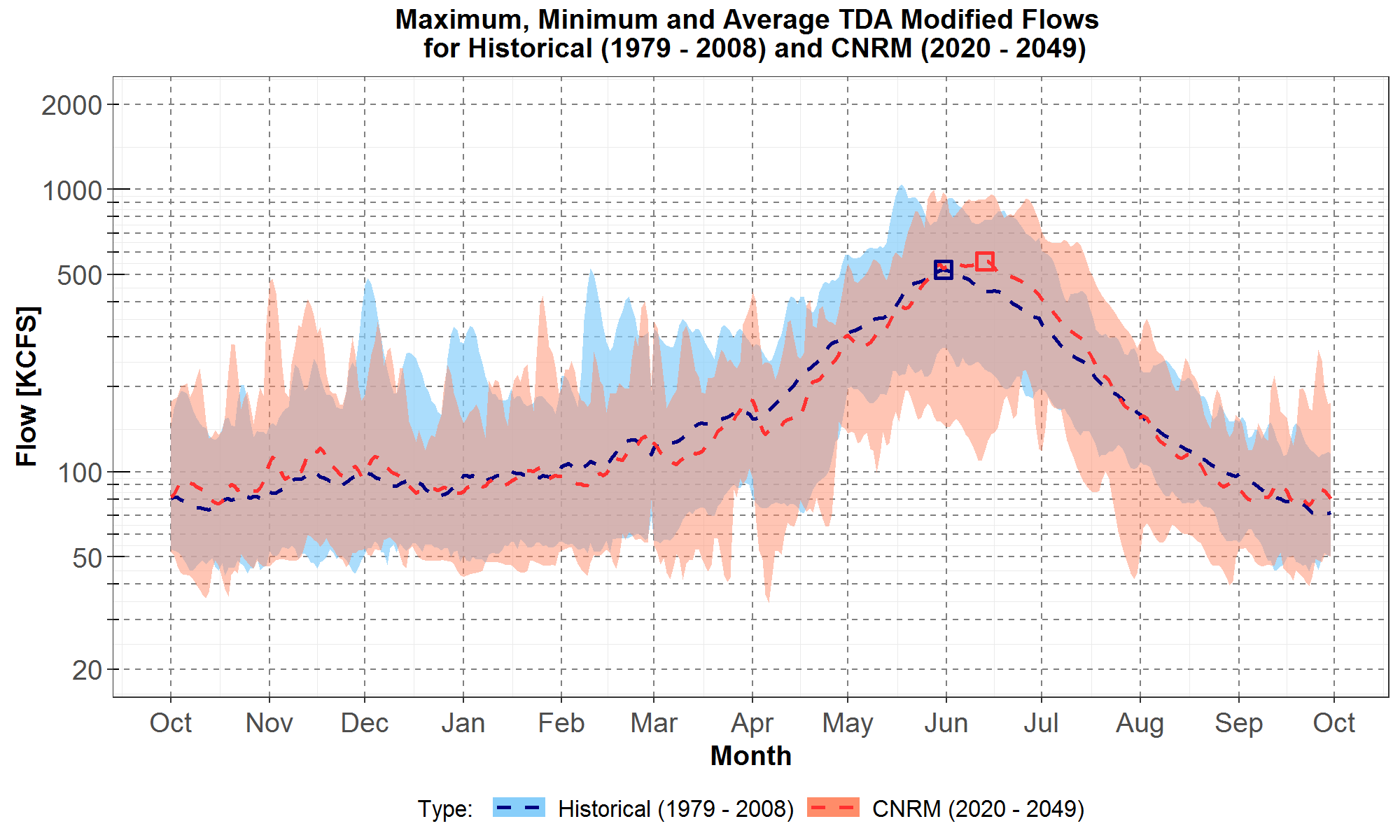
Figure 12: Comparisons of maximum, minimum and average TDA daily streamflows the historical last 30 years, from 1979 to 2008, and climate scenario G (CNRM) for the next 30 years, from 2020 to 2049. The historical and climate envelopes are plotted respectively in the light blue area and peach areas. The historical and climate average are plotted in the blue and red dashed curves respectively. The spring maxima for the averages are indicated by the blue and red squares. On the x-axis are the months from October to the next September for a water-year. The TDA flows in thousand cubic feet per second (KCFS) are plotted along the y-axis in log scale.
Comparisons of the envelopes and averages in Figure 12 show that flows are comparable between the climate and the last 30 historical years for many months. The average flow for scenario G is generally slightly higher from October to December, slightly lower from January to May, but higher for June and July. Furthermore, the spring maximum average climate flow occurs later by 13 days. This is in contrast to those for scenarios A and C which occur earlier.
Thus, climate trends for scenario G are significantly different than those for scenarios A and C. The increase in average streamflow, observed from October to mid-May for A and from November to May for C, is not apparent in Figure 12 where the average streamflow for G oscillates about the historical average. Conversely, the decrease in summer flows for June to August observed for A and C is actually reversed where the average for G is higher than the historical average (for June and July).
Finally, in Figure 13, monthly distributions of the daily TDA streamflows for the first 30 historical years, the last 30 historical years, and the CNRM 30 years are plotted in the gray, light blue and peach boxplots, respectively.
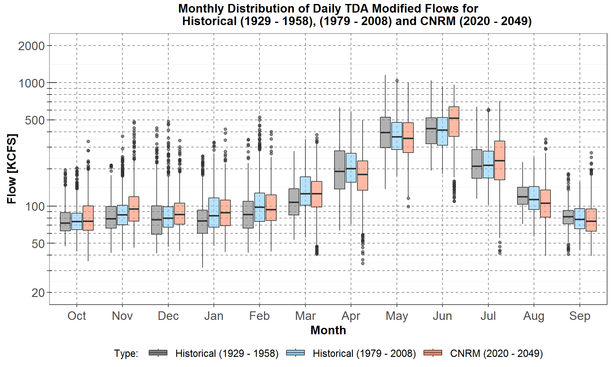
Figure 13: Boxplot comparisons of monthly distributions of TDA daily streamflows among the historical first 30 years, from 1929 to 1958, the historical last 30 years, from 1979 to 2008, and climate scenario G (CNRM) for the next 30 years, from 2020 to 2049. Data for the historical first 30 years and last 30 years are plotted respectively in gray and light blue while the climate data are plotted in peach. On the x-axis are the months from October to the next September for a water-year. The TDA flows in thousand cubic feet per second (KCFS) are plotted along the y-axis in log scale.
Boxplot comparisons of the monthly distributions show that streamflows for scenario G (in peach) are slightly higher than the historical flows (last 30 years, in light blue) for November to January, where the median climate scenario streamflows are higher by less than 10 KCFS. However, climate scenario streamflows are generally slightly lower than historical flows for February to May. In contrast, flows for scenarios A and C are significantly higher than historical flows over the same months. In addition, for the summer months the climate median flow is 102 KCFS (or 24.8%) higher for June, and 19.6 KCFS (or 9%) higher for July. The increasing flows in the two summer months for scenario G is opposite to the decreasing flows for scenarios A and C.
A Summary of the Trends in Climate Scenario Flows
In summary, all three climate scenarios show increasing TDA streamflows in mid-winter, from November to January, and decreasing streamflows in late summer and early fall, from August to September. In particular, scenarios A and C show increasing streamflows in spring, from March to May, and decreasing flows in early summer, from June to July. In contrast, for scenario G, streamflows decrease in spring, from March to May, and increase in early summer, from June to July. These climate trends are consistent with
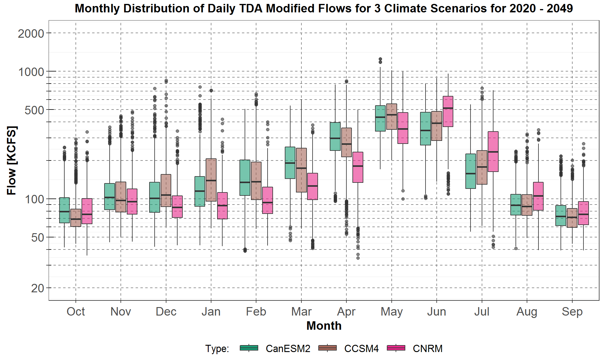
Figure 14: Boxplot comparisons of monthly distributions of TDA daily streamflows for the next 30 years, from 2020 to 2049, among the climate scenarios A (CanESM2), C (CCSM4) and G (CNRM). Boxplots for scenarios A, C and G are plotted in green, brown, and pink respectively. On the x-axis are the months from October to the next September for a water-year. The TDA flows in thousand cubic feet per second (KCFS) are plotted along the y-axis in log scale.
In Figure 14, compared to the flows for scenarios A and C, the flows for scenario G are lower for December to May, and higher for June to August. Flow comparisons between scenarios A and C show scenario A having higher flows in October, March and April, and scenario C having higher flows in December and January, and May to July. For the remaining four months, scenarios A and C have comparable flows where the differences between their median flows are less than 6 KCFS.
A possible explanation for scenario G having opposite climate-driven trends in streamflows than those for scenarios A and C is as follows. It could be seen from the Figures 54 to 57 in RMJOC report I that nearly all scenarios that show decreasing streamflows in spring, from March to May, and increasing streamflows in early summer, from June to July, are outputs from hydrological model VIC-P3, which is the model used to calculate scenario G. In contrast, all scenarios that were derived using hydrological model VIC-P1, which include both scenarios A and C, have the opposite seasonal trends of increasing streamflows in spring and decreasing streamflows in early summer. This observation suggests that the opposite climate-driven trends between scenarios G and A or C are primarily due to differences in the hydrological models and not primarily due to the GCMs themselves.