


Overview
The Council’s Annual Resource Adequacy Assessments include northwest wind fleet generation as a part of the total northwest generation resources. In particular, wind generation in the Council’s adequacy model, GENESYS has been modeled using observed and synthetic historical wind data. However, for the 2021 Power Plan the Council plans to incorporate climate data from three of the 19 climate scenarios developed by the River Management Joint Operating Committee (RMJOC), and thus, wind generation should also be updated with appropriate data from the selected climate scenarios. A comprehensive report on the RMJOC climate data is available in the RMJOC report I, and details of the climate scenario selection process are available in the climate scenario selection write-up. Because the RMJOC climate scenarios do not include wind data, Council staff obtained similar climate scenario wind data from the Climatology Laboratory at the University of California, Merced. Then with the climate wind data as input, the northwest climate wind generation could be modeled by the System Advisory Model (SAM) developed by the National Renewable Energy Laboratory (NREL). The following sections contain analyses and transformations of the climate wind data and wind generation output from SAM. These sections also reference the RMJOC climate scenarios from Summary of the RMJOC Climate Scenarios.
Wind Data for the Selected Climate Scenarios
The RMJOC climate scenarios selected for study in the Power Plan are A, C and G listed in Table 3 in Summary of the RMJOC Climate Scenarios. Details on the scenario selection methodology are available in climate scenario selection.
Because the RMJOC climate scenario data (see RMJOC report I) do not include wind data, Council staff obtained wind data for scenarios similar to the selected scenarios A, C and G from the Climatology Laboratory (to be abbreviated as CL) at the University of California, Merced. The CL data were downscaled using only the MACA method (the BCSD method was not used) and downloaded for the Council by consultants at Ecotope. Comparisons between the RMJOC and CL scenarios are presented in Table 1.
Table 1: Comparison between the selected RMJOC and Climatology Lab Scenarios
| RMJOC | Climatology Lab |
| A: CanESM2_RCP85_BCSD | A: CanESM2_RCP85_MACA |
| C: CCSM4_RCP85_BCSD | C: CCSM4_RCP85_MACA |
| G: CNRM-CM5_RCP85_MACA | G: CNRM-CM5_RCP85_MACA |
Since hydrological modeling does not affect the downscaled wind data, the hydrological model names have been dropped from the RMJOC scenarios A, C and G in the left column in Table 1. Both the RMJOC and CL sets of scenarios have the same GCMs and RCP8.5 and only differ in the downscaling methods used for scenarios A and C. In fact, scenario G is identical for both sets. While downscaled climate data, such as temperature, are different between BCSD and MACA for the same GCM, they are nevertheless qualitatively similar in location and magnitude as presented in Figures 24 to 28 in the . Although there is no BCSD wind data available for comparison, Council staff believe that, for the same GCM, the BCSD wind data should be similar to the MACA wind data in magnitude, location and timing. In other words, the two downscaled wind data sets should represent roughly the same weather events as modeled by their common GCM.
For resource adequacy studies in the Power Plan, Council staff decided to model wind fleet generation for three northwest locations: the Columbia River Gorge (Gorge), southeast Washington (SE-WA) and Montana (MT). Therefore, the CL climate wind data were downloaded for these longitude and latitude coordinates: (-120.602, 45.60123) representing the Gorge, (-117.5782, 46.39895) representing SE-WA and (-110.501, 47.16644) representing MT. The CL wind data are average daily vectors (representing wind speeds and directions) for the eastward wind and the northward wind at a height of 10 meters. For example, if represents a unit vector pointing east (i.e. the unit eastward vector), then, in units of meters/second, an east wind with a wind speed of 3 meters/second is expressed as -3
, whereas a west wind with the same wind speed is expressed as 3
.
Transformations of CL Climate Wind Data into SAM Input Data
For the 2021 Power Plan, the Council used climate wind data to model hourly generation for the northwest wind fleet composed primarily of existing turbines with 80-meter hub-height, and future turbines with 100-meter hub-height. Details of the specific turbines to be modeled are discussed in a subsequent section. To produce hourly wind generation (from the CL daily wind data) for a particular wind farm configuration populated with a specific type of wind turbine, SAM needs hourly pressure, temperature, wind speed and wind direction data (in terms of an angle measured clockwise with respect to north) at the hub-height of the wind turbine. While the CL climate wind and temperature data are available, climate pressure data are not. Council staff believe that wind speed and direction are the more important variables in determining wind generation, and thus decided to use the CL climate wind speed and direction but historical pressure and temperature data as input for SAM.
Because the CL climate wind data are in cartesian coordinates at 10-meter height, they need to be transformed into polar coordinates (wind speed and direction) and then extrapolated to 80-meter and 100-meter heights. Furthermore, the newly transformed CL wind data are still daily averages and need to be given hourly shapes in order for SAM to produce hourly generation. Finally, for a historical time period, the CL climate wind data are compared to historical wind data and undergo appropriate calibration, if necessary, to ensure the two distributions are reasonably similar. These transformations and approximations are presented in the next few sections.
Transformation from Cartesian to Polar Coordinates
In this section is an example that demonstrates the transformation of two CL cartesian wind vectors into a polar-coordinate wind vector, with wind speed V and wind direction angle ϕ . As illustrated in Figure 1, the two CL cartesian wind vectors are a south wind (wind from south to north) with speed VN and a west wind (wind from west to east) with speed VE , and the transformed polar wind vector with speed V (red line) and an approximately south-west direction represented by angle ϕ relative to north.
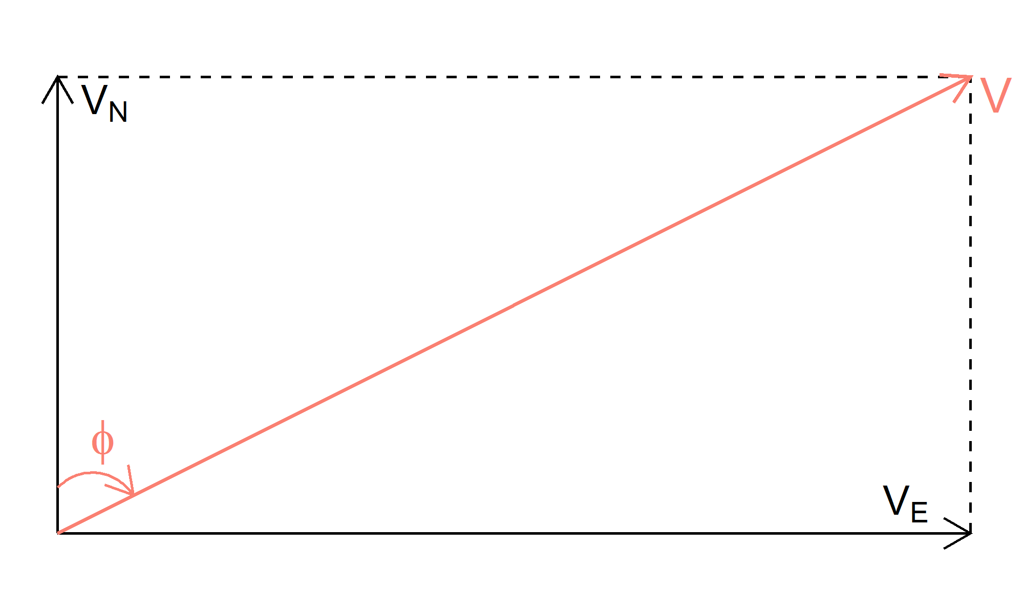
Figure 1: The CL northward wind vector, representing south wind, with speed VN , and eastward wind vector representing west wind, with speed VE. The CL cartesian vectors are transformed into polar vector (in orange) with wind speed V and wind direction angle ϕ , which is measured clockwise with respect to the north axis. The angle ϕ represents an approximately southwesterly wind.
The polar coordinates V and ϕ are calculated from the cartesian VN and VE by Equations (1) and (2) below.
Extrapolating the 10-meter Wind Speed to Other Heights
Next, in this section is a discussion of the method used to extrapolate 10-meter wind speed to wind speed at 80 and 100 meters (typical heights for existing and new wind turbines, respectively). The formulas used were taken from the chapter “Methodologies Used in the Extrapolation of Wind Speed Data at Different Heights and Its Impact in the Wind Energy Resource Assessment in a Region” by Bañuelos-Ruedas et al. in the book Wind Farm - Technical Regulations, Potential Estimation and Siting Assessment (DOI: 10.5772/20669). The authors presented several formulas that relate wind speeds at different heights under certain conditions. One of the formulas is the exponential law:
where V1 and V2 are the wind speeds at heights H1 and H2 respectively, and α is the friction coefficient or the Hellman exponent. Equation (3) has a slightly different expression than the one in the reference material. Since many existing wind turbines are located around farmlands, values for α could be selected based on similar landscape types from Table 1 in the reference. For example, α=0.15 for grasslands, while α=0.2 for tall crops, hedges and shrubs. In addition, a commonly used value for α is (1/7) ≈ 0.143.
Another formula presented in the reference is the logarithmic law:
where H0 is the roughness coefficient length, in meters. Similarly, Equation (4) has a slightly different expression than the one in the reference. To model wind turbines around farmlands, the landscape type “farming land dotted with some houses and 8-meter tall sheltering hedgerows within a distance of some 1,250 meters” was selected from Table 4 in the reference with a corresponding coefficient H0=0.055 meters.
For H1 = 10 meters and V1 being the 10-meter height wind speed, Figure 2 plots the ratio (V2/V1) as a function of height H2 (in meters) for the exponential law in Equation (3) for α=(1/7) and α=0.2 , and for the logarithmic law in Equation (4) for H0=0.055 meters.
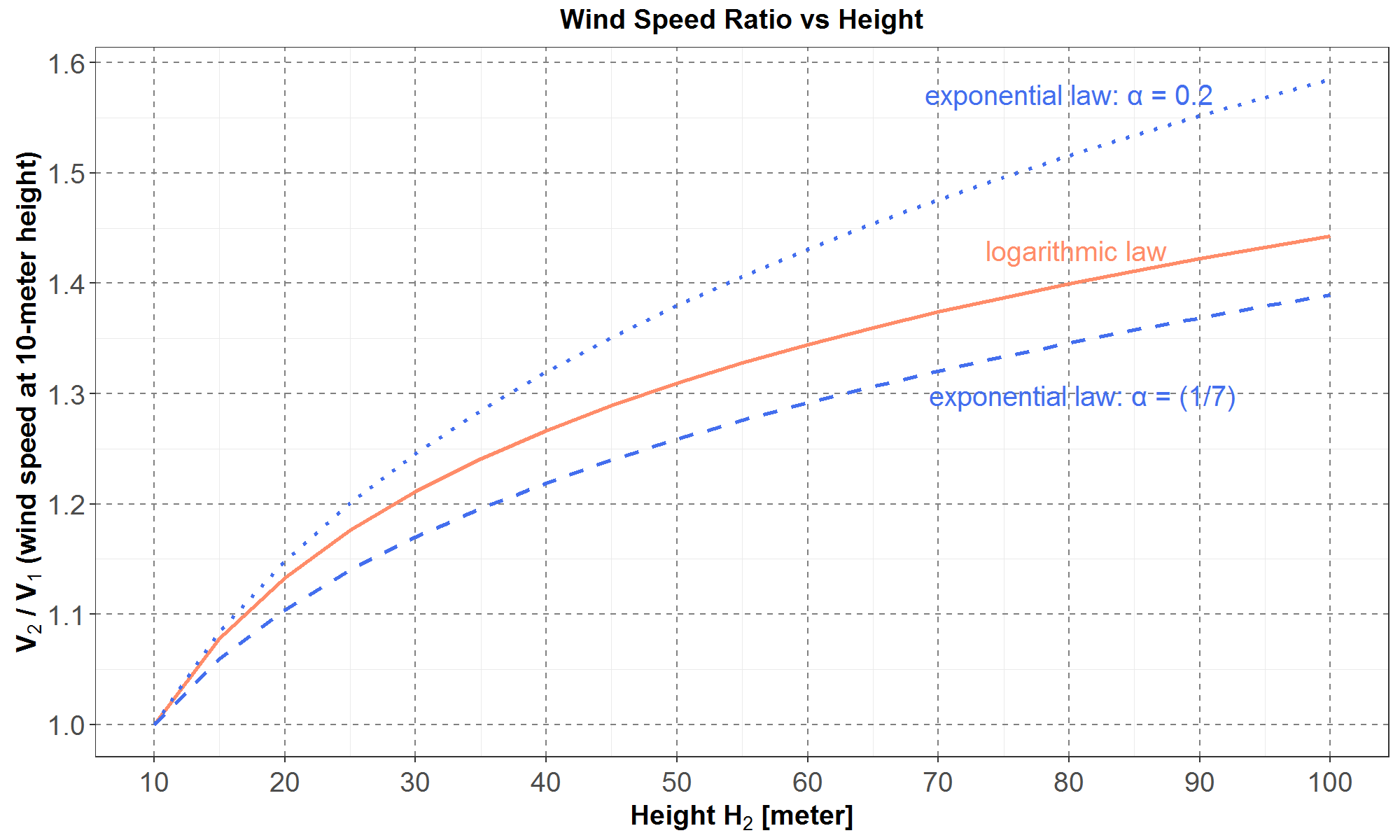
Figure 2: On the y-axis is (V2/V1 ), the ratio of wind-speed at height H2 relative to the 10-meter height wind-speed. This ratio is plotted versus height H2 (in meters) on the x-axis. The two blue curves represent the exponential law in Equation (3) with parameter α=0.2 for the upper dotted curve and α=(1/7) for the lower dashed curve. The orange curve represents the logarithmic law in Eq. (4) with parameter H0 = 0.055 meters.
Figure 2 shows that all three wind-speed ratios start correctly at 1 at a height of 10 meters. For the logarithmic law, the 80-meter and 100-meter wind speeds are respectively 40% and 44% higher than the 10-meter wind speed. Because the log function increases more slowly for larger values, the 100-meter wind speed is only 3% higher than the 80-meter wind speed. All three curves are relatively close together in Figure 3: the upper and lower blue curves are about 9% higher and 4% lower, respectively than the orange curve for heights of 80 meters and 100 meters. For simplicity, the orange curve, or the logarithmic law in Equation (4), is used to extrapolate climate wind speeds at a 10-meter height to wind speeds at 80 meters and 100 meters.
Calculating Hourly Shapes for the Climate Average Daily Wind Speed
Since the newly calculated 80-meter and 100-meter climate wind speeds from the previous section are still average daily quantities, in this section, a method is developed to estimate hourly shapes for these climate average daily wind speed using available historical hourly wind speed data.
The hourly-shape calculation is illustrated in Figures 3 and 4.
In Figure 3, for the 24 hours of a day on the x-axis and wind speed on the y-axis, an example climate average daily wind speed Vc is plotted as the horizontal orange dashed line, and an example historical hourly wind speeds are plotted in the gray squares along the gray curve. The average daily historical wind speed Vh , calculated from the 24 historical hourly wind speeds, is plotted as the horizontal gray dashed line.

Figure 3: Example data for the average daily climate wind speed Vc is plotted as the orange dashed line, and example data for historical hourly wind speeds are plotted as gray squares on the solid gray curve. The average daily historical wind speed Vh is plotted as the gray dashed line. All the data are plotted for 24 hours of a day along the x-axis.
The hourly shapes for the average daily climate wind speed are calculated by scaling the historical hourly data in Figure 3 with the ratio (Vc /Vh ). In other words, the hourly climate wind speeds are obtained by multiplying the historical hourly wind speeds by this ratio. Scaling the historical hourly wind speeds with this ratio keeps the average daily climate wind speed constant, at Vc.
The scaling method is illustrated in Figure 4 where the historical hourly wind speeds in gray squares are multiplied by the ratio (Vc/Vh ) to become the hourly climate wind speeds in orange squares.
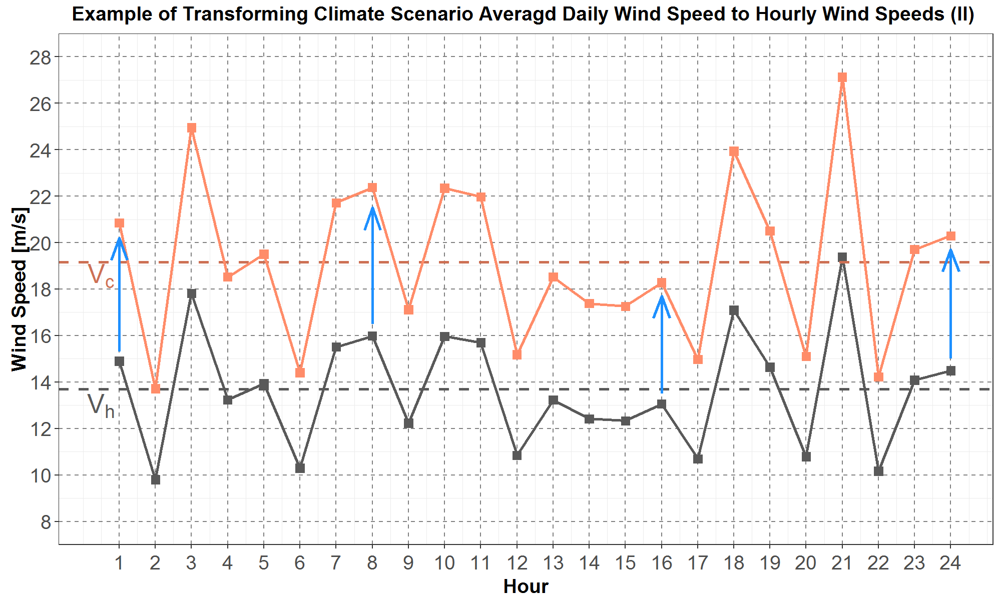
Figure 4: The hourly historical wind speeds in the black squares are each multiplied by the ratio (Vc /Vh ) to become the hourly climate wind speeds in the orange squares.
Calculating Hourly Shapes for the Average Daily Climate Wind Direction
The climate wind direction, in terms of the angle ϕ illustrated in Figure 1 and calculated in Equation (2), is also an average daily quantity. Therefore, in this section, a method is also developed to calculate hourly directions for the average daily climate wind direction using available historical hourly wind direction data.
The hourly-direction calculation is illustrated in Figures 5 and 6.
In Figure 5, an example average daily climate wind direction is plotted as an orange vector with angle ϕ measured with respect to the north axis. Also plotted are example historical hourly directions (for a day) as black vectors with a corresponding set of angles {θi } where the index i goes from 1 to 24. For simplicity, only 10 historical hourly directions are plotted. From the set of historical hourly angles {θi }, a historical daily average angle θ is calculated, and its direction is the blue vector.

Figure 5: Example data for an average daily climate wind direction is plotted as the orange vector with angle ϕ , and example data for historical hourly wind directions are plotted as the set of black vectors with a corresponding set of angles {θi }. For simplicity, only 10 historical hourly wind direction vectors are plotted. The average daily historical wind direction is plotted as the blue vector with angle θ .
Unfortunately, for a set of N angles {θi }, calculating the average angle θ via the usual method, presented in Equation (5), sometimes does not result in an average angle close to the set of angles {θi }.
For example, for N = 2, let {θ1 , θ2 } = {10, 350} (in degrees), then the average angle according to Equation (5) is θ = 180, instead of θ = 360 (or 0) which is the average closest to both 10 and 350.
Thus, the average angle θ closest to {θi } is calculated as follows. Each angle θi is first decomposed into its component vectors, xi=sin(θi) and yi=cos(θi) . Then the averages of all the component vectors are calculated as
which lead to the average angle (closest to set {θi }) being θ=tan-1(x/y) .
In Figure 5, let the displacement angle Δ=ϕ- θ be defined as the difference between the climate average daily angle and the historical average daily angle. Then hourly directions for the climate average daily direction are calculated by displacing the set of historical hourly angles {θi } by ∆ . In other words, the climate hourly angles are ϕi=θi+Δ for i = 1 to 24.
The displacement method is illustrated in Figure 6, where the historical hourly wind direction vectors in black are transformed to the climate hourly wind direction vectors in pink by displacing each historical angle θi by ∆ .
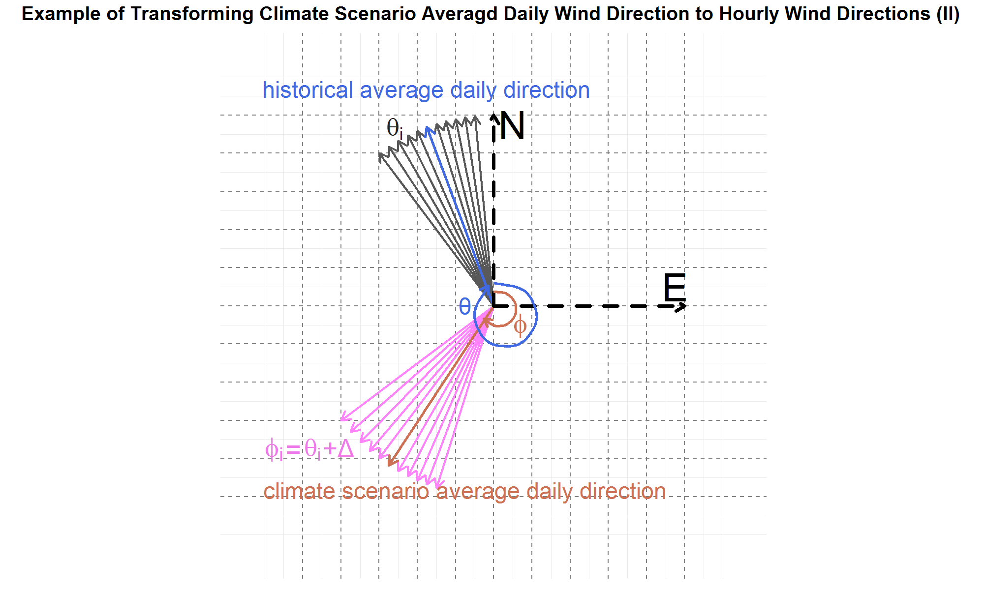
Figure 6: The historical hourly wind directions in the black vectors whose angles {θi } are each displaced by the displacement angle Δ=ϕ- θ to become the hourly climate wind directions in the pink vectors with angles {ϕi }.
Calibrating Hourly Climate Wind Speeds with Historical Wind Speeds
In the previous sections, several methods were presented to transform the CL climate wind data that are average daily northward wind and eastward wind vectors at 10-meter height into hourly wind speeds and directions at 80-meter and 100-meter heights. In particular, the transformations from average daily data to hourly data required using historical hourly wind data. Council staff decided to use the publicly available simulated historical wind data produced by the Wind Prospector, a program developed by NREL. The downloaded NREL (Wind Prospector) data are simulated hourly data for wind speed, wind direction, temperature and pressure at 100-meter height at the Gorge, southeast Washington and Montana for the six years from 2007 to 2012. Therefore, to model climate wind generation, the NREL data files are modified by replacing the historical wind speed and wind direction columns with the corresponding transformed climate wind data, while the historical temperature and pressure columns are left unchanged. The modified NREL data files then become inputs into SAM to produce climate wind generation. In this section, the NREL data are analyzed and used to calibrate the climate wind data.
Since in subsequent sections many box-and-whiskers plots are used to present results and for analysis, a brief description of this type of plot is as follows. The box-and-whiskers plot, which for simplicity is abbreviated as the boxplot, is illustrated in Figure 7. The boxplot allows for quantitative comparisons of distributional statistics such as the 25th, 50th (the median) and 75th percentiles. The grey box in Figure 7, which starts from the 25th percentile at the bottom and ends at the 75th percentile at the top, contains the central 50% of the population of the distribution. The length of the box is defined as the inter-quartile-range (IQR) and is used to delineate outliers (if any) which are those data that lie beyond one-and-a-half times the IQR from the box.
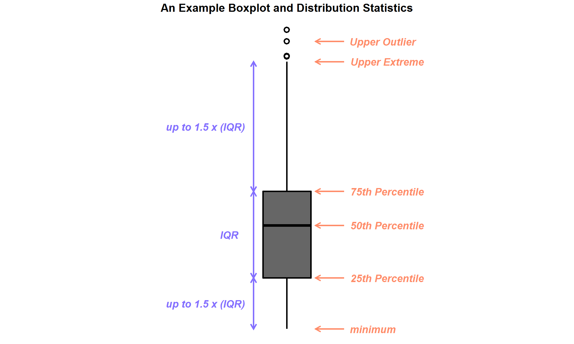
Figure 7: An example box-and-whiskers plot, with upper outliers shown.
Thus, in Figure 8, the NREL simulated historical 100-meter wind speed distributions by year and location are presented in boxplots. Plots for the three locations are separated into three panels: the left for the Gorge, the middle for Montana (abbreviated as MT) and the right for southeast Washington (abbreviated as SE_WA). Within each location panel, the boxplots for wind speeds, in unit of meters/second (m/s), are along the y-axis, and the years 2007 to 2012 are separated along the x-axis. In addition, the blue diamond inside each boxplot represents the average of the distribution.
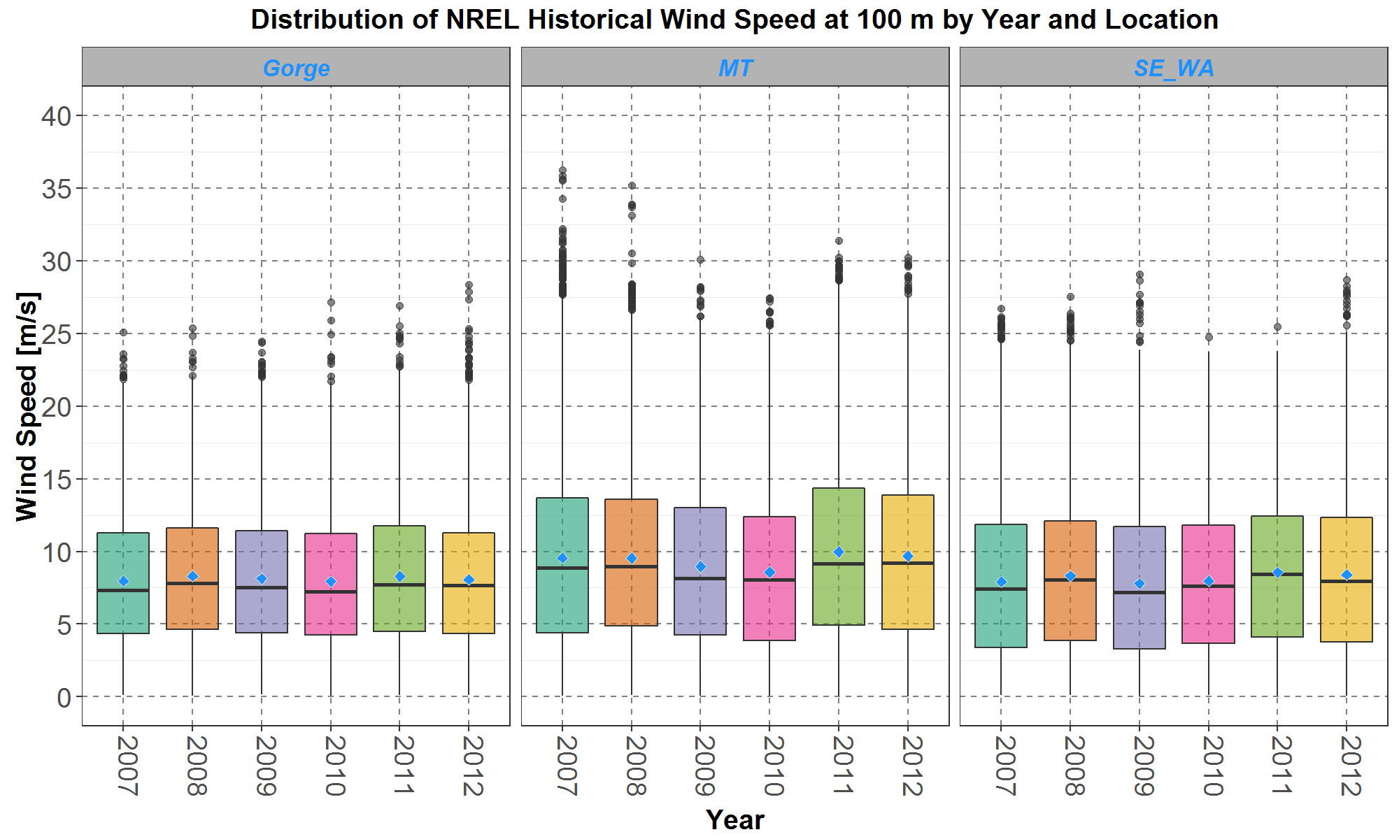
Figure 8: The NREL (Wind Prospector) hourly wind speed distributions are plotted for the Gorge in the left panel, Montana (MT) in the middle panel and southeast Washington (SE_WA) in the right panel. Within each panel, the boxplots are along the y-axis and plotted by year, from 2007 to 2012, on the x-axis. The blue diamond inside each boxplot represents the average of the distribution.
It can be seen that for each of the three locations, the NREL wind speed distributions for the six years are all very similar. In terms of boxplot statistics, the upper and lower whiskers, the 25th, 50th (median) and 75th percentiles, and the averages for each year are close to each other. Therefore, for subsequent analyses, the NREL historical wind speed distributions for the six years are grouped together.
The grouped NREL wind speed distributions are plotted in boxplots in Figure 9 where the three locations are separated along the x-axis. The Gorge and SE_WA distributions are very similar to each other, but the upper-half (from the median upward) of the MT distribution is higher than the upper-half of other two.
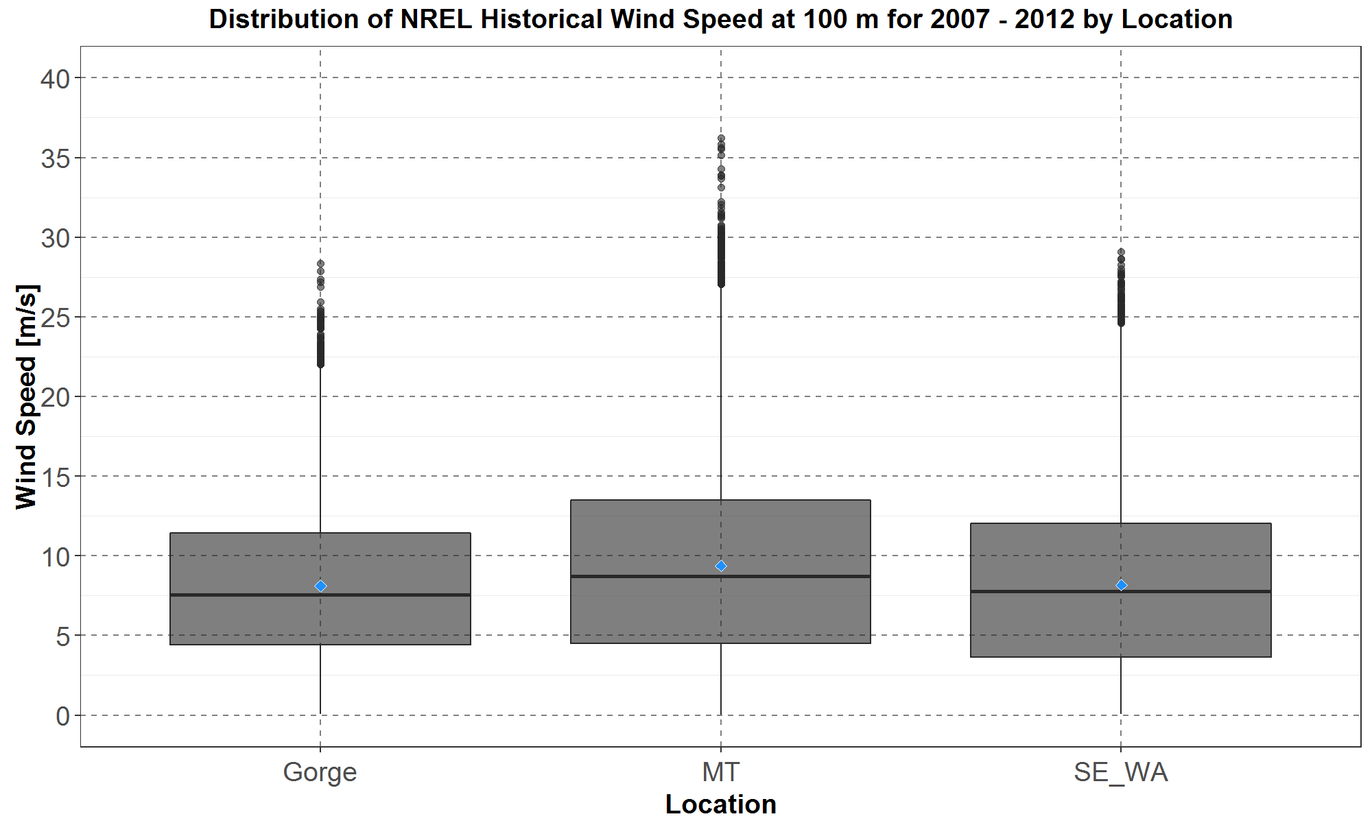
Figure 9: The NREL (Wind Prospector) hourly wind speed distributions for the years 2007 to 2012 expressed in boxplot for the Gorge, Montana (MT) and southeast Washington (SE_WA).
Since the CL daily climate wind speeds were calculated for the years 2006 to 2099, it would be prudent to analyze how well they match the simulated NREL wind speed data at 100-meter height for an appropriate set of historical years. Because a decade is usually the minimal length of time for analysis of climate data, then the ten year period from 2006 to 2015 was chosen. The chosen decade also encompasses all six years (from 2007 to 2012) of the NREL data.
Because the climate wind speeds are daily while the NREL wind speeds are hourly, for appropriate comparisons, the daily climate data could be given historical hourly shapes from the NREL hourly data as presented in the previous sections. However, it is probably not useful to compare the hourly NREL data to the transformed hourly climate data that have NREL hourly shapes embedded. Thus, the daily climate data are compared with the average daily NREL data calculated from the hourly NREL data.
Comparisons between the climate and NREL 100-meter (average daily) wind speed distributions are presented in boxplots for the three locations in three panels in Figure 10. For each location panel, the distributions are plotted as boxplots along the y-axis while the three climate scenarios designated as A, C and G (see Table 1 for more details) and the NREL distribution designated as N are separated along the x-axis. The average for each distribution is also plotted, as a blue diamond inside the box.
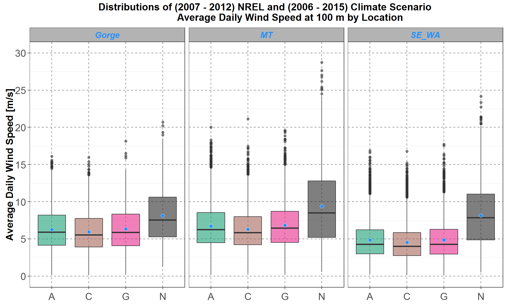
Figure 10: Boxplot comparisons of average daily wind speed distributions at 100-meter height among the three selected climate scenarios A, C and G (see Table 1 for more details) and the NREL (N) data. Historical time periods for the climate and NREL data are respectively 2006 to 2015 and 2007 to 2012. Comparisons for the Gorge, Montana (MT) and southeast Washington (SE_WA) are presented on the left, center and right panel respectively. Within each panel, the boxplots are along the y-axis and the climate scenarios and NREL data are separate along the x-axis. The blue diamond inside each boxplot represents the average of the distribution.
Figure 10 shows that within each location panel, the distributions among the three climate scenarios are comparable to each other but significantly lower than the NREL distribution. In particular, the NREL distributions have significantly more wind speeds above 5 meters/sec than the climate distributions. Since many wind turbines modeled in SAM have a cut-off speed around 5 meters/sec below which there would be no power generated (more details available in a subsequent section), then climate wind generations would generally be lower than NREL wind generations for the comparable historical periods (2006 to 2015 for climate and 2007 to 2012 for NREL). Therefore, an appropriate bias-correction method is developed to modify the climate wind speed distributions to more closely match the NREL distribution.
For simplicity, the chosen bias-correction method is to minimize the differences between the climate scenario averages and the NREL average. Table 2 lists the average (e.g., the blue diamonds in Figure 10) of all the distributions for the three locations.
Table 2: The Average (in meters/sec) of the Wind Speed Distributions in Figure 10
| Model | The Gorge | Montana | Southeast Washington |
| A | 6.27 | 6.71 | 4.84 |
| C | 5.94 | 6.29 | 4.52 |
| G | 6.33 | 6.83 | 4.86 |
| NREL | 8.12 | 9.39 | 8.17 |
Comparisons of the distributions in Figure 10 suggest three types of minimization. For this discussion, let ,
,
and
represent the average wind speed at location x for the three climate scenarios A, C and G and NREL respectively, with values listed in Table 2.
The first type of minimization uses just one scaling parameter α to minimize S , the sum of squares of all the differences at all three locations:
The solution for α is obtained using calculus. However, the resulting bias-corrected climate wind speed distributions, all scaled by α , are still too low compared with the corresponding NREL distributions, especially at southeast Washington.
The second type of minimization would use three scaling parameters αGorge, αMT and αSE_WA to minimize, at each location separately, the sum of squares of all the differences SGorge, SMT and SSE_WA :
(8)
(9)
(10)
The solutions to Equations (8) - (10) are also calculated using calculus resulting in αGorge=1.314 , αMT =1.417 and αSE_WA =1.721. Therefore, at each location the bias-corrected distributions for all three climate scenarios are scaled by the same factor. Comparisons between the bias-corrected climate scenario wind speed distributions and the NREL distribution for the three locations are presented in Figure 11.
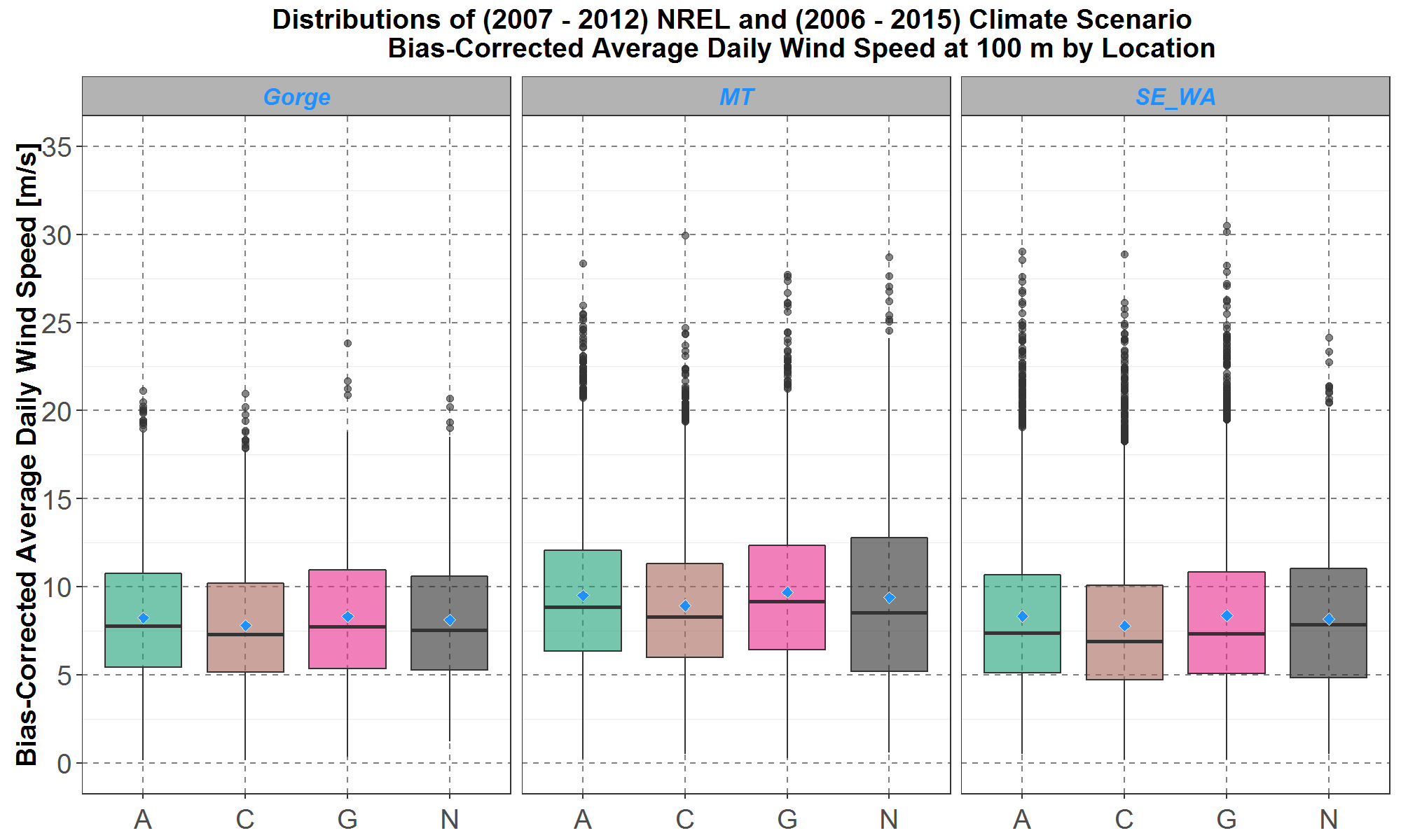
Figure 11: Boxplot comparisons of bias-corrected average daily wind speed distributions at 100-meter height between the three selected climate scenarios A, C and G and the NREL (N) data. Comparisons for the Gorge, Montana (MT) and southeast Washington (SE_WA) are presented on the left, center and right panel respectively. Within each panel, the boxplots are along the y-axis and the climate scenarios and NREL data are separate along the x-axis. The blue diamond inside each boxplot represents the average of the distribution.
Figure 11 shows that the bias-corrected climate scenario distributions are much closer to the NREL distribution at each location panel. Furthermore, at each location, the relative differences among the climate scenario distributions, as seen in Figure 10, seem to remain in Figure 11. Thus, this bias-correction, by minimization of the sums of squares in Equations (8) – (10), maintains the inherent wind speed diversity among the climate scenarios in the historical period 2006 – 2015 and possibly also for future time periods.
Finally, the third type of minimization uses nine scaling parameter ,
,
,
,
,
,
,
, and
to minimize the of square of the difference for each scenario and location
,
,
,
,
,
,
,
and
separately:
Obviously, at every location, using this bias-correction would result in the best match between each bias-corrected climate distribution and the NREL distribution because it will have the exact same average as the NREL distribution. However, that would also result in the three bias-corrected climate distributions being very similar to each other at every location, and thus the diversity among them would be much less than those presented in Figures 10 and 11.
Among the three types of minimization considered in this section, the second type as defined in Equations (8) – (10) is chosen because of good agreements between the NREL distributions and the resulting bias-corrected climate distributions and preservation of the inherent diversity among the climate distributions as seen in Figures 10 and 11.
Furthermore, although the bias-correction scaling parameters αGorge=1.314 , αMT=1.417 and αSE_WA=1.721 were calculated for climate wind speed distributions at 100-meter height, the same scaling parameters are also applied to climate wind speed distributions at 80-meter height.
Next, the bias-corrected climate wind distributions for the coming decades are analyzed. Let the historical decade represent the years 2006 to 2015, and the 2020’s, 2030’s and 2040’s decades represent the years 2020 to 2029, 2030 to 2039, and 2040 to 2049, respectively. Comparisons among the climate scenarios at the three locations for the historical, 2020’s, 2030’s and 2040’s decade are presented in Figure 12.
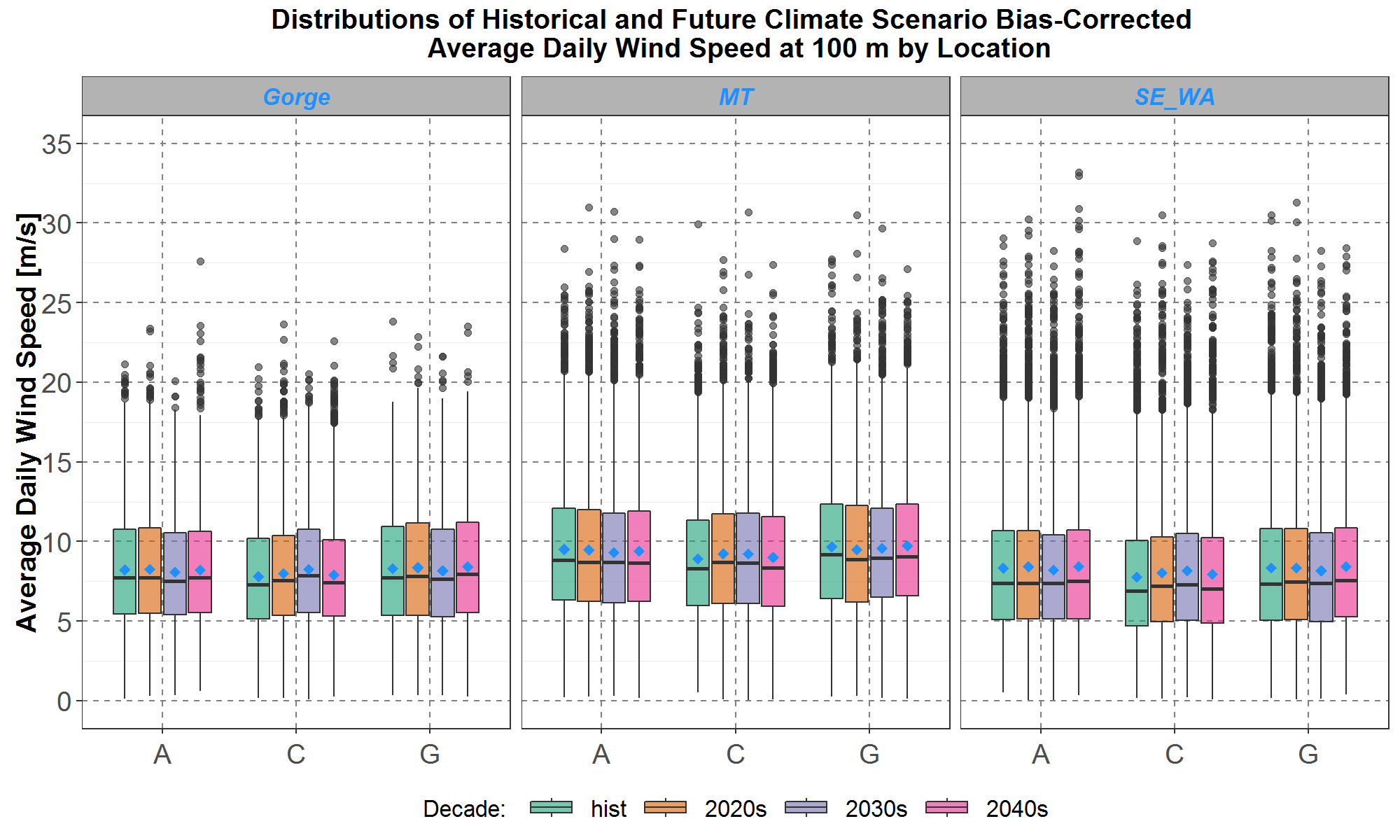
Figure 12: Comparisons of bias-corrected average daily wind speed distributions at 100-meter height among the three selected climate scenarios A, C and G and the four decades. The boxplots for the historical decade are in green, the 2020’s decade in orange, the 2030’s decade in purple and the 2040’s in pink. Comparisons for the Gorge, Montana (MT) and southeast Washington (SE_WA) are presented on the left, center and right panel respectively. Within each panel, the boxplots are along the y-axis and the climate scenarios data are separate along the x-axis. The blue diamond inside each boxplot represents the average of the distribution.
As can be seen, the wind speed distributions do not vary much over the four decades at each location, and thus distributions of the three future decades, 2020’s, 2030’s and 2040’s will be grouped together in subsequent analyses.
Finally, comparisons between the future climate scenario wind speed distributions for 2020 to 2049 and the simulated historical NREL distribution for 2007 to 2012 for the three locations are presented in Figure 13.
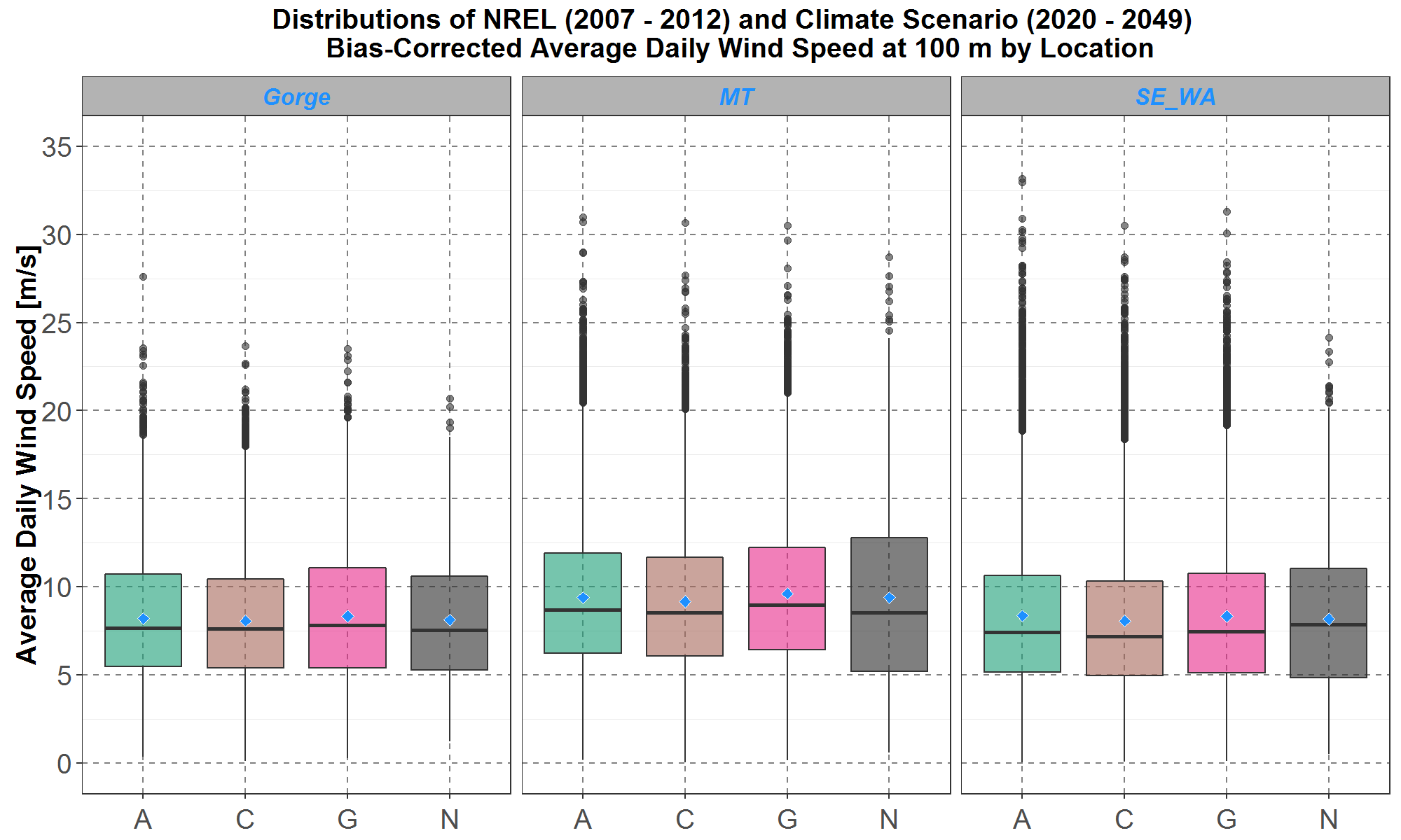
Figure 13: Boxplot comparisons of bias-corrected average daily wind speed distributions at 100-meter height between the three selected climate scenarios A, C and G for 2020 to 2049 and the NREL (N) data for 2007 to 2012. Comparisons at the Gorge, Montana (MT) and southeast Washington (SE_WA) are presented on the left, center and right panel respectively. Within each panel, the boxplots are along the y-axis and the climate scenarios and NREL data are separate along the x-axis. The blue diamond inside each boxplot represents the average of the distribution.
As expected, the bias-corrected climate distributions for 2020 to 2049 in Figure 12 look quite similar to those for 2006 to 2015 in Figure 11, except for having more outliers. This is due to grouping together all the outliers of three decades, 2020’s, 2030’s and 2040’s, in Figure 12.
For completeness, the bias-corrected 80-meter climate wind speed distributions for 2020 to 2049 are plotted in Figure 14. As explained in a previous section on the logarithmic law, the 80-meter distributions are just a few percent below the corresponding 100-meter distributions in Figure 13.
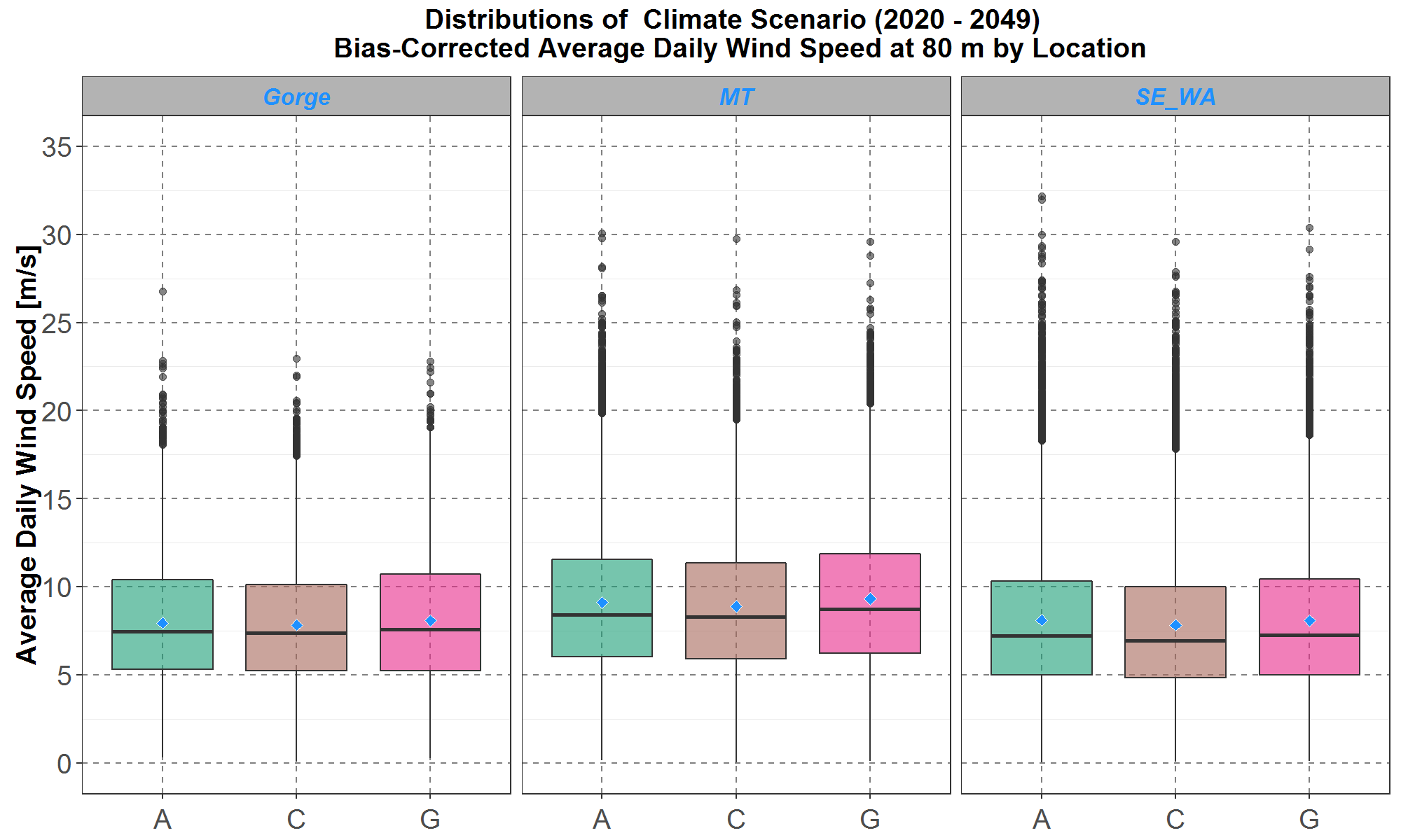
Figure 14: Boxplots of bias-corrected average daily wind speed distributions at 80-meter height for the three selected climate scenarios A, C and G for 2020 to 2049. Plots for the Gorge, Montana (MT) and southeast Washington (SE_WA) are presented on the left, center and right panel respectively. Within each panel, the boxplots are along the y-axis and the climate scenarios are separate along the x-axis. The blue diamond inside each boxplot represents the average of the distribution.
After the climate wind speed analysis and bias correction, the same calibration process is performed for the climate wind directions (e.g., the angle ϕ defined in Figure 1) for the same decade from 2006 to 2015. The result is that for each of the three locations, the distributions of climate angles for the three scenarios are similar to the distribution of the historical NREL angles from 2007 to 2012. Thus, for climate angles there is no need for any bias correction.
Summary
In summary, at the Gorge, Montana and southeast Washington, and for the three climate scenarios A, C and G (see Table 1 for more details), the CL10-meter daily climate cartesian wind vectors are first transformed into polar coordinates of daily wind speed and wind direction. Then using the logarithmic law, the 10-meter daily climate wind speeds are extrapolated to 80-meter and 100-meter daily climate wind speeds. Furthermore, for the historical decade from 2006 to 2015, the 100-meter daily climate wind speeds at each location undergo bias-correction so that their distributions more closely match the corresponding historical NREL wind speed distributions for 2007 to 2012. The same bias correction is also applied to the 80-meter daily climate wind speeds. In addition, because at each location, distributions of the daily climate wind directions (in terms of the angle ϕ defined in Figure 1) are similar to the NREL daily wind directions, then there is no need to bias-correct the climate angles. Finally, following the hourly shaping methods presented in previous sections, both the daily climate wind directions and the bias-corrected 80-meter and 100-meter daily climate wind speeds are transformed into corresponding hourly climate wind data using hourly shapes from the historical NREL (Wind Prospector) wind data. Because there are six historical NREL hourly wind data sets from 2007 to 2012, then for each day there are six possible sets of transformed hourly climate wind data.
For the Power Plan, Council staff have compiled hourly wind data sets for:
- three climate scenarios: A, C and G,
- three locations: the Gorge, Montana and southeast Washington,
- two turbine hub-heights: 80-meter and 100-meter,
- six years of historical NREL hourly shapes: 2007 to 2012.
The combinations, (3 scenarios) x (3 locations) x (2 hub-heights) x (6 historical hourly shapes), result in 108 hourly climate wind data sets where each set contains hourly data for the 30-year span from 2020 to 2049. These climate wind data sets become inputs for SAM, which models northwest wind fleet generation and are presented in the next section.
Modeling Climate Scenario Wind Generations with SAM
To model generation of the northwest wind fleet with climate data, the transformed climate wind data sets discussed in the previous section are incorporated as inputs into SAM. For simplicity, the northwest wind fleet is represented by wind farms installed with representative 80-meter and 100-meter wind turbines. In the following sections, two types of wind turbines and their associated wind farm data (as modeled in SAM) are presented. In addition, wind generation output from SAM are analyzed for each turbine type at the specified wind farm. Read the Aurora and GENESYS write-ups for more details on how climate wind generation output from SAM is used in other parts of the Power Plan.
Characteristics of Wind Farms Installed with Two Representative Wind Turbines Modeled in SAM
The 80-meter Wind Turbine
As of 2019, the 2.3 MW Siemens Turbine (with 80-meter hub height) was the most popular turbine type in operation in the northwest wind fleet, although there are many other technologies in place (see Existing Resources – Wind Section for details). Therefore, the 2.3 MW Siemens Turbine is selected to represent the current wind fleet, and Figure 15 shows a screen-capture of its characteristics as modeled in SAM.
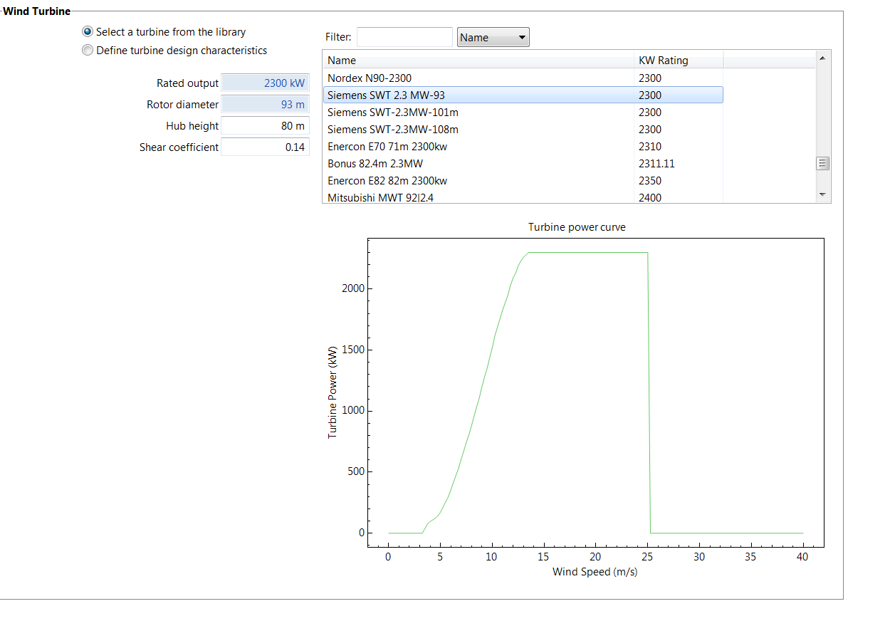
Figure 15: Screen-capture of the 2.3 MW Siemens Turbine characteristics in SAM. The turbine power curve is plotted at the bottom where the x-axis is the wind speed at 80-meter height and the y-axis is the turbine generation.
The data from the upper-left portion of Figure 15 shows that this Siemens turbine has an 80-meter hub-height and 2.3 MW nameplate capacity. Also, the turbine power curve is plotted at the bottom, where the wind speed (at 80-meter height) is along the x-axis and turbine generation is on the y-axis. From the power curve, the cut-off speed is about 3 [m/s] below which there is no generation. Furthermore, the plot also shows that turbine generation increases rapidly for speeds from 5 [m/s] to 13 [m/s], reaching the nameplate capacity of 2.3 MW for speeds from 13 [m/s] to 25 [m/s] and then dropping abruptly to zero for speeds greater than 25 [m/s]. For example, at a wind speed of 10 [m/s], turbine generation is about 1.5 MW, equivalent to a capacity factor of 0.65. Also available in SAM is the wind farm configuration associated with the 2.3 MW Siemens Turbine, which is presented in Figure 16.
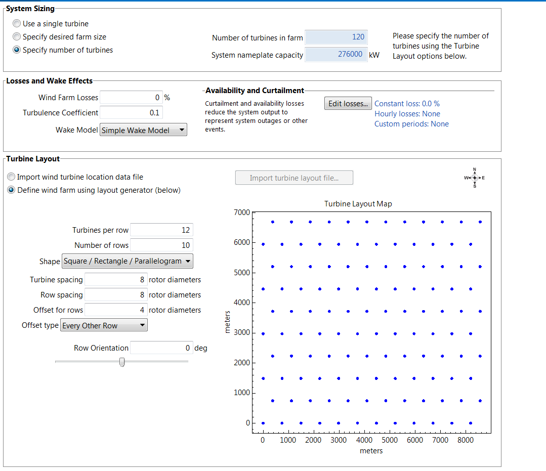
Figure 16: Screen-capture of the 2.3 MW Siemens wind farm configuration in SAM.
From the top portion of Figure 16, the model wind farm shows 120 turbines with a total nameplate capacity of 276 MW. Furthermore, the 120 turbines are arranged into 10 rows with each row having 12 turbines that are spread over an area about 9 [km] by 7 [km], as illustrated at the bottom of the plot.
The wind farm configuration described above, installed with the 80-meter 2.3 MW Siemens Turbines, is used to represent the current northwest wind fleet.
The 100-meter Wind Turbine
A different wind farm configuration is used to represent a future wind fleet, which is assumed to be installed with the 100-meter 3.6 MW Siemens SWT Turbines (the 3.6 MW Siemens Turbine is a reference wind project in New Resources – Wind Section). The 3.6 MW Siemens turbine characteristics as modeled in SAM are presented as a screen-capture in Figure 17.
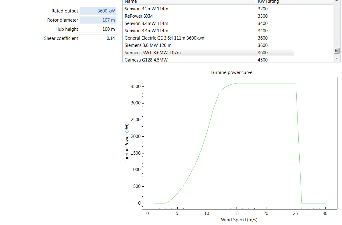
Figure 17: Screen-capture of the 3.6 MW Siemens SWT Turbine characteristics in SAM. The turbine power curve is plotted at the bottom where the x-axis is the wind speed at 100-meter height and the y-axis is the turbine generation.
The upper-left portion of Figure 17 shows that this Siemens turbine has a 100-meter hub-height and 3.6 MW nameplate capacity. In addition, the turbine power curve at the bottom shows wind speed along the x-axis and turbine generation along the y-axis. Similar to the power curve for the 80-meter turbine in Figure 15, the lower and upper cut-off speeds are 3 [m/s] and 26 [m/s], respectively. However, the 100-meter turbine generation increases more slowly than the 80-meter turbine generation, requiring wind speed of 15 [m/s] to reach its nameplate capacity of 3.6 MW generation. In contrast, the 80-meter turbine only requires a speed of 13 [m/s] to reach its nameplate capacity. For example, at a wind speed of 10 [m/s], the 100-meter turbine generation is about 2.1 MW, equivalent to a capacity factor of 0.59. Thus, at this speed the 100-meter turbine has higher generation but lower capacity factor compared to the 80-meter turbine. It can also be deduced from the power curves in Figures 15 and 17 that for wind speeds between 5 [m/s] and 12 [m/s], which represent about 50% of the wind speed distributions in Figures 13 and 14, the 80-meter turbine has a higher capacity factor than the 100-meter turbine.
Finally, the wind farm configuration installed with the 100-meter 3.6 MW Siemens Turbines is presented in Figure 18.
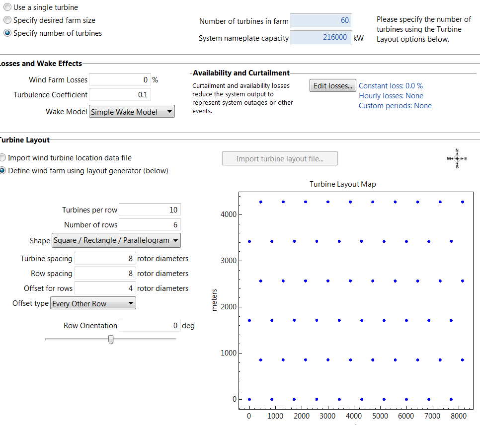
Figure 18: Screen-capture of the 3.6 MW Siemens wind farm configuration in SAM.
The top portion of Figure 18 shows that the model wind farm has 60 turbines with a total nameplate capacity of 216 MW. Furthermore, the 60 turbines are arranged into 6 rows with each row having 10 turbines and spread over an area about 9 [km] by 4.5 [km] as illustrated at the bottom of the plot.
For both types of wind farms in Figures 16 and 18, all types of generation loss modeled in SAM have been turned off for simplicity.
Climate Wind Data Inputs for SAM
To model hourly generation from a wind farm installed with a particular turbine, SAM requires four types of hourly data at the hub-height of the turbine: wind speed, wind direction, pressure and temperature. As discussed previously, climate wind direction and bias-corrected climate wind speed along with historical NREL pressure and temperature data were used as SAM inputs.
For the 2021 Power Plan, for each climate scenario, the daily climate wind data span the 30-years from 2020 to 2049. Because there are six years of historical NREL hourly wind shapes (2007 to 2012) applied to the 30-years of daily climate wind data, then six sets of 30-year hourly climate wind data are calculated. In other words, in each of the six sets, the (same) hourly wind shape from one of the six historical NREL years is used for every year from 2020 to 2049. In addition, the associated 30 years of hourly pressure and temperature input data for SAM also originate from the same historical NREL year.
Climate Wind Generation for Wind Farm installed with the 80-Meter Turbines
There are 54 sets of 80-meter hourly climate wind data for 2020 to 2049 from the combinations of three climate scenarios (A, C and G), three locations (the Gorge, Montana and southeast Washington) and six historical NREL hourly shapes (from 2007 to 2012). For each of the 54 sets of inputs, SAM models hourly generation for the wind farm configuration installed with the 2.3 MW Siemens 80-meter turbines. The hourly SAM wind generation is divided by the wind farm nameplate capacity to create a set of hourly capacity factors (CF) whose distributions are plotted in Figure 19.
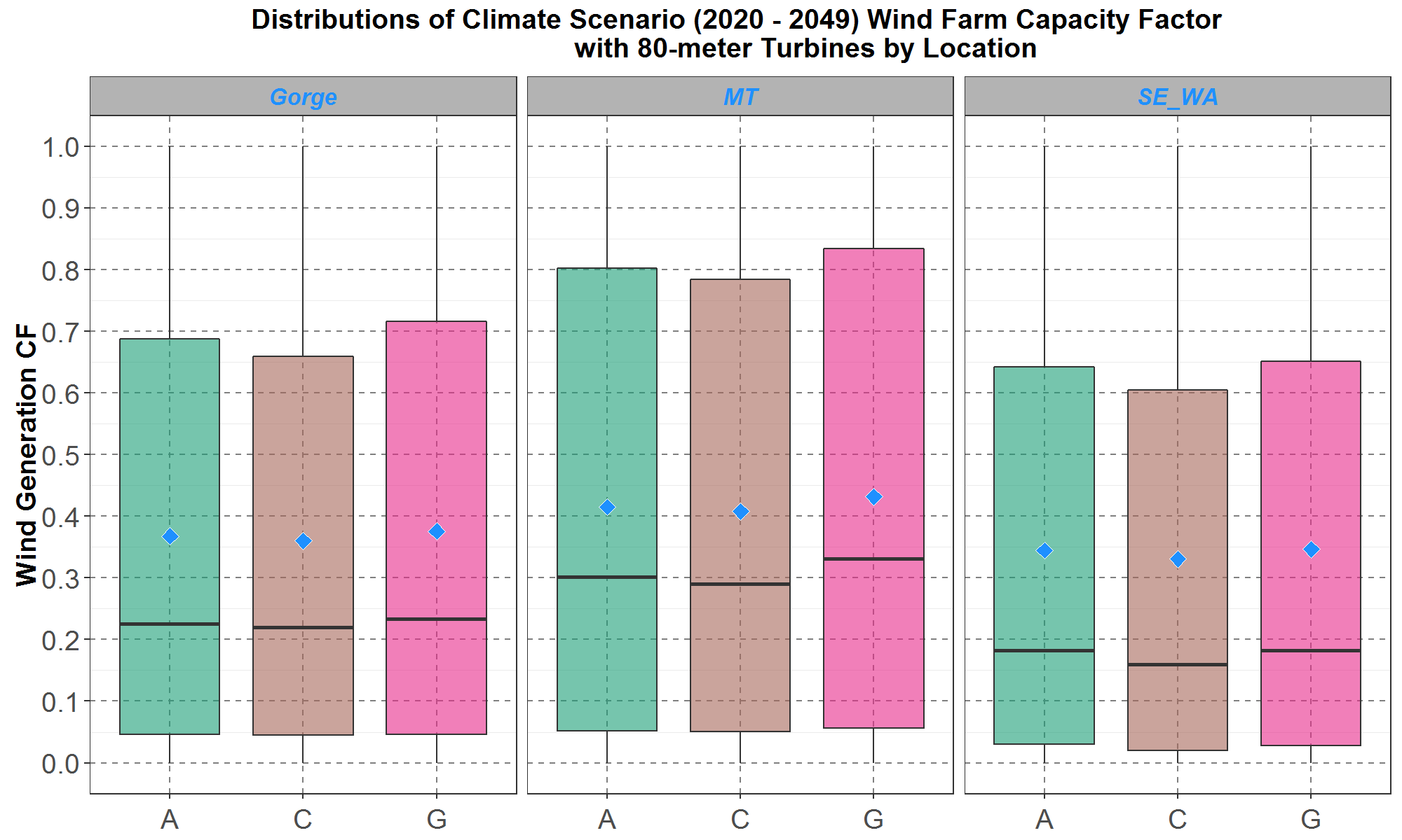
Figure 19: Boxplots of the hourly wind farm capacity factors (CF) for the transformed 80-meter hourly climate wind data for the years 2020 to 2049. Comparisons for the Gorge, Montana (MT) and southeast Washington (SE_WA) are presented on the left, center and right panel respectively. Within each panel, the boxplots are along the y-axis and the climate scenarios are separate along the x-axis. The blue diamond inside each boxplot represents the average of the distribution.
For the capacity factor distributions at the Gorge on the left panel in Figure 18, the averages range from 36% to 38% for the three climate scenarios. Since the Gorge capacity factors are used to model how the current northwest wind fleet would perform under climate wind, it is prudent to determine if the distributions are reasonable. The following is a simple analysis.
From the left panel in Figures 11 and 13, it can be seen that for the two time periods (2006 to 2015, and 2020 to 2049), distributions of the bias-corrected 100-meter climate wind speeds are similar to the historical 100-meter NREL distribution at the Gorge. Since the 80-meter wind speed is only a few percent below the 100-meter wind speed according to the logarithmic law defined in Equation (4) and plotted in Figure 2, then over the two time periods, the bias-corrected 80-meter climate wind distributions should also be similar to the hypothetical 80-meter historical NREL wind distribution at the Gorge. And if the hypothetical 80-meter NREL historical wind distribution is a good representation of the observed historical 80-meter wind distribution, then over the two time periods the bias-corrected 80-meter climate wind distributions should also be similar to the observed historical distribution. Thus, the climate Gorge capacity factors for 2020 to 2049 in Figure 19 could be expected to be somewhat close to the observed historical capacity factors for the wind fleet in the Columbia Gorge from 2010 to 2019, which has an average around 28% (compiled from data in the Council’s existing project database).
However, it is evident that the average climate Gorge capacity factors in Figure 19, from 36% to 38%, are too high compared to the historical capacity factor of 28%. Council staff believe this is due in part to the assumption that turbines modeled in SAM are new and thus are able to perform at full capability, whereas existing turbines suffer from aging which leads to degraded performance. Wind projects at the Gorge have a range of ages, turbine technologies, locations, and nameplate capacities. For example, Vansycle, the oldest, was installed in 1998 and has a nameplate of 25 MW. On the other hand, Wheatridge, the newest, was installed in 2020 and has a nameplate of 300 MW. As a rough approximation, the age of Gorge turbines is assumed to be around 10 years. To include an aging effect, results from the article “How does wind farm performance decline with age?” (Renewable Energy 66 (2014) 775 – 786) are applied to the Gorge 80-meter wind fleet capacity factors in Figure 19. In the article, the authors analyzed performance of 282 wind farms in the United Kingdom and found that turbine performance declines by about 1.6% per year. Therefore, the 10-year aging factor, e-0.016 ×(10) ≅ 0.85 is multiplied to the Gorge capacity factors in Figure 19. And for convenience, capacity factors for the Montana and southeast Washington turbines are also degraded by the same aging factor of 0.85. The results are plotted in Figure 20.
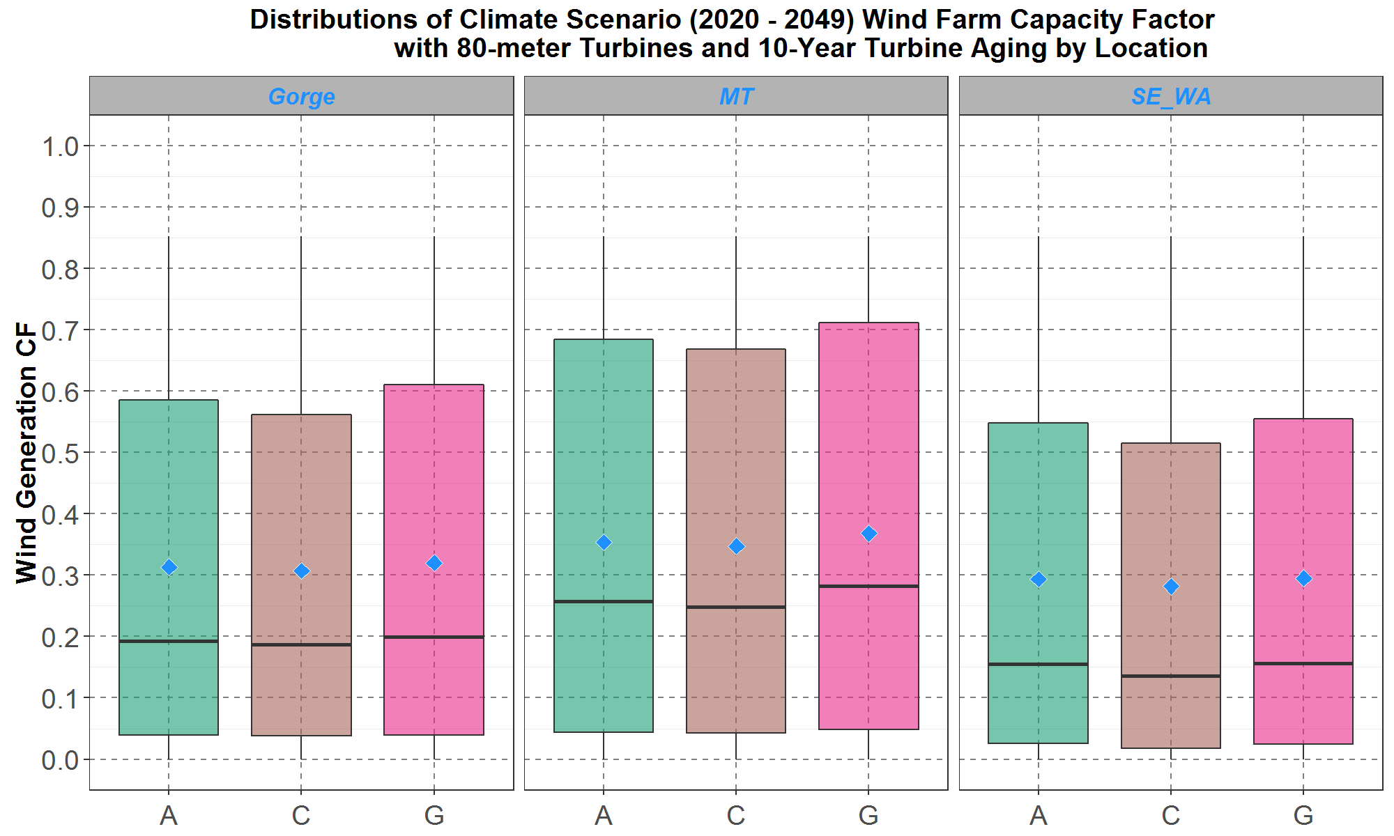
Figure 20: Boxplots of the hourly wind farm capacity factors (CF) with a 10-year aging factor of (0.85) for the transformed 80-meter hourly climate wind data for the years 2020 to 2049. Comparisons for the Gorge, Montana (MT) and southeast Washington (SE_WA) are presented on the left, center and right panel respectively. Within each panel, the boxplots are along the y-axis and the climate scenarios are separate along the x-axis. The blue diamond inside each boxplot represents the average of the distribution.
The climate Gorge capacity factor distributions in the left panel, with a 10-year aging factor, have averages from 31% to 32% which is a little higher than but much closer to the observed historical average of 28%. It is worth remembering that all types of generation losses modeled in SAM had been turned off, as mentioned previously. And if generation losses were activated in SAM with appropriate parameters, then the simulated average Gorge capacity factor in Figure 20 could be even closer to the observed historical average. In addition, with the 10-year aging factor, the Montana distributions in the middle panel have averages from 35% to 37% while the southeast Washington distributions in the right panel have averages from 28% to 30%.
Climate Wind Generation for Wind Farm installed with the 100-Meter Turbines
There are also 54 sets of 100-meter hourly climate wind data for 2020 to 2049 from the combinations of three climate scenarios (A, C and G), three locations (the Gorge, Montana and southeast Washington) and six historical NREL hourly shapes (from 2007 to 2012). With these 54 sets of inputs, SAM also models generation for the wind farm configuration installed with the 3.6 MW Siemens 100-meter turbines. The SAM climate and NREL capacity factor distributions (resulting from the 2007 to 2012 historical wind data) are plotted in Figure 21. In contrast to the 80-meter turbines, there is no aging factor applied to the 100-meter turbines since they are considered new.
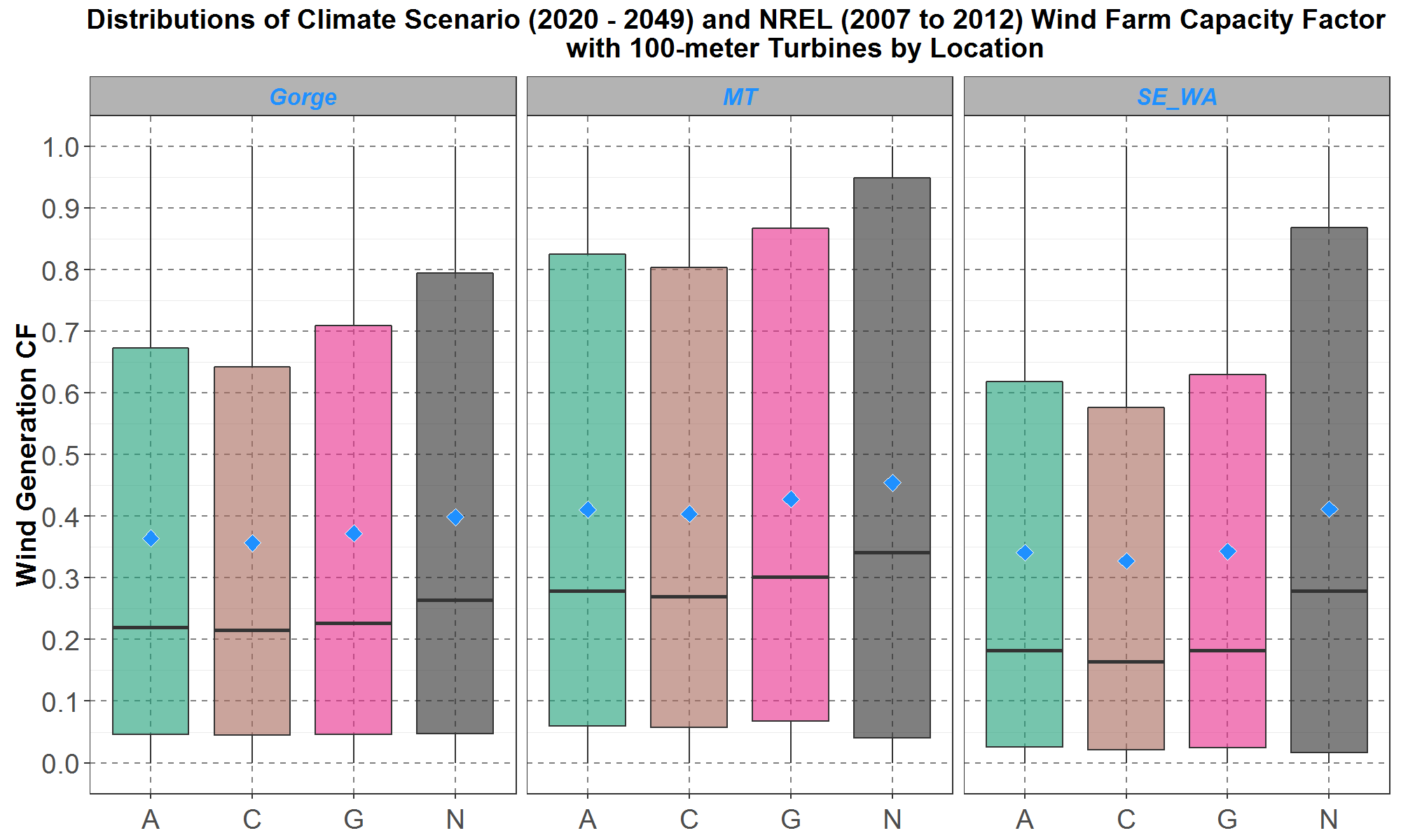
Figure 21: Boxplots of the hourly wind farm capacity factors (CF) for the transformed 100-meter hourly climate scenario (A, C and G) wind data for the years 2020 to 2049, and the 100-meter NREL (N) data for 2007 to 2012. Comparisons for the Gorge, Montana (MT) and southeast Washington (SE_WA) are presented on the left, center and right panel respectively. Within each panel, the boxplots are along the y-axis and the climate scenarios are separate along the x-axis. The blue diamond inside each boxplot represents the average of the distribution.
Without turbine aging, the 100-meter climate capacity factors are higher than the corresponding 80-meter climate capacity factors in Figure 20. The averages (plotted as the blue diamonds) of their distributions range from 36% to 37% for the Gorge in the left panel, 40% to 43% for Montana in the middle panel and 33% to 34% for southeast Washington in the right panel. For comparison, at each location, the NREL capacity factor from historical wind data are slightly higher than all the climate capacity factors. It seems that for each location, having the bias-corrected climate average wind speeds being close to the NREL average wind speeds, as presented in Figure 13, is not sufficient to ensure that the resulting climate wind capacity factors are close to the NREL capacity factors.
Monthly Shapes for Climate Wind Generation from the 100-meter Turbine Wind Farm during Day Hours
For power planning in the coming years, it would be useful to also have monthly wind capacity factors. Therefore, in this section the annual climate capacity factor data in Figures 20 and 21 are disaggregated by month for the upcoming decade, 2020 to 2029, and for hour starting 7 to hour starting 19. These “Day” hours are of interest due to the potential competition between wind and solar generation. Monthly distributions for the 100-meter climate and historical NREL capacity factors at the Gorge are plotted in Figure 22.

Figure 22: Monthly boxplots of the hourly wind farm capacity factors (CF) at the Gorge for the transformed 100-meter hourly climate scenario (A, C and G) wind data for the years 2020 to 2029, and the 100-meter NREL (N) data for 2007 to 2012. The boxplots are along the y-axis and the months along the x-axis. For each month, data for climate scenario A is in green, C in brown and G in pink with the NREL (N) data in dark gray. The blue diamond inside each boxplot represents the average of the distribution.
In Figure 22, the historical NREL capacity factors are higher for some spring and summer months, from April to August, with averages from 40% to 51%, and lower for some fall and winter months, from October to February, with averages from 25% to 31%. For the climate capacity factors as a group, they seem to increase from January to March and then decrease from March to September. However, each climate scenario seems to have slightly different seasonal trends. For simplicity, the monthly capacity factor for the three climate scenarios in Figure 22 are combined (aggregated) into one monthly climate capacity factor and plotted in Figure 23.
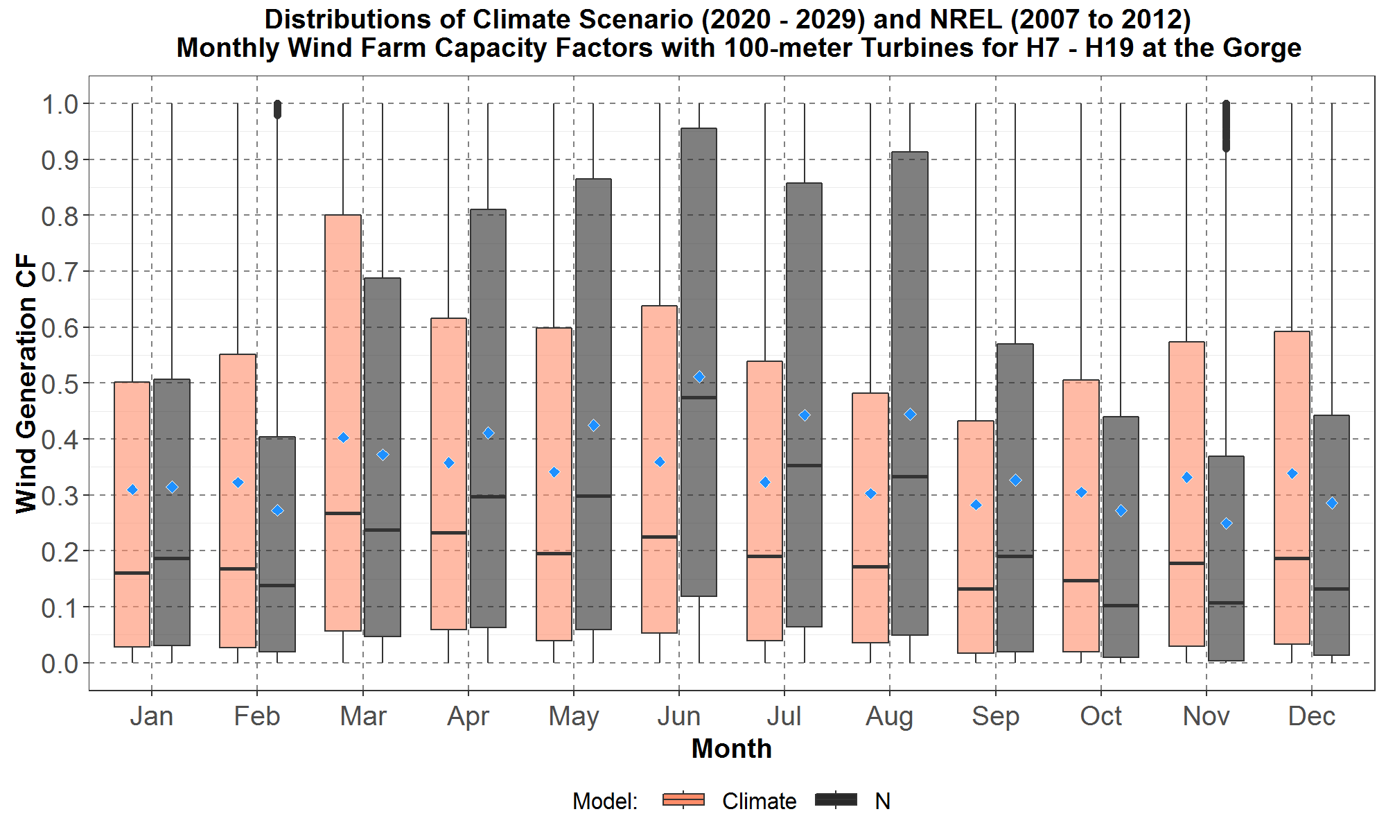
Figure 23: Monthly boxplots of the hourly wind farm capacity factors (CF) at the Gorge for the transformed 100-meter hourly climate wind data for the years 2020 to 2029, and the 100-meter NREL (N) data for 2007 to 2012. The hours are hour starting 7 to hour starting 19. The boxplots are along the y-axis and months along the x-axis. For each month, data for the aggregated climate scenarios are in peach color with the NREL data in dark gray. The blue diamond inside each boxplot represents the average of the distribution.
In Figure 23, it is easier to see the high spring and summer and low fall and winter trend for the NREL capacity factors. For the aggregated climate scenarios, the trend is a nearly steady increase from October through March, then a continuing decrease to a minimum for September. Thus, it appears that the climate and NREL capacity factors have different seasonal trends for the Gorge.
Similarly, the 100-meter monthly aggregated climate and NREL distributions of capacity factors for Montana wind site are plotted in Figure 24.
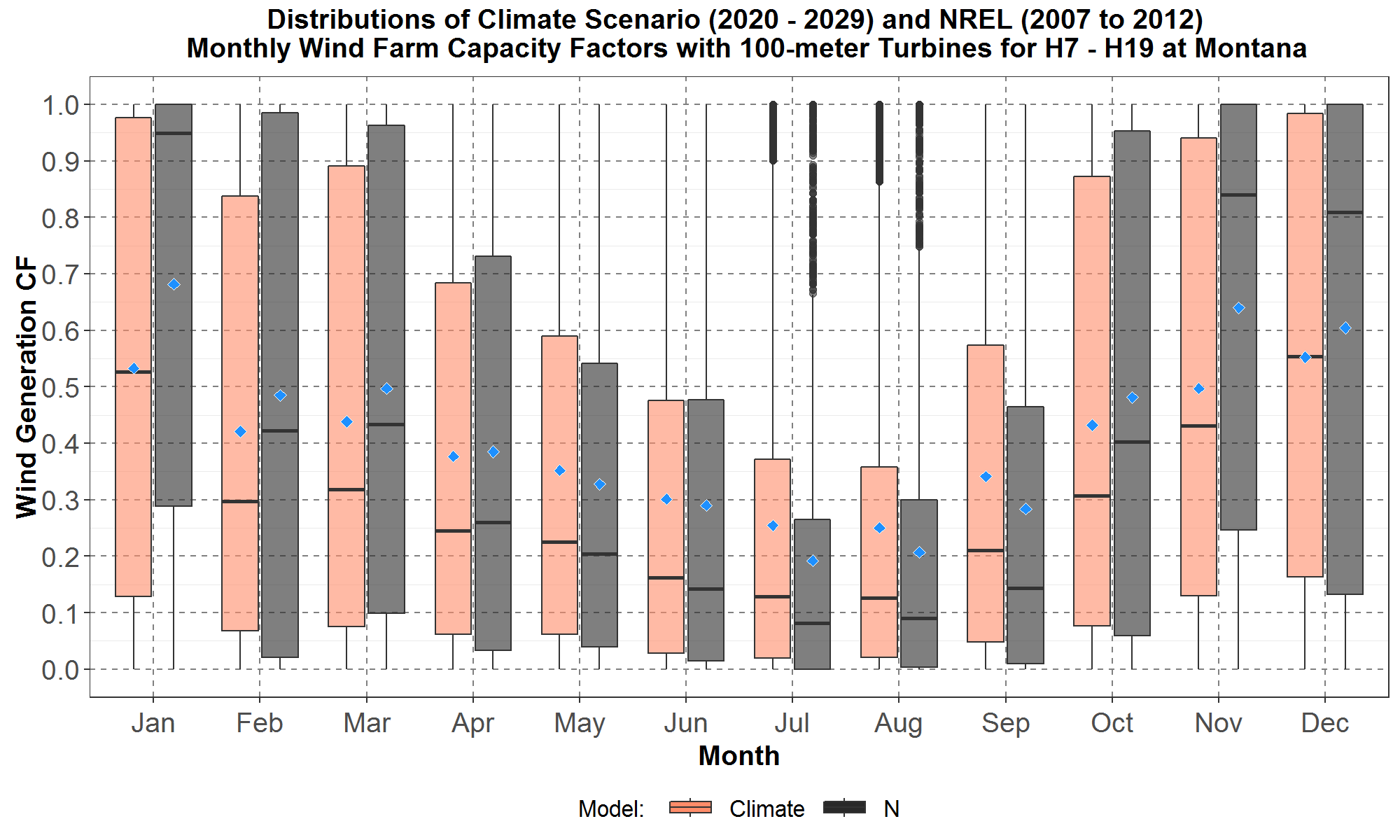
Figure 24: Monthly boxplots of the hourly wind farm capacity factors (CF) at Montana for the transformed 100-meter hourly climate wind data for the years 2020 to 2029, and the 100-meter NREL (N) data for 2007 to 2012. The hours are hour starting 7 to hour starting 19. The boxplots are along the y-axis and months along the x-axis. For each month, data for the aggregated climate scenarios are in peach color with the NREL data in dark gray. The blue diamond inside each boxplot represents the average of the distribution.
Figure 24 shows that both the aggregated climate and NREL distributions have almost the same seasonal trend: starting from the minima in July and August, followed by an steady increase to the maxima for December and January, and then a steady decrease to the summer months. The average climate capacity factors for December and January are over 50%.
Next, in Figure 25 are monthly boxplots for the 100-meter aggregated climate and NREL distributions of capacity factors for southeast Washington.
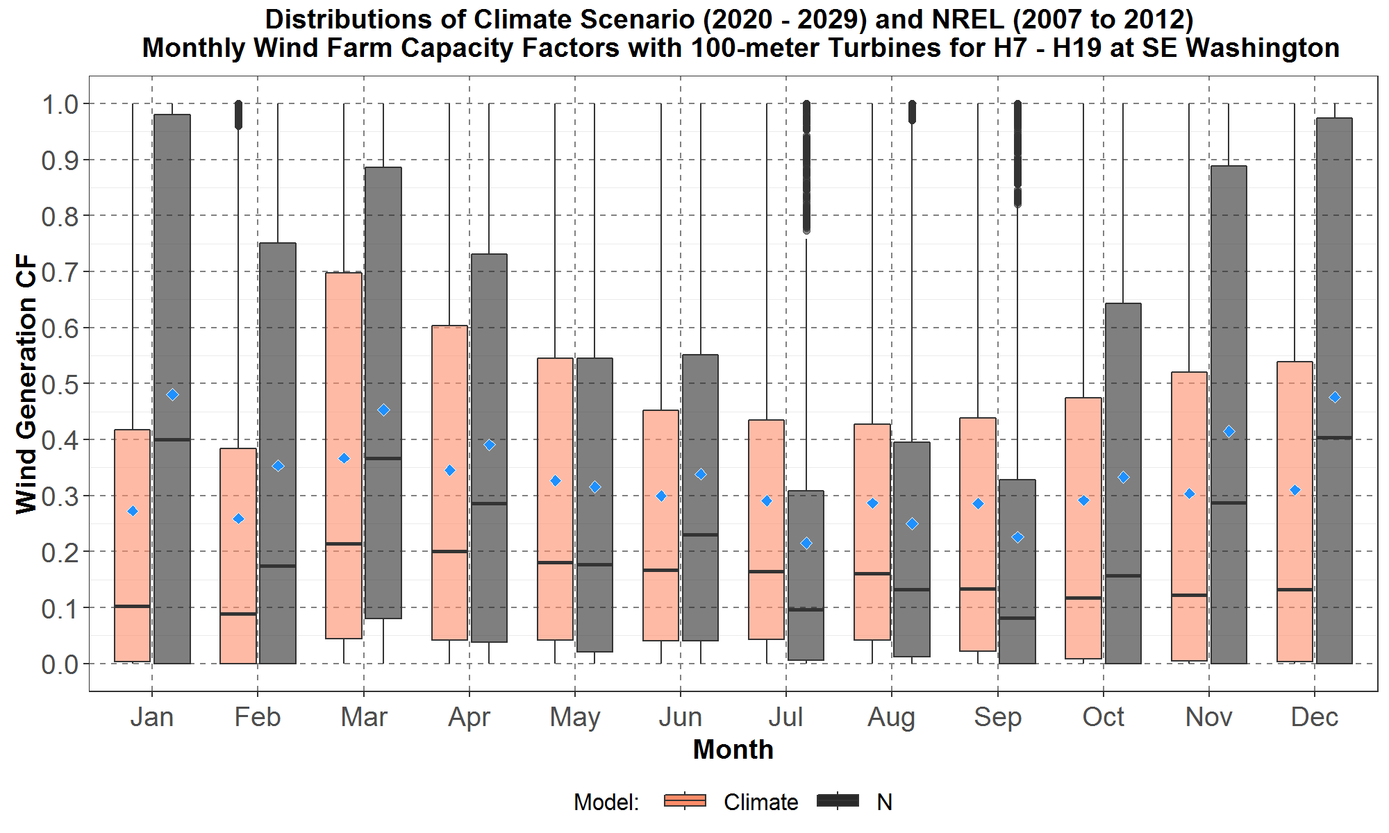
Figure 25: Monthly boxplots of the hourly wind farm capacity factors (CF) at southeast Washington for the transformed 100-meter hourly climate wind data for the years 2020 to 2029, and the 100-meter NREL (N) data for 2007 to 2012. The hours are hour starting 7 to hour starting 19. The boxplots are along the y-axis and months along the x-axis. For each month, data for the aggregated climate scenarios are in peach color with the NREL data in dark gray. The blue diamond inside each boxplot represents the average of the distribution.
It is interesting to see that the NREL monthly distributions for southeast Washington follow nearly the same seasonal trend as the NREL distributions for Montana presented in Figure 24. On the other hand, the climate distributions for southeast Washington follow nearly the same trend as the climate distributions for the Gorge plotted in Figure 23.
Figures 23 to 25 suggest that the NREL capacity factor seasonal trends for Montana and southeast Washington (higher in fall and winter but lower in summer) tend to be opposite to the seasonal trend at the Gorge (lower in fall and winter but higher in summer). But for the climate capacity factors from November through February, the seasonal trend at Montana (higher) tends to be opposite to those for the Gorge and southeast Washington (lower). And for all three locations, the climate capacity factors are relatively lower for summer months.
Comparing Climate Wind Generation Monthly Shapes between Day and Night Hours for the 100-meter Turbine Wind Farm
The next three Figures, 26, 27 and 28, compare climate capacity factors between the “Day” hours, from (hour starting) 7 to 19, and the “Night” hours, from (hour starting) 20 to 6, for the Gorge, Montana and southeast Washington, respectively. These figures show that “Night” capacity factors are higher than the “Day” capacity factors, especially during summer months. For Montana, both “Day” and “Night” climate capacity factors have the same seasonal trend. For the Gorge and southeast Washington, “Day” and “Night” climate capacity factors have the same seasonal trend only from September to March. Furthermore, since the climate hourly shapes were developed from the NREL historical hourly data, then it follows that the NREL “Night” capacity factors should also be higher than the “Day” capacity factors.
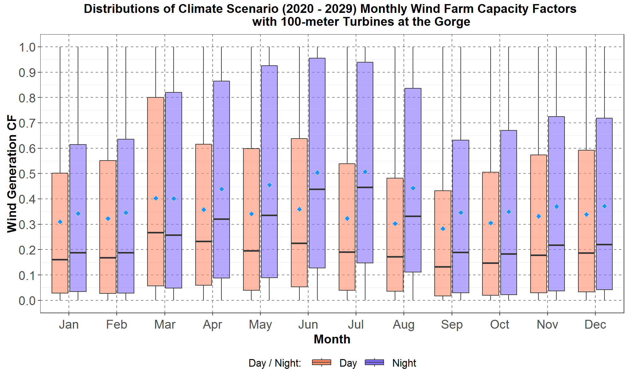
Figure 26: Monthly boxplots of the hourly wind farm capacity factors (CF) at the Gorge for the transformed 100-meter hourly climate wind data for the years 2020 to 2029 for the “Day” hours from (hour starting) 7 to 19 and “Night” hours from (hour starting) 20 to 6. The boxplots are along the y-axis and months along the x-axis. For each month, data for “Day” hours are in peach color while data for the “Night” hours are in blue. The blue diamond inside each boxplot represents the average of the distribution.
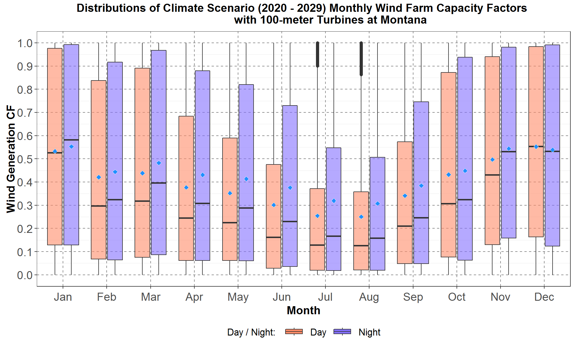
Figure 27: Monthly boxplots of the hourly wind farm capacity factors (CF) at Montana for the transformed 100-meter hourly climate wind data for the years 2020 to 2029 for the “Day” hours from (hour starting) 7 to 19 and “Night” hours from (hour starting) 20 to 6. The boxplots are along the y-axis and months along the x-axis. For each month, data for “Day” hours are in peach color while data for the “Night” hours are in blue. The blue diamond inside each boxplot represents the average of the distribution.
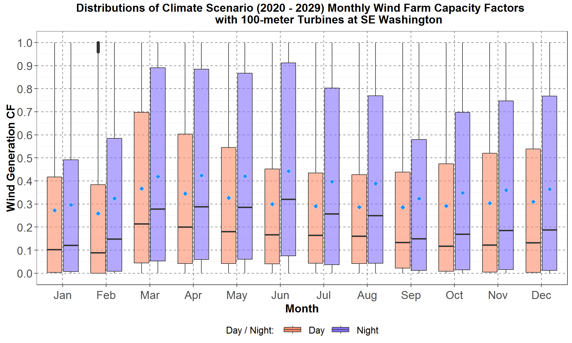
Figure 28: Monthly boxplots of the hourly wind farm capacity factors (CF) at southeast Washington for the transformed 100-meter hourly climate wind data for the years 2020 to 2029 for the “Day” hours from (hour starting) 7 to 19 and “Night” hours from (hour starting) 20 to 6. The boxplots are along the y-axis and months along the x-axis. For each month, data for “Day” hours are in peach color while data for the “Night” hours are in blue. The blue diamond inside each boxplot represents the average of the distribution.
Comparing Climate Wind Generation Monthly Shapes between the 80-meter Turbine Wind Farm the 100-Meter Turbine Wind Farm
Finally, Figures 29, 30 and 31 compare the 80-meter and 100-meter monthly capacity factors for the “Day” hours (hour starting 7 to 19) at the Gorge, Montana and southeast Washington, respectively. These figures show that, at each location, capacity factors for both hub-heights have the same seasonal trend. And as a reminder, the 80-meter capacity factors have been degraded by the aging factor and thus are lower than the 100-meter capacity factors (which had not been degraded by aging).
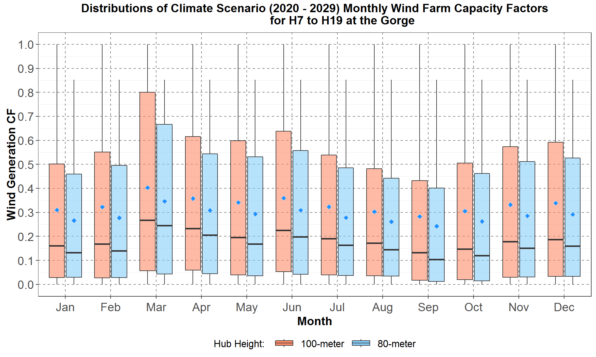
Figure 29: Monthly boxplots of the hourly wind farm capacity factors (CF) at the Gorge for the transformed 80-meter and 100-meter hourly climate wind data for the years 2020 to 2029 for hours (hour starting) 7 to 19. The boxplots are along the y-axis and months along the x-axis. For each month, data for the 100-meter turbines are in peach color while data for the 80-meter turbines are in light blue. The blue diamond inside each boxplot represents the average of the distribution.
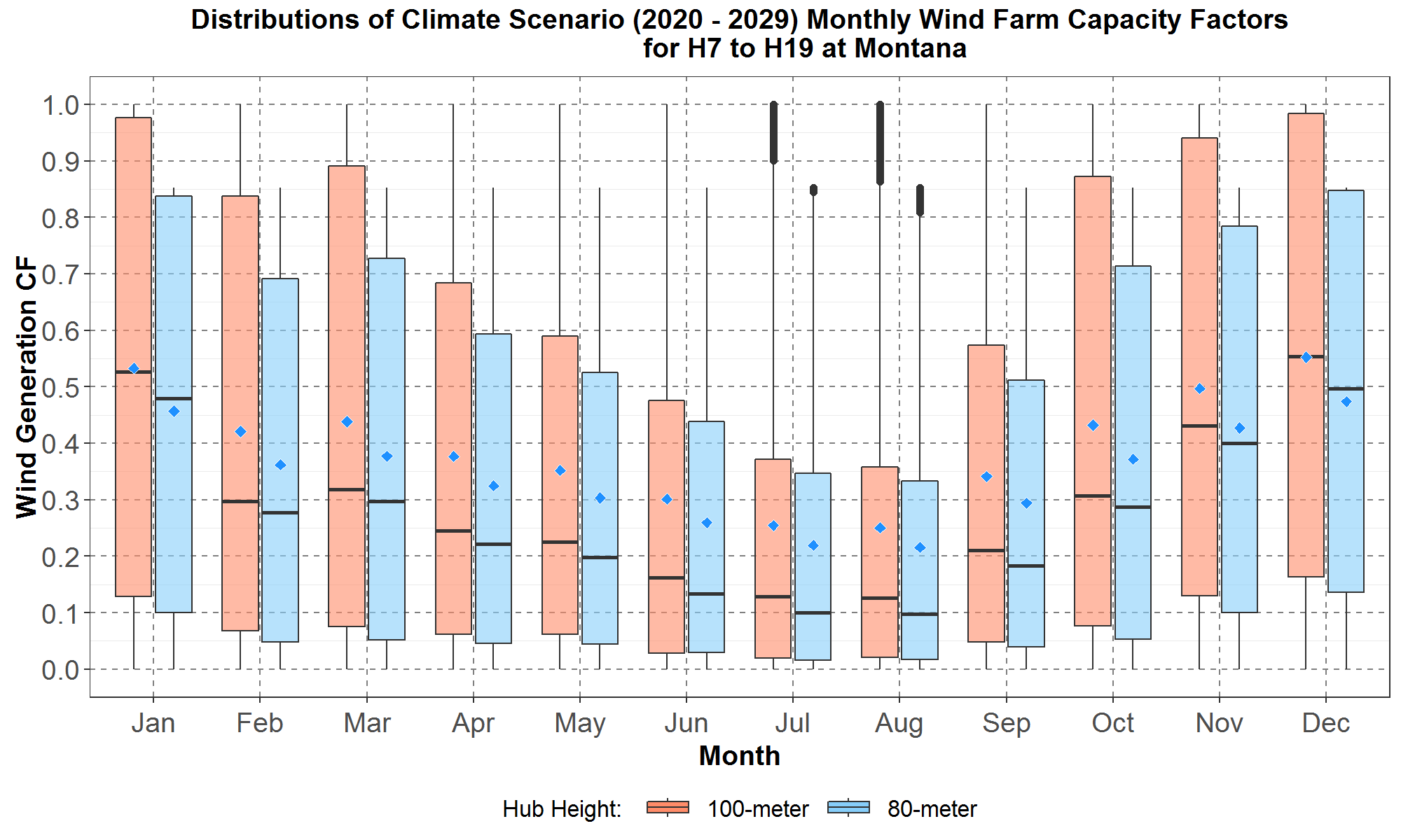
Figure 30: Monthly boxplots of the hourly wind farm capacity factors (CF) at Montana for the transformed 80-meter and 100-meter hourly climate wind data for the years 2020 to 2029 for hours (hour starting) 7 to 19. The boxplots are along the y-axis and months along the x-axis. For each month, data for the 100-meter turbines are in peach color while data for the 80-meter turbines are in light blue. The blue diamond inside each boxplot represents the average of the distribution.
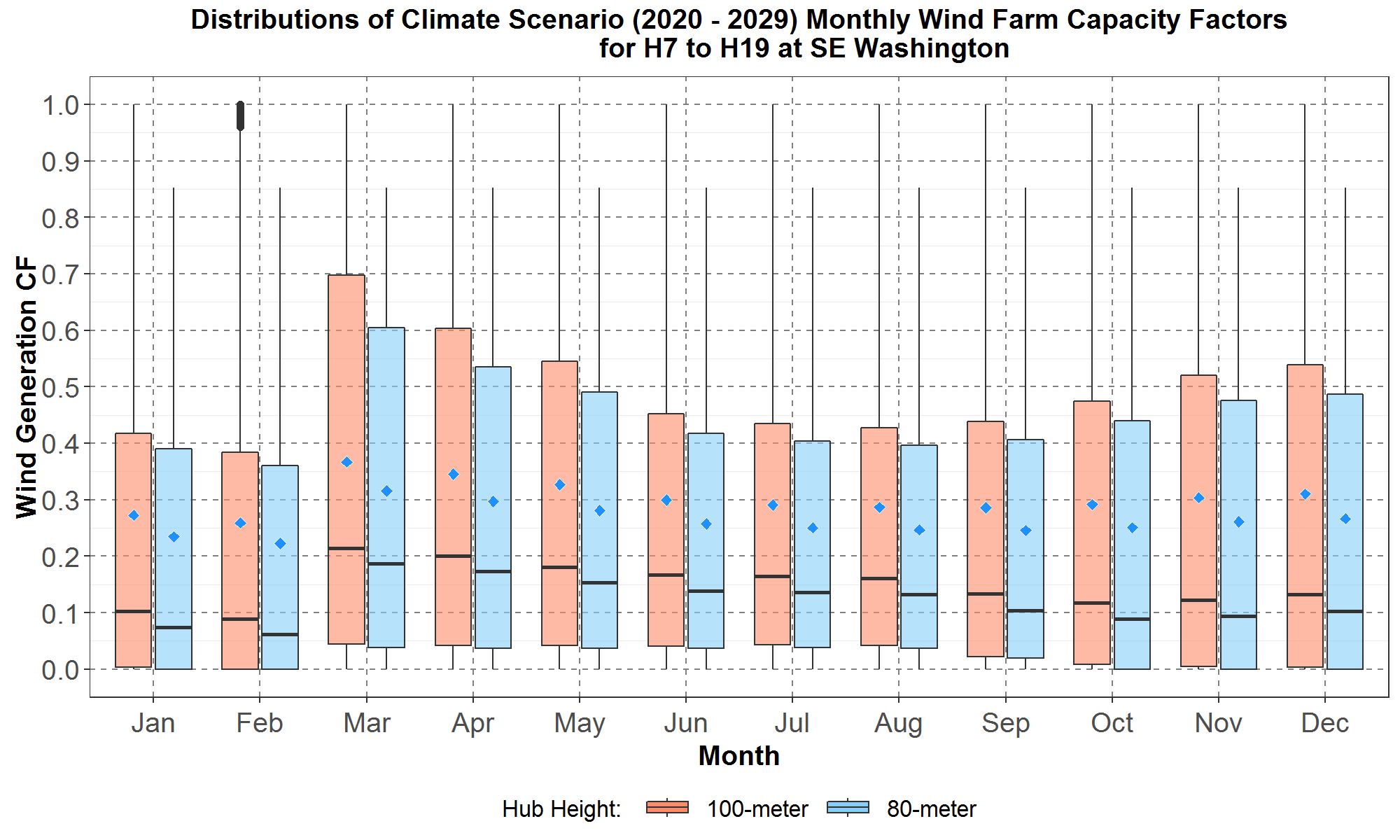
Figure 31: Monthly boxplots of the hourly wind farm capacity factors (CF) at southeast Washington for the transformed 80-meter and 100-meter hourly climate wind data for the years 2020 to 2029 for hours (hour starting) 7 to 19. The boxplots are along the y-axis and months along the x-axis. For each month, data for the 100-meter turbines are in peach color while data for the 80-meter turbines are in light blue. The blue diamond inside each boxplot represents the average of the distribution.