


Overview
Since 2017, historical regional hourly temperatures (from 1948 onward) have been used to produce regional load forecasts for use in the Council’s analytical models. However, for this Power Plan, the Council has instead incorporated forecasted temperatures from three of the 19 climate scenarios developed by the River Management Joint Operating Committee (RMJOC). A comprehensive report on the RMJOC climate data is available in the RMJOC report I and details of the climate scenario selection process are available in climate scenario selection. Since temperatures have a significant impact on monthly, daily and hourly loads (especially peak loads), the relationship between historical temperatures and the three RMJOC climate scenario forecasted temperatures is examined in detail in the following sections. Several of the sections also reference the RMJOC climate scenarios from Summary of the RMJOC Climate Scenarios.
Trends in Historical Temperatures
The warming trend of historical temperatures is well known and the forecast of higher warming in the future is also well documented. In this section, warming trends for regional historical temperatures are analyzed in detail.
Regional temperature is of particular interest since it is an input of the Council’s load forecast model. The regional temperature T is not the temperature at any specific location, but rather a weighted sum of temperatures at the airport of four northwest cities, Seattle, Portland, Spokane, and Boise, including a constant term and is expressed as follows:
where coefficients a , b , c , d and constant k vary by months as indicated in Table 1 below.
Table 1: Monthly coefficients a , b , c , d and constant term k for transforming temperatures for Seattle, Portland, Spokane and Boise to the regional temperature
| Month | a | b | c | d | k |
| 1 | 0.492 | 0.258 | 0.219 | 0.062 | -2.544 |
| 2 | 0.492 | 0.258 | 0.219 | 0.062 | -2.544 |
| 3 | 0.492 | 0.258 | 0.219 | 0.062 | -2.544 |
| 4 | 0.492 | 0.258 | 0.219 | 0.062 | -2.544 |
| 5 | 0.352 | 0.192 | 0.203 | 0.150 | 6.542 |
| 6 | 0.352 | 0.192 | 0.203 | 0.150 | 6.542 |
| 7 | 0.337 | 0.230 | 0.218 | 0.103 | 7.343 |
| 8 | 0.337 | 0.230 | 0.218 | 0.103 | 7.343 |
| 9 | 0.337 | 0.230 | 0.218 | 0.103 | 7.343 |
| 10 | 0.414 | 0.127 | 0.175 | 0.122 | 9.573 |
| 11 | 0.414 | 0.127 | 0.175 | 0.122 | 9.573 |
| 12 | 0.147 | 0.443 | 0.152 | 0.046 | 6.391 |
From Table 1, over most months Seattle’s temperature makes the largest contribution to the regional temperature since its coefficients, a , are the largest. Next, Portland’s and Spokane’s temperatures have comparable contributions since their coefficients, b and c , in general have similar magnitudes and rank second and third respectively. Finally, Boise’s temperature provides the smallest contribution since its coefficients, d , are the smallest. The monthly coefficients, a, b , c , and d were derived based on ratios of historical monthly loads among the four Northwest states. A validation of using weighted average temperatures similar to these coefficients is presented in Historical Weather Data.
Historical hourly temperature data at the airport of the four northwest cities were downloaded from the NOAA website (https://www.ncei.noaa.gov/access/search/index) from which historical regional hourly temperatures are calculated by Equation (1). From 1948 forward, there are fewer missing data, and thus for simplicity the historical temperature data chosen for analysis are the 70 years from 1948 to 2017. To analyze possible trends, monthly temperature distributions between the first 30 years, from 1948 to 1977, and recent 30 years, from 1988 to 2017 are compared.
The first type of plot to be presented is the box-and-whiskers plot, which for simplicity is abbreviated as the boxplot and illustrated in Figure 1, and a description of which is as follows. The boxplot allows for quantitative comparisons of distributional statistics such as the 25th, 50th (the median), and 75th percentiles. The grey box in Figure 1, which starts from the 25th percentile at the bottom and ends at the 75th percentile at the top, contains the central 50% of the population of the distribution. The length of the box is defined as the inter-quartile-range (IQR) and is used to delineate outliers (if any) which are those data that lie beyond one-and-a-half times the IQR from the box.
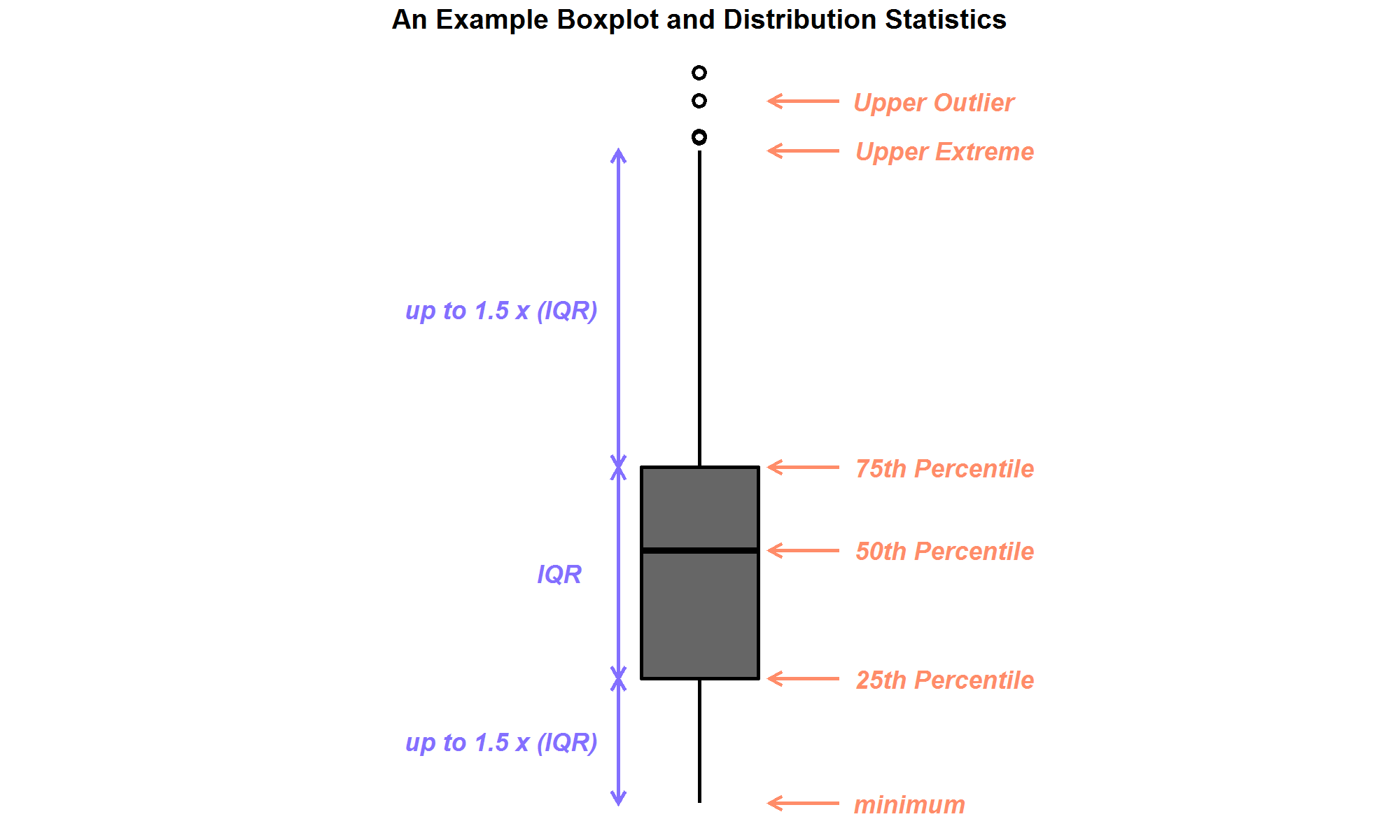
Figure 1: An example box-and-whiskers plot, or boxplot, with upper outliers shown.
Figure 2 presents comparisons of the monthly distributions of regional hourly temperatures in boxplots. Data for the first 30 years and recent 30 years are plotted in gray and light blue boxplots, respectively. In addition, the blue diamond inside each boxplot represents the average of the distribution.
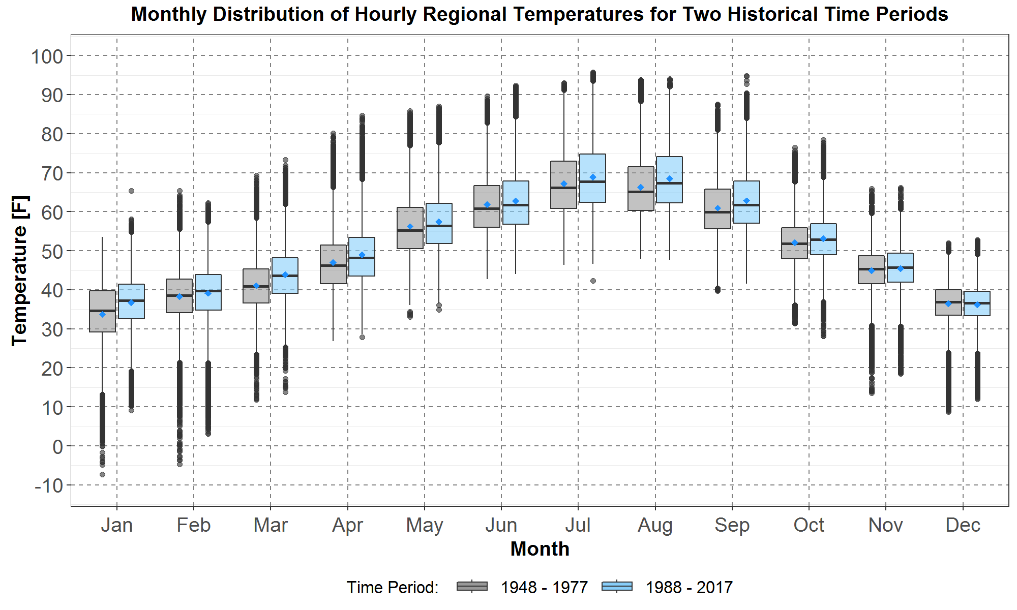
Figure 2: Boxplot comparisons of monthly distributions of regional hourly temperatures between the historical first 30 years, from 1948 to 1977, and the recent 30 years, from 1988 to 2017. Data for the first 30 years and the recent 30 years are plotted respectively in gray and light blue boxplots. The blue diamond inside each boxplot represents the average of the distribution. On the x-axis are the months from January to December. The monthly temperature distributions in [F] are plotted along the y-axis.
Except for December, it could have been expected in Figure 2 that all the averages (in the blue diamonds) and most of the boxplot statistics (outliers, whiskers, median, 25th and 75th percentiles) are higher for temperature distributions for the recent 30 years. Table 2 lists the differences in average monthly temperatures between the recent 30 years and the first 30 years. For convenience, the difference is designated as ∆H2-H1 .
Table 2: Difference of the Monthly Averages between Temperatures for the Recent 30 Years and the First 30 Years
| Jan | Feb | Mar | Apr | May | Jun | Jul | Aug | Sep | Oct | Nov | Dec | |
| ∆H2-H1 | 3.0 | 0.8 | 2.8 | 2.0 | 1.3 | 0.9 | 1.7 | 2.2 | 1.9 | 1.0 | 0.5 | -0.2 |
The average monthly temperature increases in Table 2 have an annual average of 1.5F, which is the same as the 1.5F warming calculated for slightly different historical time periods in the RMJOC report I. In addition, the higher warming, of about 2F or higher, occurs for January, March, April, August, September.
In Figure 2, comparisons of the monthly averages and most boxplot statistics show that temperatures are coldest for January and warmest for July. Since the coldest and warmest temperatures tend to lead to periods of highest loads, historical hourly temperatures for January and July are compared next.
Trends in Historical January Temperatures
Thus, Figure 3 displays the January hourly temperatures for the first 30-year period from 1948 to 1977 (plotted in the 30 gray curves), and temperatures for the recent 30-year period from 1988 to 2017 (plotted in the 30 light blue curves).
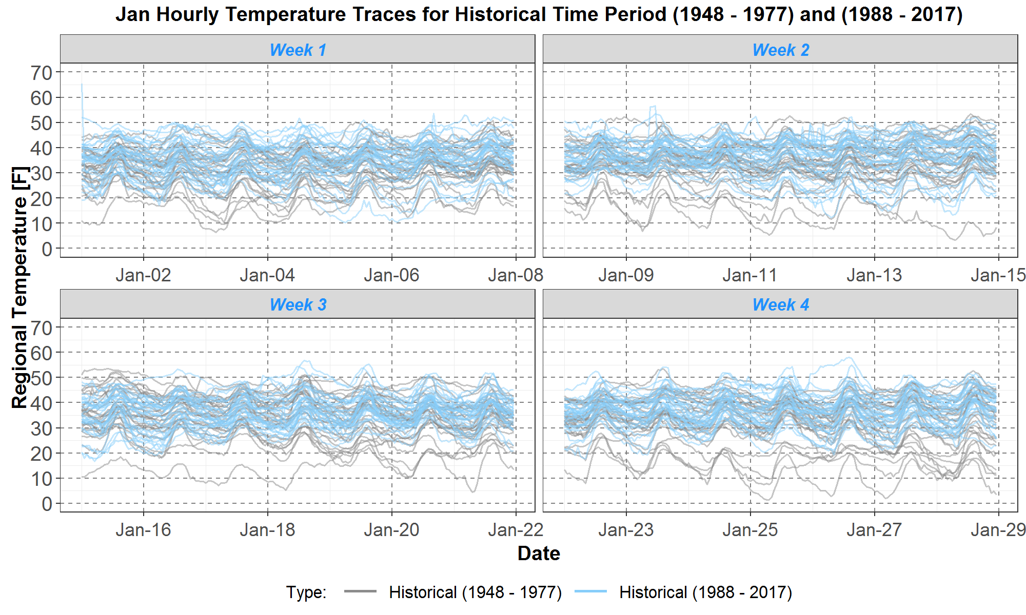
Figure 3: Comparisons of January regional hourly temperatures between the first 30 years, from 1948 to 1977, and the recent 30 years, from 1988 to 2017. The January data are divided into 4 weeks and plotted on 4 panels: weeks 1, 2, 3 and 4 are respectively on the upper left, upper right, lower left and lower right panels. Temperature data for the first 30 years and the recent 30 years are plotted in the 30 gray and 30 light blue curves (or traces) respectively. On the x-axis are day 1 to day 28 of January. The hourly temperatures in [F] are plotted along the y-axis.
For convenience, only the first 28 days of January are plotted in Figure 3, where the monthly data are plotted in 4 weekly panels with weeks 1, 2, 3 and 4 on the upper left, upper right, lower left and lower right panels, respectively.
The plots in Figure 3 are also called trace plots since hourly temperatures for the 60 years are plotted separately in 60 traces. Comparisons among the 60 traces are difficult because they overlap extensively. Nevertheless, they are still useful because they allow for easy visualization of years with significantly different daily shapes or magnitudes. For example, on all 4 weekly panels it can be seen that the temperature traces for the recent 30 years (in light blue curves) have many more traces above 30F than those for the first 30 years (in gray curves). Furthermore, on all 4 panels, the 5 or 6 gray traces that are mainly below 30F are likely to drive higher average and peak loads. In addition, there are also a few light blue traces below 30F, however they are fewer in number and generally they are not as far below 30F as the gray traces. Thus, analysis of the trace plots in Figure 3 supports the observation that temperature distribution is higher for the recent 30 years than for the first 30 years, as presented in the January boxplots in Figure 2.
Next, to better visualize the hourly and daily temperature shapes in Figure 3, the same data are presented in envelope plots in Figure 4. Hourly temperatures for the first 30 years are represented in the gray area while those for the recent 30 years are represented in the light blue area. For each day on the x-axis, the envelope data are obtained by extracting the maximum and minimum hourly temperature for all 30 years. In addition to the envelopes, the average daily temperatures are also plotted: the white dashed curve representing the average for the first 30 years and the blue dashed curve representing the average for the recent 30 years.
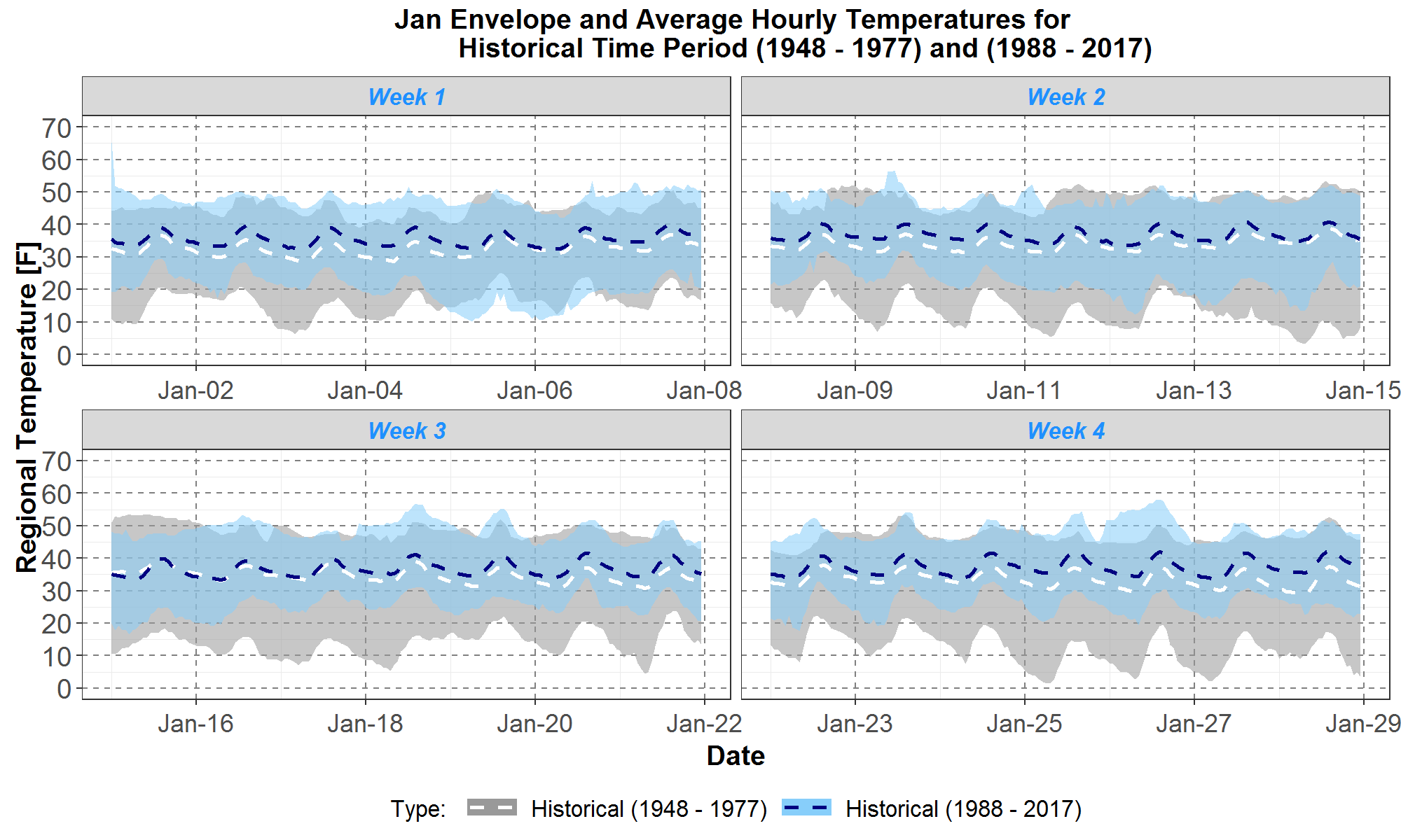
Figure 4: Comparisons of January maximum, minimum and average regional hourly temperatures between the first 30 years, from 1948 to 1977, and the recent 30 years, from 1988 to 2017. The January data are divided into 4 weeks and plotted on 4 panels: weeks 1, 2, 3 and 4 are respectively on the upper left, upper right, lower left and lower right panels. Envelopes for the historical first 30 years and recent 30 years are respectively plotted in gray and light blue areas. The averages for the first 30 years and recent 30 years are plotted in the white and blue dashed curves respectively. On the x-axis are day 1 to day 28 of January. The hourly temperatures in [F] are plotted along the y-axis.
For January, minimum temperatures are most likely to drive peak loads. It can be seen in all four panels in Figure 4 that the lower gray envelope is always below the lower blue envelope, except for January 5th and 6th in week 1 in the upper left panel. Furthermore, the average temperature for the first 30 years in the white dashed curve is almost always a few degrees below the average temperature for the recent 30 years in the blue dashed curve. The envelope and average plots in Figure 4 have less data than the trace plots in Figure 3, but they allow for easier comparisons of monthly shapes of the maxima, minima and averages.
Trends in Historical July Temperatures
The next two figures are the trace and envelope plots for the July hourly temperatures. In Figure 5, July temperatures for the first 30 years are in the 30 gray traces and those for the recent 30 years are in the 30 light blue traces.
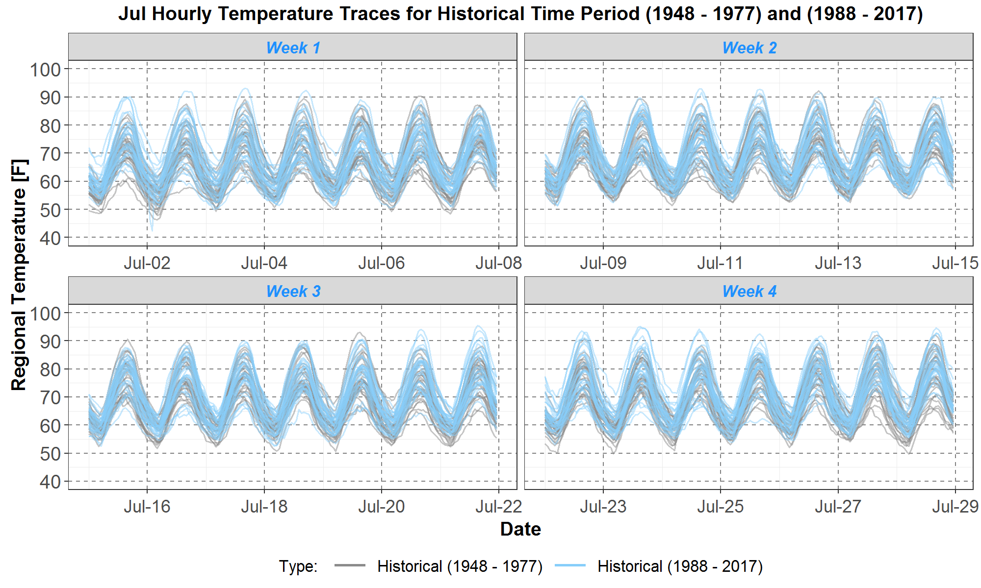
Figure 5: Comparisons of July regional hourly temperatures between the first 30 years, from 1948 to 1977, and the recent 30 years, from 1988 to 2017. The July data are divided into 4 weeks and plotted on 4 panels: weeks 1, 2, 3 and 4 are respectively on the upper left, upper right, lower left and lower right panels. Temperature data for the first 30 years and the recent 30 years respectively plotted in the 30 gray and 30 light blue traces. On the x-axis are day 1 to day 28 of July. The hourly temperatures in [F] are plotted along the y-axis.
Figure 5 shows that, in general, the daily shapes and magnitudes of both sets of July temperature traces are quite well aligned, which is not seen for January traces in Figure 3. For July, the maximum temperatures are likely to drive peak loads. And comparisons of daily maxima show that there are 7 days where those for the first 30 years (in the gray traces) are the same or higher than those for the recent 30 years (in the blue traces). In contrast, there are 21 days where those for the recent 30 years (in the blue traces) are higher than those for the first 30 years (in the gray traces).
Finally, Figure 6 presents the envelope and average plots for the traces in Figure 5. Temperatures for the first 30 years are plotted in the gray area and the white dashed curve, and temperatures for the recent 30 years are in the light blue area and the blue dashed curve.
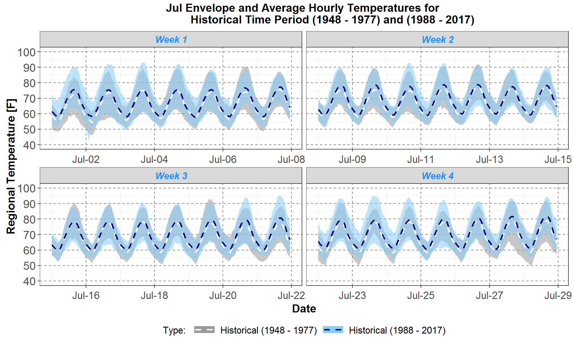
Figure 6: Comparisons of July maximum, minimum and average regional hourly temperatures between the first 30 years, from 1948 to 1977, and the recent 30 years, from 1988 to 2017. The July data are divided into 4 weeks and plotted on 4 panels: weeks 1, 2, 3 and 4 are respectively on the upper left, upper right, lower left and lower right panels. Envelopes for the historical first 30 years and recent 30 years are respectively plotted in gray and light blue areas. The averages for the first 30 years and recent 30 years are plotted in the white and blue dashed curves respectively. On the x-axis are day 1 to day 28 of July. The hourly temperatures in [F] are plotted along the y-axis.
The envelope plots in Figure 6 are consistent with the observations made for the trace plots in Figure 5. Furthermore, since the daily shapes and magnitudes of both sets of traces are similar, as seen in Figure 5, it is not surprising that the averages represented by the dashed curves are close together. However, the blue dashed curve is slightly higher overall since Table 2 shows that the average July temperature is 1.7F warmer for the recent 30 years than for the first 30 years.
Thus, analysis in this section confirms the expected result that regional temperatures for the recent 30 years are warmer, on average, than temperatures from the first 30 years for all months except December. Furthermore, it also indicates that, over the two historical periods, daily temperature shapes for January are variable while those for July remain fairly stable.
Trends in Climate Scenario Temperatures
The RMJOC climate scenarios selected for study in the Power Plan are A, C and G listed in Table 3 in Summary of the RMJOC Climate Scenarios. Details on the scenario selection methodology are available in climate scenario selection.
The RMJOC climate temperatures are daily minimums and maximums. To incorporate them into the Council’s load forecast model, they need to be transformed into hourly temperatures. A methodology for the transformation, developed by the Council, is documented in daily-to-hourly-temperatures.
For climate scenarios A, C and G, their transformed hourly temperatures are similarly analyzed using the three types of plots: the boxplot, the trace and the envelope plots, presented previously in Figures 2 to 6. For each scenario, comparisons are made between historical temperatures for the recent 30 years and climate temperatures for the next 30 years, from 2020 to 2049. Similar comparisons have already been done in the RMJOC report I for a slightly different set of historical years and presented in different types of plots. However, it is expected that warming trends for the regional temperature discovered in this section are consistent with those analyzed by the RMJOC.
Because the boxplot is compact, Figure 7 presents monthly distributions of hourly temperatures for the historical first 30 years and recent 30 years, and scenario A (CanESM2), in the gray, light blue and peach boxplots, respectively. As before, the blue diamond inside each boxplot represents the average of the distribution.
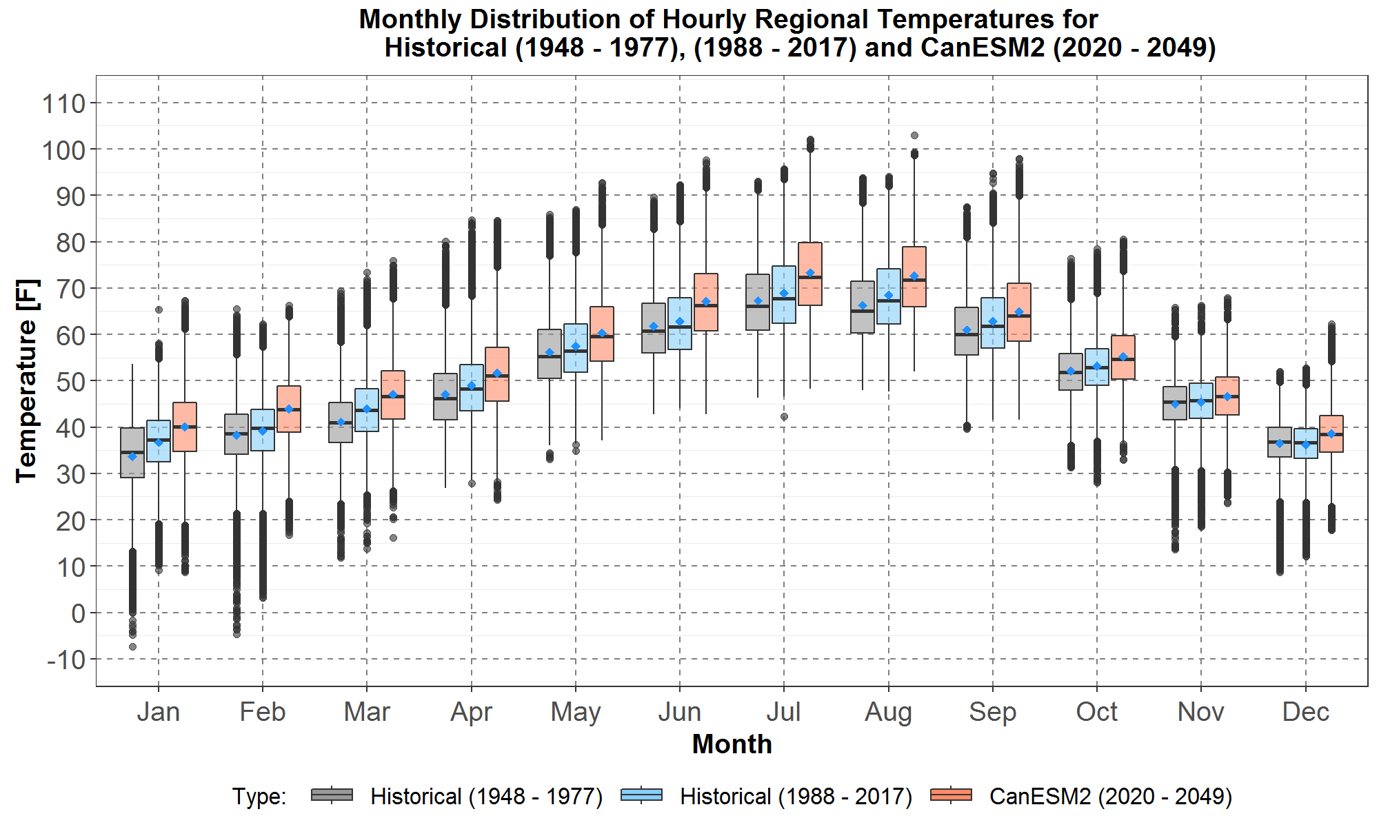
Figure 7: Boxplot comparisons of monthly distributions of regional hourly temperatures between the historical first 30 years, from 1948 to 1977, the recent 30 years, from 1988 to 2017, and climate scenario A (CanEMS2) next 30 years, from 2020 to 2049. Data for the historical first 30 years, recent 30 years and the climate are plotted respectively in gray, light blue and peach boxplots. The blue diamond inside each boxplot represents the average of the distribution. On the x-axis are the months from January to December. The monthly temperature distributions in [F] are plotted along the y-axis.
Next, Figure 8 similarly plots the monthly boxplot comparisons between the historical and climate scenarios C (CCSM4 GCM) temperature distributions.
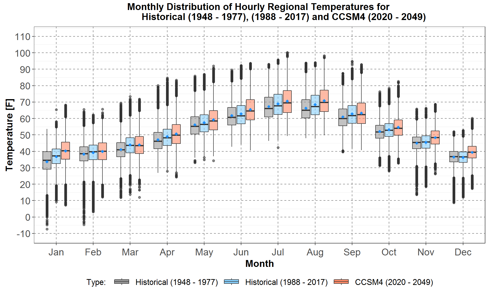
Figure 8: Boxplot comparisons of monthly distributions of regional hourly temperatures between the historical first 30 years, from 1948 to 1977, the recent 30 years, from 1988 to 2017, and climate scenario C (CCSM4) next 30 years, from 2020 to 2049. Data for the historical first 30 years, recent 30 years and the climate are plotted respectively in gray, light blue and peach boxplots. The blue diamond inside each boxplot represents the average of the distribution. On the x-axis are the months from January to December. The monthly temperature distributions in [F] are plotted along the y-axis.
Finally, Figure 9 shows the monthly boxplot comparisons between the historical and climate scenarios G (CNRM GCM) temperature distributions.
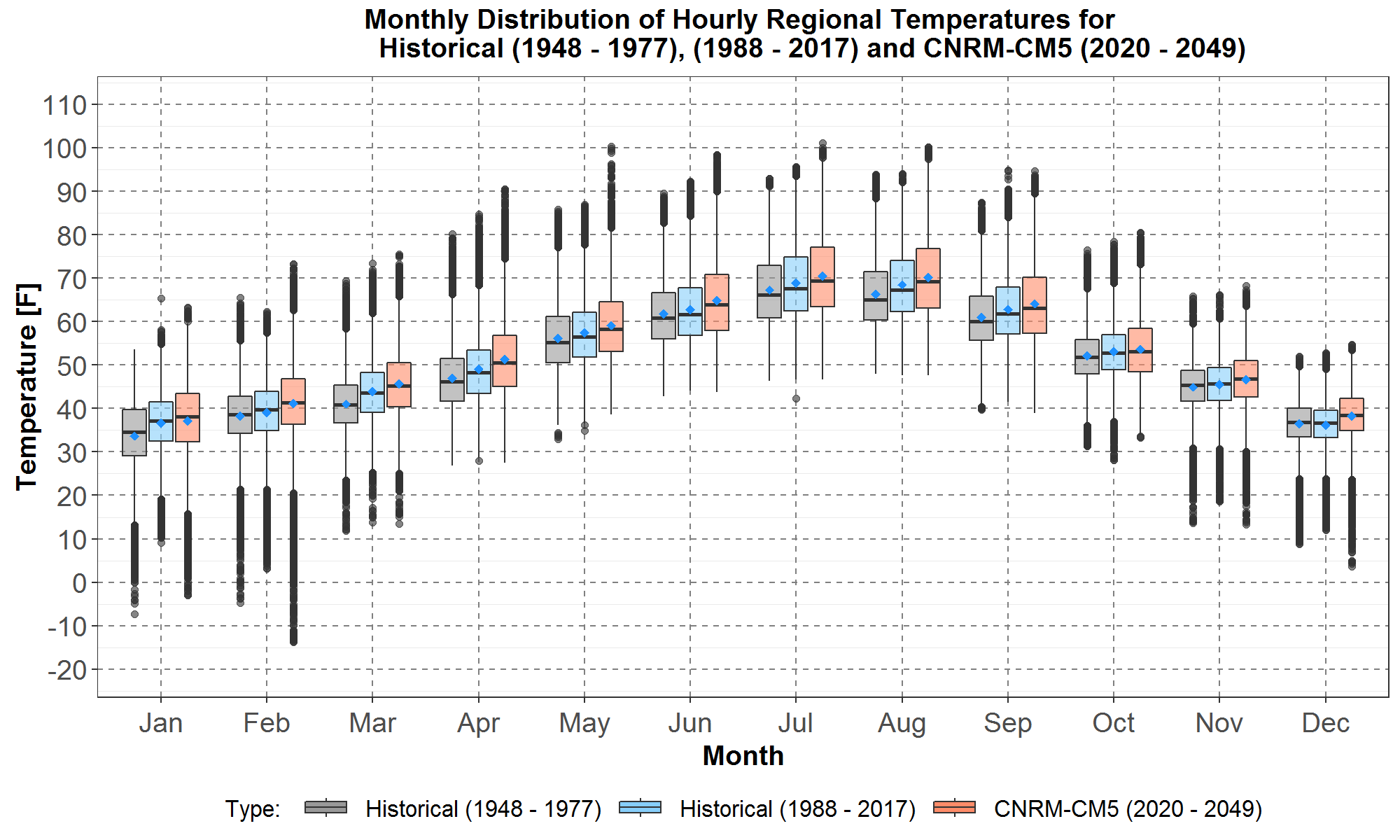
Figure 9: Boxplot comparisons of monthly distributions of regional hourly temperatures between the historical first 30 years, from 1948 to 1977, the recent 30 years, from 1988 to 2017, and climate scenario G (CNRM) next 30 years, from 2020 to 2049. Data for the historical first 30 years, recent 30 years and the climate are plotted respectively in gray, light blue and peach boxplots. The blue diamond inside each boxplot represents the average of the distribution. On the x-axis are the months from January to December. The monthly temperature distributions in [F] are plotted along the y-axis.
The plots in Figures 7, 8 and 9 show that, for all months, the averages and almost all boxplot statistics are higher for the three climate temperature distributions than those for the historical recent 30 years. Thus, the warming trend in the historical data continues, but with different magnitudes, under all three climate scenarios. For example, the maximum temperature for all 3 climate scenarios is over 100F which is about 5F higher than the maximum historical temperature. Also, it is interesting to note in Figure 9 that for November, December and February, the minimum temperatures for scenario G are equal to or lower than both sets of historical minimums. In fact, scenario G has the lowest minimum temperature overall, below -10F, in February.
Table 3 lists the difference of average monthly temperatures between the climate scenarios and the historical recent 30 years, along with the difference between the recent 30 years and the earlier 30 years. For convenience, the differences are designated as ∆A-H2 , ∆C-H2 and ∆G-H2 . It can be seen that, relative to the recent 30 years, the three climate scenarios have the highest warming for summer, from June to August, and the next highest warming for winter, from December to February.
Table 3: Difference of the Monthly Average Temperatures ∆H2-H1 , ∆A-H2 , ∆C-H2 and ∆G-H2
| Jan | Feb | Mar | Apr | May | Jun | Jul | Aug | Sep | Oct | Nov | Dec | |
| ∆H2-H1 | 3.0 | 0.8 | 2.8 | 2.0 | 1.3 | 0.9 | 1.7 | 2.2 | 1.9 | 1.0 | 0.5 | -0.2 |
| ∆A-H2 | 3.3 | 4.8 | 3.2 | 2.7 | 2.9 | 4.4 | 4.4 | 4.2 | 2.1 | 2.1 | 1.1 | 2.4 |
| ∆C-H2 | 3.6 | 0.8 | 0.1 | 1.7 | 1.8 | 2.7 | 1.6 | 2.4 | 0.5 | 1.5 | 2.9 | 3.2 |
| ∆G-H2 | 0.4 | 2.0 | 1.8 | 2.3 | 1.7 | 2.0 | 1.6 | 1.7 | 1.3 | 0.5 | 1.2 | 2.0 |
Comparisons among the climate scenarios in Table 3 show that over the critical winter months from December to February and summer months from June to August, scenario A has the highest warming and G has the lowest warming. The scenario ranking for regional temperature warming is consistent with a similar ranking presented in Figure 29 in the RMJOC report I.
Next, Figure 10 presents the monthly boxplot comparisons of temperature distributions among all three climate scenarios, A (CanESM2), C (CCSM4) and G (CNRM) for 2020 to 2049.
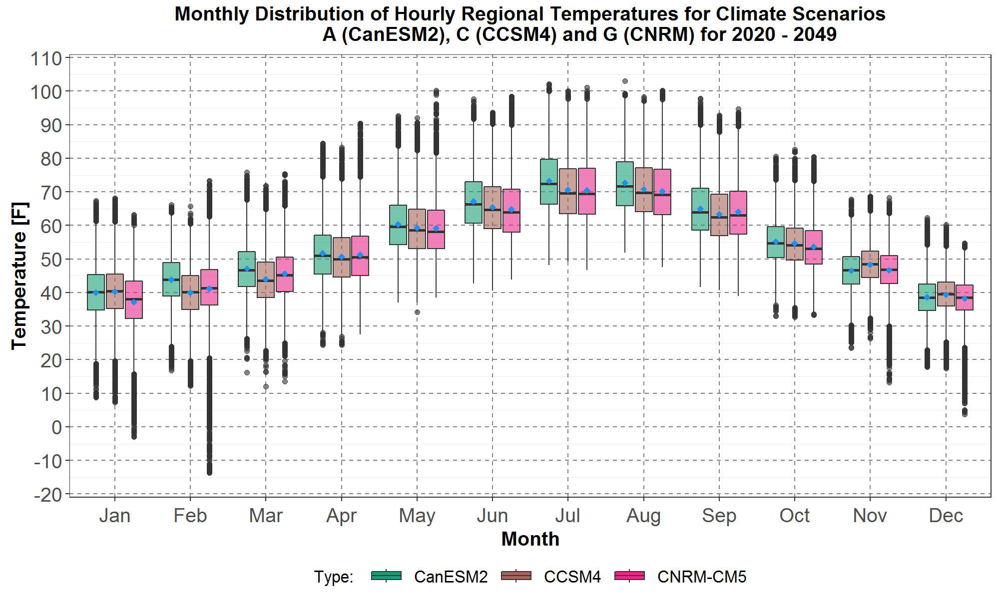
Figure 10: Boxplot comparisons of monthly distributions of regional hourly temperatures among the climate scenarios A (CanESM2), C (CCSM4) and G (CNRM) for the next 30 years, from 2020 to 2049. Boxplots for scenarios A, C and G are plotted in green, brown, and pink respectively. The blue diamond inside each boxplot represents the average of the distribution. On the x-axis are the months from January to December. The monthly temperature distributions in [F] are plotted along the y-axis.
In Figure 10, comparisons of the averages of the monthly distributions among the three scenarios also support scenario A being the warmest, as it has the highest average for nine months, from February to October, and the lowest average for November only. In contrast, scenario G is the coolest because of it having the lowest average over seven months: January, May to August, October and December. Scenario C on the other hand is somewhere in the middle - it has the highest average for three months, from November to January, and the lowest average for four months, from February to April and September.
The next two sections present analyses of the January and July daily and monthly shapes for the three climate scenarios.
Trends in January Temperatures for the Three Selected Climate Scenarios
The January hourly temperature trace plots for the historical period from 1988 to 2017 (in 30 light blue traces) and scenario A (CanEMS2 GCM) from 2020 to 2049 (in 30 peach traces) are presented in Figure 11. It should be noted that the hourly shapes of the climate temperatures for each day in Figure 11 were derived from the 1987 historical hourly shapes for the same day of the year. Therefore, for each day all the orange traces have the same general hourly shape from 1987. Details of this calculation are in daily-to-hourly-temperatures write-up.
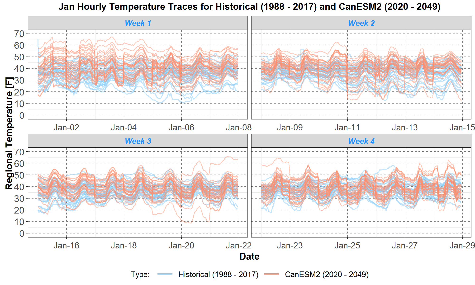
Figure 11: Comparisons of January regional hourly temperatures between the historical 1988 to 2017 and scenario A (CanESM2). The January data are divided into 4 weeks and plotted on 4 panels: weeks 1, 2, 3 and 4 are respectively on the upper left, upper right, lower left and lower right panels. The historical and climate temperatures are plotted in the 30 light blue and 30 peach traces respectively. On the x-axis are day 1 to day 28 of January. The hourly temperatures in [F] are plotted along the y-axis.
In Figure 11, it can be seen that the distribution of peach climate traces tends to be higher in temperature than the distribution of light blue historical traces for weeks 1 and 2. For example, there are quite a few climate traces warmer than the maximum historical traces, especially in week 1. For weeks 3 and 4 the distributions are more comparable. However, there are also two climate traces that show occasionally colder temperatures (i.e., below 20F) than the minimum historical traces for weeks 2 and 3.
Similarly, the January temperature trace plots for historical and scenario C (CCSM4 GCM) are presented in Figure 12.
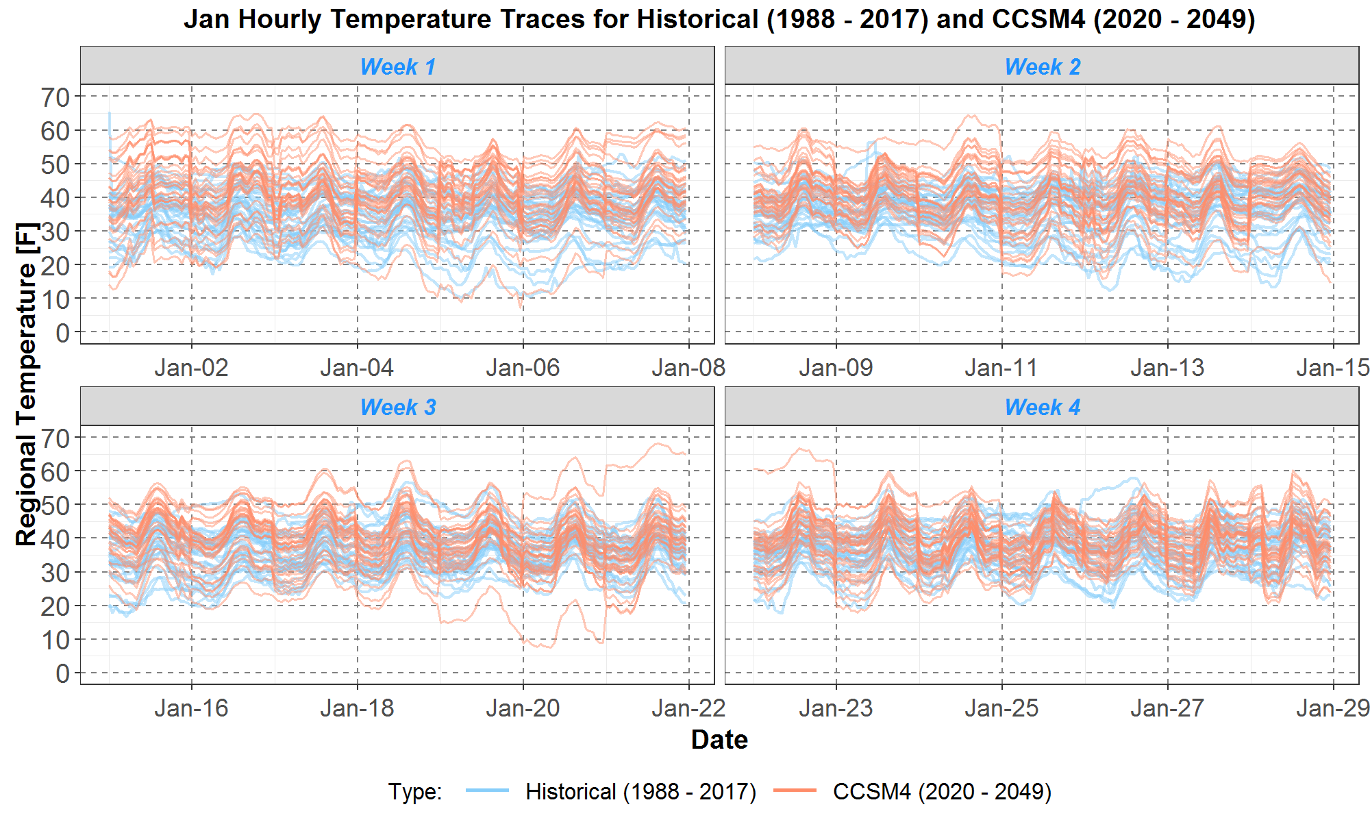
Figure 12: Comparisons of January regional hourly temperatures between the historical 1988 to 2017 and scenario C (CCSM4). The January data are divided into 4 weeks and plotted on 4 panels: weeks 1, 2, 3 and 4 are respectively on the upper left, upper right, lower left and lower right panels. The historical and climate temperatures are plotted in the 30 light blue and 30 peach traces respectively. On the x-axis are day 1 to day 28 of January. The hourly temperatures in [F] are plotted along the y-axis.
Figure 12 looks similar to Figure 11 in that the distribution of peach climate traces tends to be higher in temperature than the distribution of light blue historical traces for weeks 1 and 2. And there are quite a few climate traces that are warmer than the maximum historical traces for both weeks. For weeks 3 and 4, the distributions are comparable. However, there remains one climate trace that shows occasionally colder temperatures (i.e., below 20F) than the minimum historical traces in week 3.
Next, Figure 13 presents the January temperature trace plots for the historical and scenario G (CNRM GCM).
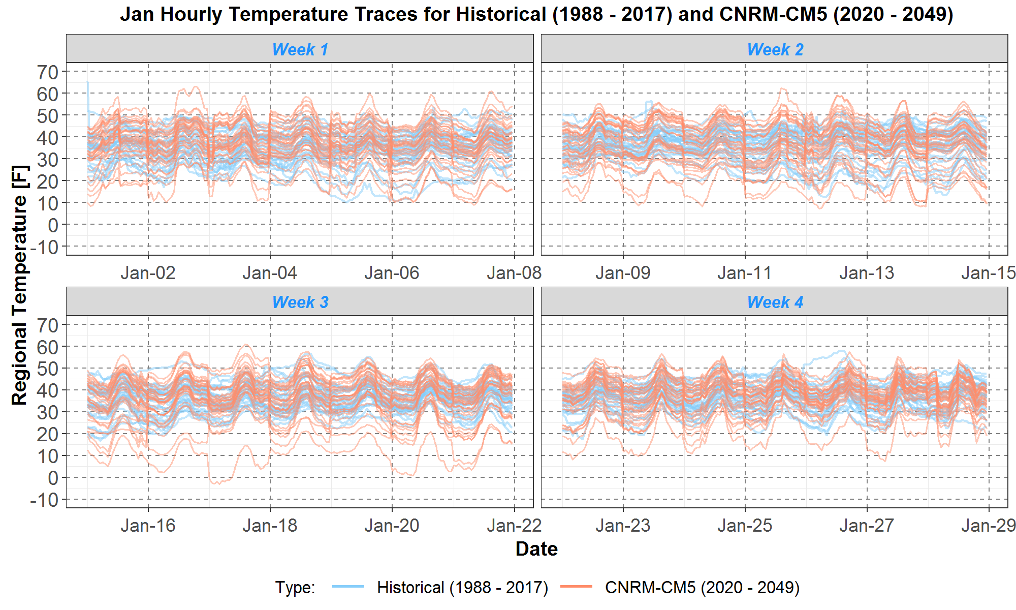
Figure 13: Comparisons of January regional hourly temperatures between the historical 1988 to 2017 and scenario G (CNRM). The January data are divided into 4 weeks and plotted on 4 panels: weeks 1, 2, 3 and 4 are respectively on the upper left, upper right, lower left and lower right panels. The historical and climate temperatures are plotted in the 30 light blue and 30 peach traces respectively. On the x-axis are day 1 to day 28 of January. The hourly temperatures in [F] are plotted along the y-axis.
In contrast to Figures 11 and 12, there are fewer climate temperature traces higher than the maximum historical traces in Figure 13. Also, there are more climate traces lower than the minimum historical traces for all 4 weeks.
Qualitatively, Figures 11 to 13 show that, compared with the historical distribution, the climate distributions are warmer for some weeks and comparable for other weeks. In addition, there are still a few years (or traces) where climate temperatures are colder than the minimum historical temperatures.
Next, Figure 14 graphs the corresponding envelope and average plots for the historical and CanESM2 traces presented in Figure 11. The historical and climate envelopes are plotted in the light blue areas and peach areas, respectively. The historical and climate averages are the blue and red dashed curves, respectively.
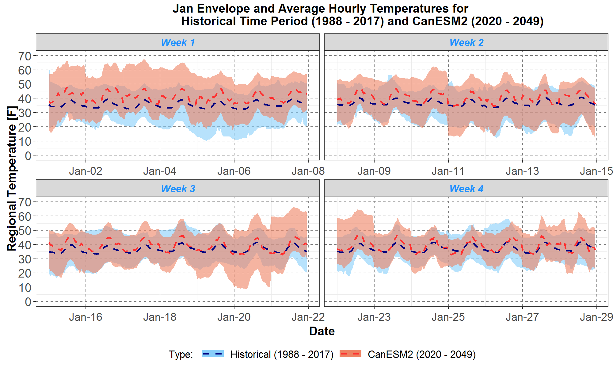
Figure 14: Comparisons of January maximum, minimum and average regional hourly temperatures between the historical 1988 to 2017 and scenario A (CanESM2) 2020 to 2049. The January data are divided into 4 weeks and plotted on 4 panels: weeks 1, 2, 3 and 4 are respectively on the upper left, upper right, lower left and lower right panels. Envelopes for the historical and climate data are plotted in light blue and peach areas respectively. The historical and climate averages are plotted in the blue and red dashed curves respectively. On the x-axis are day 1 to day 28 of January. The hourly temperatures in [F] are plotted along the y-axis.
Similarly, Figure 15 presents the corresponding envelope and average plots for the historical and CCSM4 traces in Figure 12.
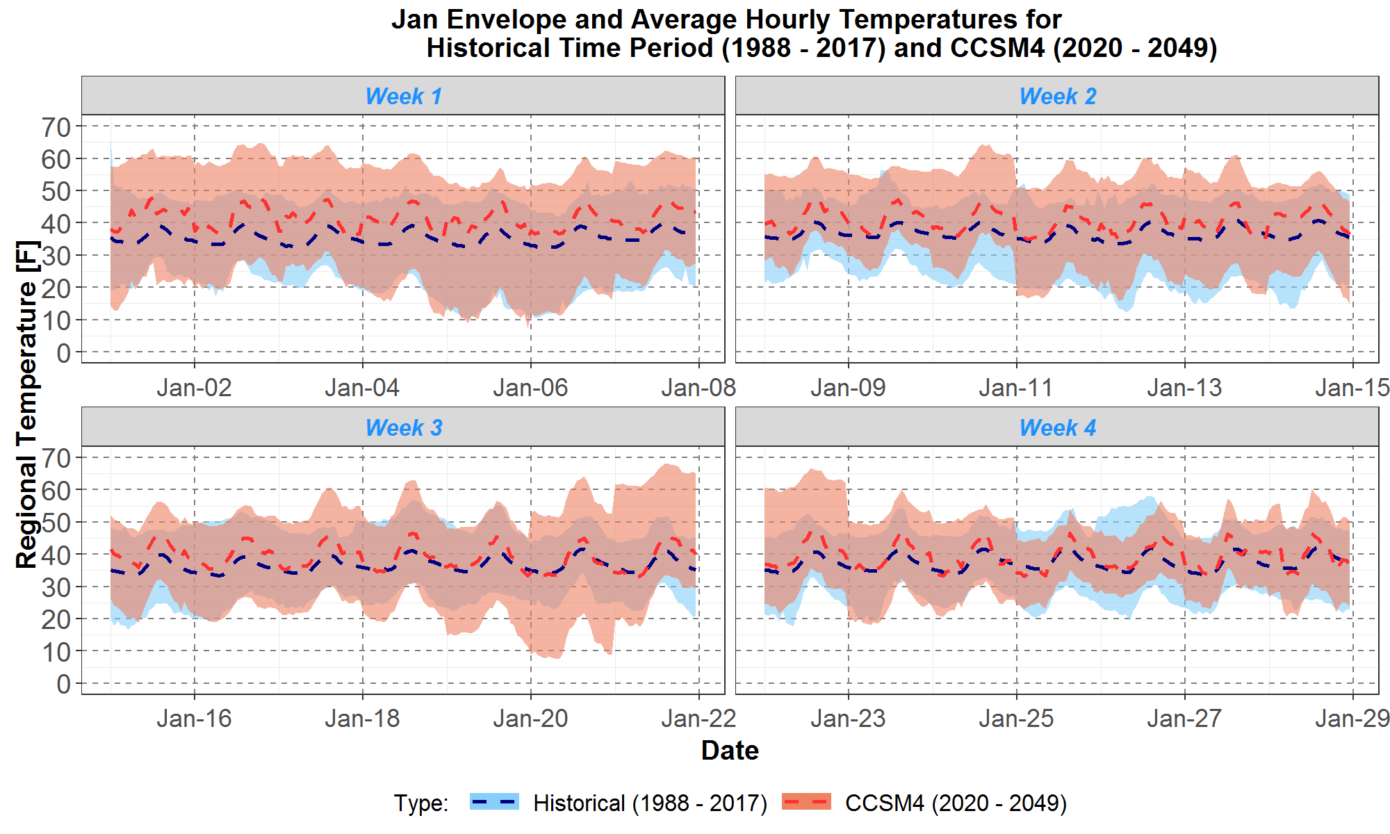
Figure 15: Comparisons of January maximum, minimum and average regional hourly temperatures between the historical 1988 to 2017 and scenario C (CCSM4) 2020 to 2049. The January data are divided into 4 weeks and plotted on 4 panels: weeks 1, 2, 3 and 4 are respectively on the upper left, upper right, lower left and lower right panels. Envelopes for the historical and climate data are plotted in light blue and peach areas respectively. The historical and climate averages are plotted in the blue and red dashed curves respectively. On the x-axis are day 1 to day 28 of January. The hourly temperatures in [F] are plotted along the y-axis.
Finally, in Figure 16 the corresponding envelopes and averages are plotted for the historical and CNRM traces presented in Figure 13.
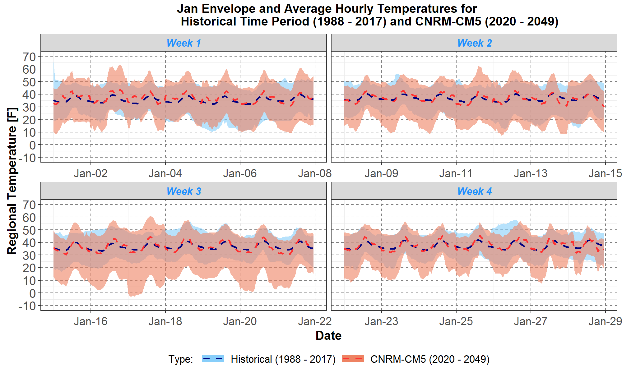
Figure 16: Comparisons of January maximum, minimum and average regional hourly temperatures between the historical 1988 to 2017 and scenario G (CNRM) 2020 to 2049. The January data are divided into 4 weeks and plotted on 4 panels: weeks 1, 2, 3 and 4 are respectively on the upper left, upper right, lower left and lower right panels. Envelopes for the historical and climate data are plotted in light blue and peach areas respectively. The historical and climate averages are plotted in the blue and red dashed curves respectively. On the x-axis are day 1 to day 28 of January. The hourly temperatures in [F] are plotted along the y-axis.
The envelope and average plots in Figures 14 to 16 support the observations and qualitative analyses of the trace plots in Figures 11 to 13. However, it is easier to draw the same conclusions using these plots since they show summary statistics of the trace data. In particular, they show that the January warming trends of the climate scenarios are not uniform over the 4 weeks: warmings tend to be higher in the first 2 weeks and lower in the last 2 weeks. Also, over a few days, all the scenarios have colder temperatures than the historical minimum. Furthermore, comparisons of the January averages (dashed curves) show that scenario C has the highest warming and scenario G has the lowest warming, which is consistent with the rankings in Table 3.
Trends in July Temperatures for the Three Selected Climate Scenarios
Comparisons of the July hourly temperature trace plots between the historical period from 1988 to 2017 (in 30 light blue traces) and the three climate scenarios A, C and G (in 30 peach traces) are presented in Figures 17 to 19, respectively.
First, Figure 17 shows the historical and scenario A (CanESM2) comparisons.
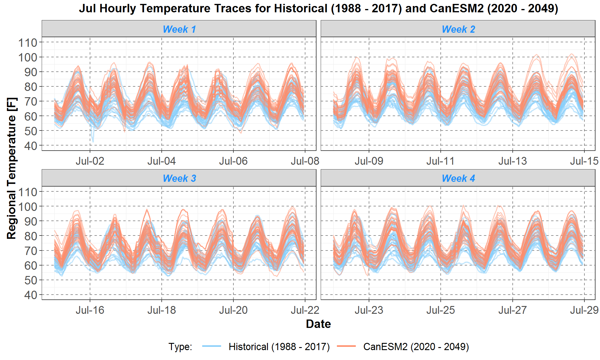
Figure 17: Comparisons of July regional hourly temperatures between the historical 1988 to 2017 and scenario A (CanESM2). The July data are divided into 4 weeks and plotted on 4 panels: weeks 1, 2, 3 and 4 are respectively on the upper left, upper right, lower left and lower right panels. The historical and climate temperatures are respectively plotted in the 30 light blue and 30 peach traces. On the x-axis are day 1 to day 28 of July. The hourly temperatures in [F] are plotted along the y-axis.
In Figure 17, it is clear that the July daily shapes for the peach climate traces are very well aligned with those for the blue historical traces, in contrast to the January daily shapes in Figure 11. Furthermore, the climate traces in general are higher than the historical traces over the 4 weekly panels. For example, for 24 of 28 days, the daily climate maximum and minimum are higher than the corresponding daily historical maximum and minimum. Furthermore, there are 9 days where the climate temperatures reach or exceed 100F. As for the historical temperatures, there are 4 days where they are near 95F (versus 26 days for climate temperatures). Finally, for 4 days, only one climate trace is barely below the minimum historical trace.
Next, Figure 18 presents comparisons between the historical and scenario C (CCSM4) traces.
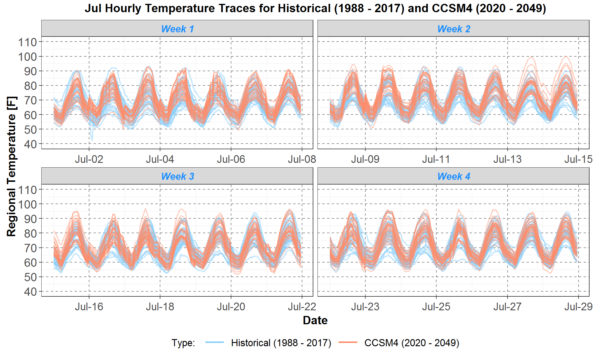
Figure 18: Comparisons of July regional hourly temperatures between the historical 1988 to 2017 and scenario C (CCSM4). The July data are divided into 4 weeks and plotted on 4 panels: weeks 1, 2, 3 and 4 are respectively on the upper left, upper right, lower left and lower right panels. The historical and climate temperatures are respectively plotted in the 30 light blue and 30 peach traces. On the x-axis are day 1 to day 28 of July. The hourly temperatures in [F] are plotted along the y-axis.
Climate temperatures for scenario C in Figure 18 are not as high as those for scenario A presented in Figure 17. There are fewer days where climate traces for scenario C are higher than the maximum historical trace. And there are only two days where climate temperatures reach 100F. Nevertheless, the climate temperature distribution seems higher than the historical distribution since there are several historical traces (blue) that are lower than the minimum climate traces for nearly the entire month.
And finally, temperature trace comparisons between the historical and scenario G (CNRM) are plotted in Figure 19.
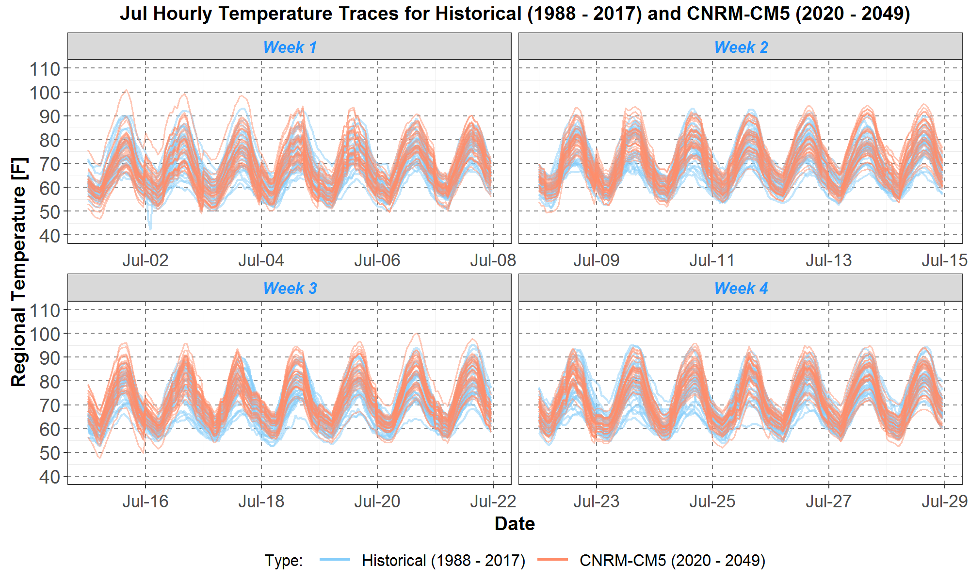
Figure 19: Comparisons of July regional hourly temperatures between the historical 1988 to 2017 and scenario G (CNRM). The July data are divided into 4 weeks and plotted on 4 panels: weeks 1, 2, 3 and 4 are respectively on the upper left, upper right, lower left and lower right panels. The historical and climate temperatures are respectively plotted in the 30 light blue and 30 peach traces. On the x-axis are day 1 to day 28 of July. The hourly temperatures in [F] are plotted along the y-axis.
The scenario G (CNRM) peach temperature traces in Figure 19 look similar to the scenario C (CCSM4) peach traces in Figure 18. For example, there are 2 days with scenario G temperatures being at or over 100F. Although scenario G traces are warmer than historical traces, they do not seem as warm as scenario C traces since there are fewer historical traces (blue) below the minimum scenario G traces.
Next, Figures 20 to 22 present the corresponding envelope plots, with averages, for the traces in Figures 17 to 19. The historical and climate envelopes are plotted in light blue and peach areas, respectively. The historical and climate averages are plotted in the blue and red dashed curves, respectively.
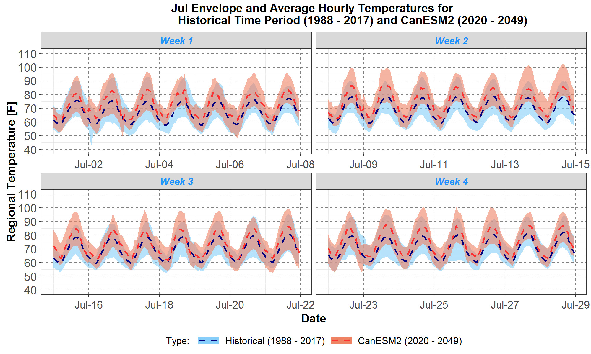
Figure 20: Comparisons of July maximum, minimum and average regional hourly temperatures between the historical 1988 to 2017 and scenario A (CanESM2) 2020 to 2049. The July data are divided into 4 weeks and plotted on 4 panels: weeks 1, 2, 3 and 4 are respectively on the upper left, upper right, lower left and lower right panels. Envelopes for the historical and climate data are respectively plotted in light blue and peach areas. The historical and climate averages are plotted in the blue and red dashed curves respectively. On the x-axis are day 1 to day 28 of July. The hourly temperatures in [F] are plotted along the y-axis.
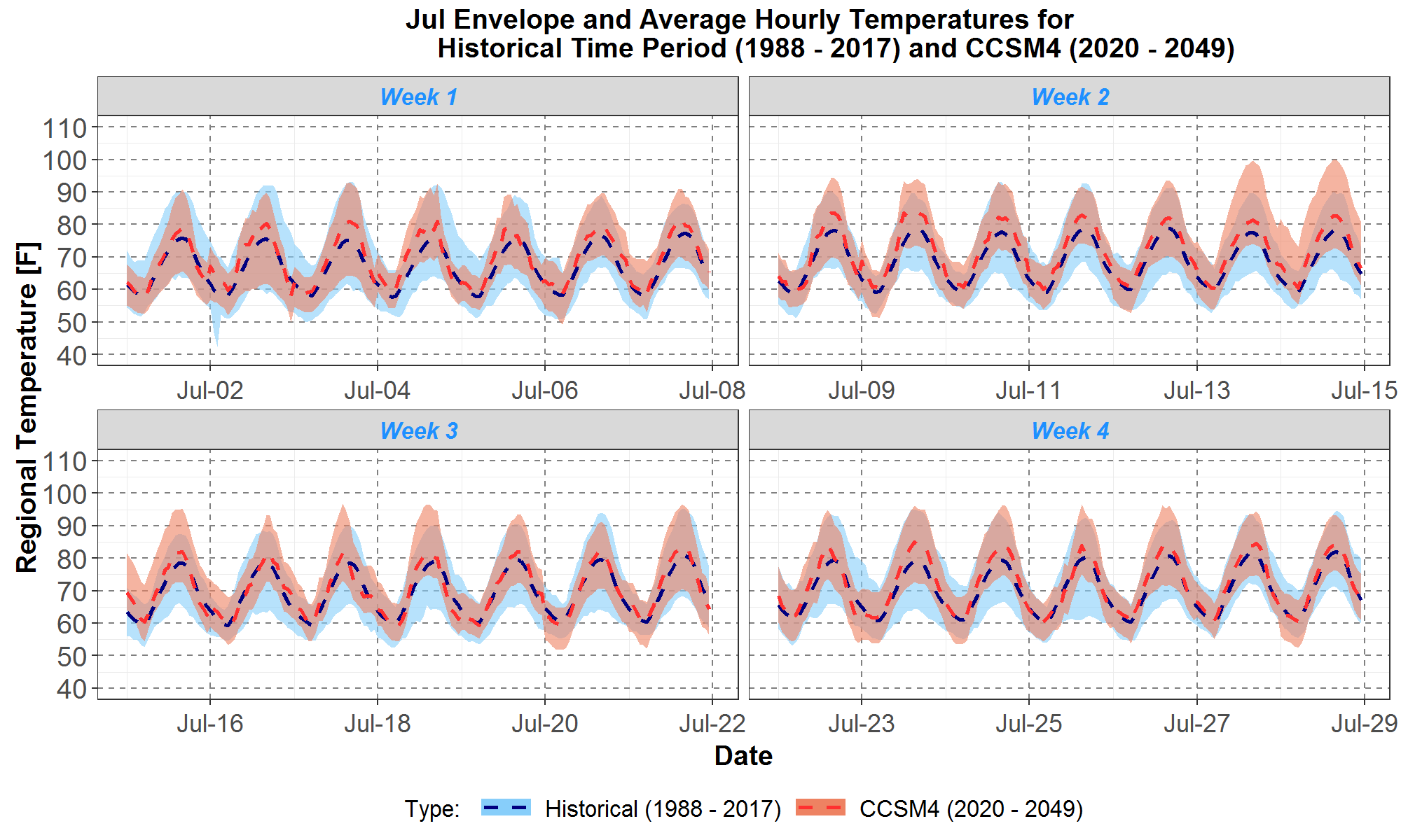
Figure 21: Comparisons of July maximum, minimum and average regional hourly temperatures between the historical 1988 to 2017 and scenario C (CCSM4) 2020 to 2049. The July data are divided into 4 weeks and plotted on 4 panels: weeks 1, 2, 3 and 4 are respectively on the upper left, upper right, lower left and lower right panels. Envelopes for the historical and climate data are respectively plotted in light blue and peach areas. The historical and climate averages are respectively plotted in the blue and red dashed curves. On the x-axis are day 1 to day 28 of July. The hourly temperatures in [F] are plotted along the y-axis.
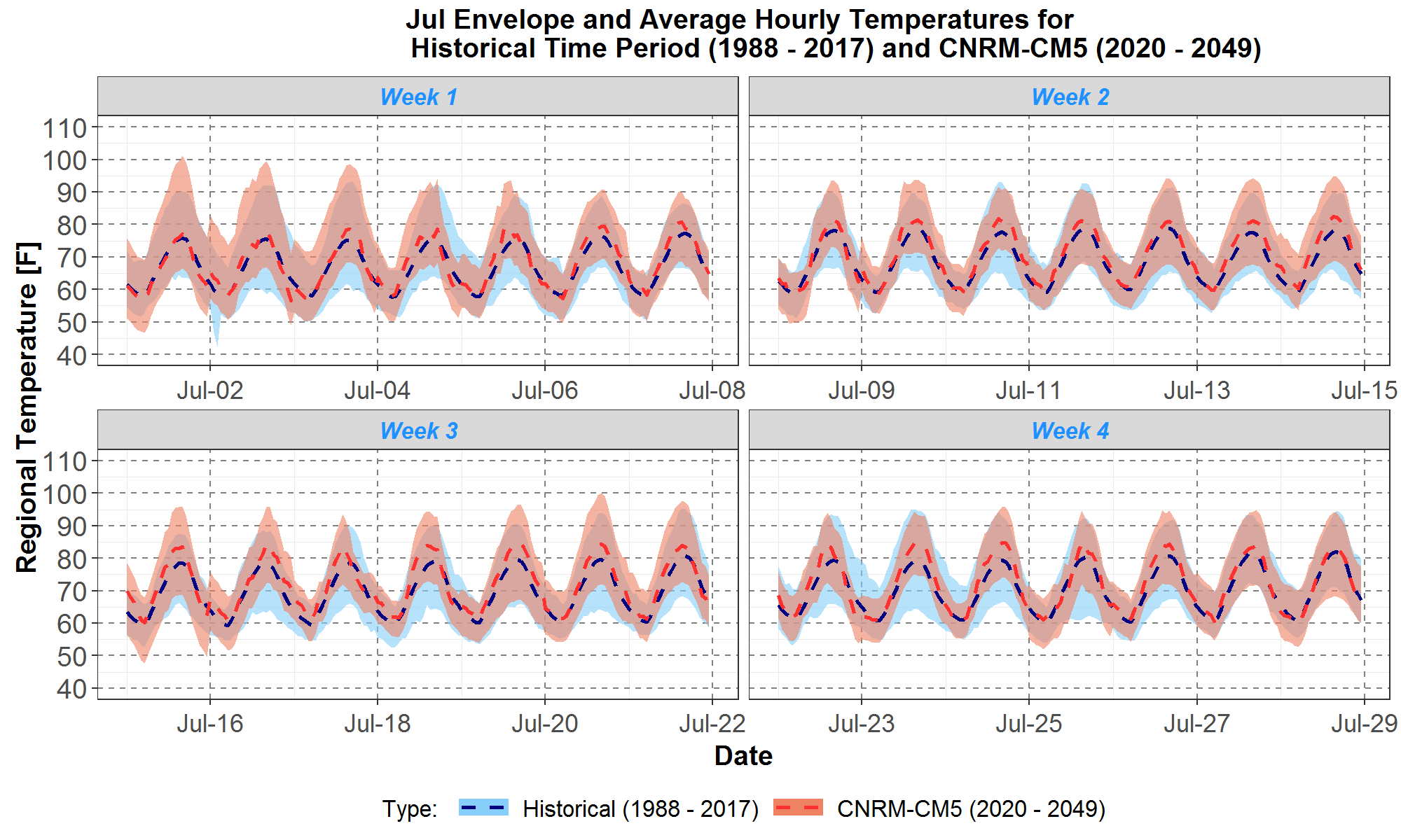
Figure 22: Comparisons of July maximum, minimum and average regional hourly temperatures between the historical 1988 to 2017 and scenario G (CNRM) 2020 to 2049. The July data are divided into 4 weeks and plotted on 4 panels: weeks 1, 2, 3 and 4 are respectively on the upper left, upper right, lower left and lower right panels. Envelopes for the historical and climate data are respectively plotted in light blue and peach areas. The historical and climate averages are plotted in the blue and red dashed curves respectively. On the x-axis are day 1 to day 28 of July. The hourly temperatures in [F] are plotted along the y-axis.
The envelope and average plots in Figures 20 to 22 support observations from the corresponding trace plots in Figures 17 to 19 and the corresponding boxplots in Figures 7 to 9, in that July temperatures for scenario A have the highest warming and temperatures for scenario G have the lowest warming. This is also consistent with the average July climate warmings presented in Table 3 (to two decimal places, scenario C is warmer than G). Furthermore, average climate warmings look roughly uniform for all 4 weeks, and the hourly and daily climate temperature shapes are well aligned with the historical shapes. In contrast, for January, the average climate warmings are higher for two weeks and lower for the other two weeks, and the climate hourly shapes are not well aligned with historical hourly shapes.
Trends in Extreme Temperatures
Frequency of Extreme Temperatures
In previous sections, Figures 2, 7, 8, 9, and 10 presented monthly historical and climate scenario temperature distributions in terms of boxplots, an example of which is illustrated in Figure 1. However, it is also of interest to analyze the distributions in finer scales than the few percentiles and outliers (if any) indicated in boxplots, especially for extremely cold or extremely warm temperatures. Thus, for the five sets of 30-year temperature data, the historical (1948 – 1977), historical (1988 – 2017), CanESM2 (2020 – 2049), CCSM4 (2020 – 2049), and CNRM-CM5 (2020 – 2049), Table 4 lists their corresponding fractions of total hourly temperatures that fall within each of the temperature intervals shown in the first column.
Since the range of temperatures for the five data sets is between a minimum of -13.7F and a maximum of 103.0F, then for simplicity, in Table 4 each temperature interval in the first column is expressed as -20<T≤ Ti where i is the row index. For example, the interval in the first row begins with an interval of size 10F where T1= -10 , and for each succeeding row the size of the interval increases by 10F by adding 10 to the previous Ti . Therefore, the interval in the last row, -20<T≤110 , has an interval of size 130F with T13=110 . Also, since the last interval exceeds the full temperature ranges of all five data sets, then all five fractions, in columns 2 to 6, are equal to 1 in that interval, by definition.
Table 4: Fraction of Total Hourly Temperatures within the Temperature Interval Listed in Column 1
| Temperature Intervals [F] | Historical (1948-1977) | Historical (1988-2017) | CanESM2 (2020-2049) | CCSM4 (2020-2049) | CNRM-CM5 (2020-2049) |
| -20<T≤-10 | 0.00000 | 0.00000 | 0.00000 | 0.00000 | 0.00010 |
| -20<T≤0 | 0.00006 | 0.00000 | 0.00000 | 0.00000 | 0.00028 |
| -20<T≤10 | 0.00116 | 0.00021 | 0.00003 | 0.00005 | 0.00136 |
| -20<T≤20 | 0.00864 | 0.00331 | 0.00082 | 0.00151 | 0.00654 |
| -20<T≤30 | 0.04564 | 0.03158 | 0.01802 | 0.02254 | 0.02977 |
| -20<T≤40 | 0.24239 | 0.21128 | 0.14827 | 0.16561 | 0.17515 |
| -20<T≤50 | 0.50282 | 0.46929 | 0.40281 | 0.42428 | 0.43421 |
| -20<T≤60 | 0.74278 | 0.70842 | 0.63574 | 0.66629 | 0.67379 |
| -20<T≤70 | 0.91432 | 0.89259 | 0.83372 | 0.86114 | 0.86211 |
| -20<T≤80 | 0.98440 | 0.97571 | 0.94830 | 0.96312 | 0.95921 |
| -20<T≤90 | 0.99964 | 0.99894 | 0.99372 | 0.99722 | 0.99644 |
| -20<T≤100 | 1.00000 | 1.00000 | 0.99995 | 1.00000 | 0.99998 |
| -20<T≤110 | 1.00000 | 1.00000 | 1.00000 | 1.00000 | 1.00000 |
In Table 4, for simplicity in presentation, the fractions in columns 2 to 6 are expressed to just five decimal places which cause some to appear to have just one significant figure (e.g., 0.00003 for the CanESM2 data set in the interval -20<T≤10 ). However, calculations involving those fractions use more significant figures. Since each of the five 30-year temperature data sets has a total of 262,992 hourly temperatures, then even the small fraction 0.00003 is equivalent to about 8 hourly temperatures.
As an example, in the first row of Table 4, where the temperature interval in the first column represents temperatures T in the range -20F<T≤-10F , only the CNRM-CM5 data set has a non-zero fraction, 0.00010, that falls within the interval. In contrast, the two historical and remaining two climate scenario data sets do not have any temperatures that fall within that interval. As presented previously in Figures 9 and 10, the CNRM-CM5 data has the coldest temperatures among the five data sets.
Furthermore, for this interval, -20<T≤-10 , the average of the three climate scenario fractions is 0.00003, which is higher than the fractions for both historical data sets, which are zeroes. Thus, the extremely cold temperatures in this interval occur more frequently for the climate scenarios than for both historical data sets.
However, for extremely cold temperatures defined over a larger interval such as those at or below 20F, e.g., the interval -20<T≤20 on the fourth row of Table 4, the average of the three climate scenario fractions is 0.00296, which is lower than the fraction 0.00331 for the historical last-30 years, from 1988 to 2017, which in turn is lower than the fraction 0.00864 for the historical first-30 years, from 1948 to 1977. In terms of the number of hourly temperatures at or below 20F, the three fractions are equivalent to 778 hours for the climate scenario average, 871 hours for the historical last 30-years, and 2,272 hours for the historical first 30-years. Therefore, the average future 30-years has 3 and 50 fewer hourly temperatures at or below 20F, per year, than the average recent 30-years and the average distant 30-years, respectively. Thus, for extremely cold temperatures in this interval, the trend is that they occur less frequently over time.
On the other hand, analysis for extremely warm temperatures such as those higher than 90F could be performed by noting in Table 4 that the interval -20<T≤110 in the last row is the union of the interval (-20<T≤90) in the 11th row and the interval 90<T≤110. Therefore, the fraction within (90<T≤110) is equal to the difference between the fractions within (-20<T≤110) and -20<T≤90 . Results of the calculations are presented in Table 5.
Table 5: Fraction of Total Hourly Temperatures within the Temperature Interval 90<T≤110
| Temperature Intervals [F] | Historical (1948-1977) | Historical (1988-2017) | CanESM2 (2020-2049) | CCSM4 (2020-2049) | CNRM-CM5 (2020-2049) |
| 90<T≤110 | 0.00036 | 0.00106 | 0.00628 | 0.00278 | 0.00356 |
Thus, according to Table 5, for very warm temperatures higher than 90F (e.g., 90<T≤110 ), the average of the three climate scenario fractions is 0.00421, which is higher than the fraction 0.00106 for the historical last-30 years, from 1988 to 2017, which in turn is higher than the fraction 0.00036 for the historical first-30 years, from 1948 to 1977. These fractions suggest that, per year, the average future 30-years has 28 and 34 more hourly temperatures higher than 90F than the average recent 30-years and the average distant 30-years, respectively. Thus, for extremely warm temperatures in this interval, the trend is that they occur more frequently over time.
Temperatures for the Yearly Coldest and Warmest Days
Let the coldest day of a year be defined as the day containing the minimum hourly temperature of that year, and similarly let the warmest day of a year be defined as the day containing the maximum hourly temperature of that year.
Figure 23 presents histograms comparing the fractions of total hourly temperatures for the yearly coldest day over the five sets of 30-year temperature data, the historical (1948 – 1977), historical (1988 – 2017), CanESM2 (2020 – 2049), CCSM4 (2020 – 2049), and CNRM-CM5 (2020 – 2049). For each of the five data sets, there are 30 coldest days for the 30 years of hourly data, resulting in the number of total hourly temperatures being 30 ×24=720. On the x-axis, each temperature bin is expressed as (T1, T2] which represents temperatures T in the interval where T1<T ≤ T2 .
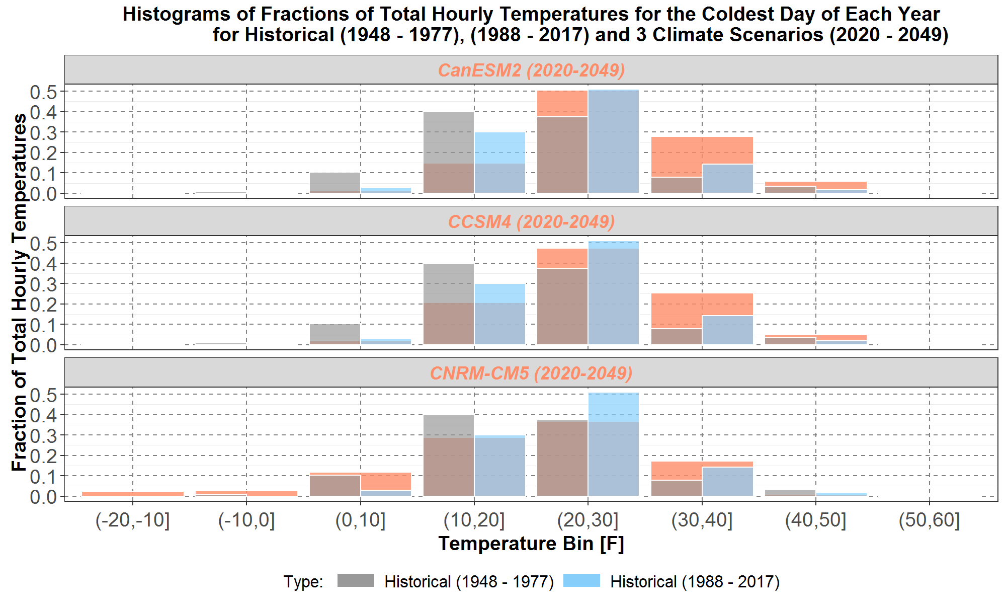
Figure 23: Comparisons of the fractions of total hourly temperatures for the yearly coldest day among the historical first 30-years, from 1948 to 1977, plotted in narrow gray histograms, the historical last 30-years, from 1988 to 2017, plotted in narrow blue histograms, and the three climate scenarios, from 2020 to 2049, plotted in wide peach histograms. The CanESM2, CCSM4 and CNRM-CM5 histograms are plotted at the top panel, the middle panel, and the bottom panel, respectively. On the x-axis are the temperature bins in [F]. The fractions of hourly temperatures are plotted along the y-axis.
It can be seen in Figure 23 that the CNRM-CM5 histogram in the bottom panel have temperatures in the coldest bin (-20, -10]. Although the bars in the warmest temperature bin (50, 60] are too small to be seen, nevertheless the CCSM4 histogram in the middle panel and historical (1948 – 1977) histograms in all three panels have temperatures in that warmest bin. Furthermore, for bins at or below 20F, the gray bars for the historical first 30-years are higher than the blue bars for the historical last 30-years, which in turn are higher than the peach bars for the CanESM2 and CCSM4 histograms in the top and middle panels respectively.
On the other hand, for bins higher than 20F, the gray bars for the historical first 30-years tend to be lower than the blue bars for the historical last 30-years, and the peach bars for all three climate scenarios.
For bins higher than 30F, the blue bars for the historical last 30-years tend to be lower than the peach bars for all three climate scenarios.
Finally Figure 24 presents histograms comparing of the fractions of total hourly temperatures for the yearly warmest day over the same five sets of 30-year temperature data. For each of the five data sets, there are similarly 30 warmest days for the 30 years of hourly data, resulting in the number of total hourly temperatures being 30 ×24=720.
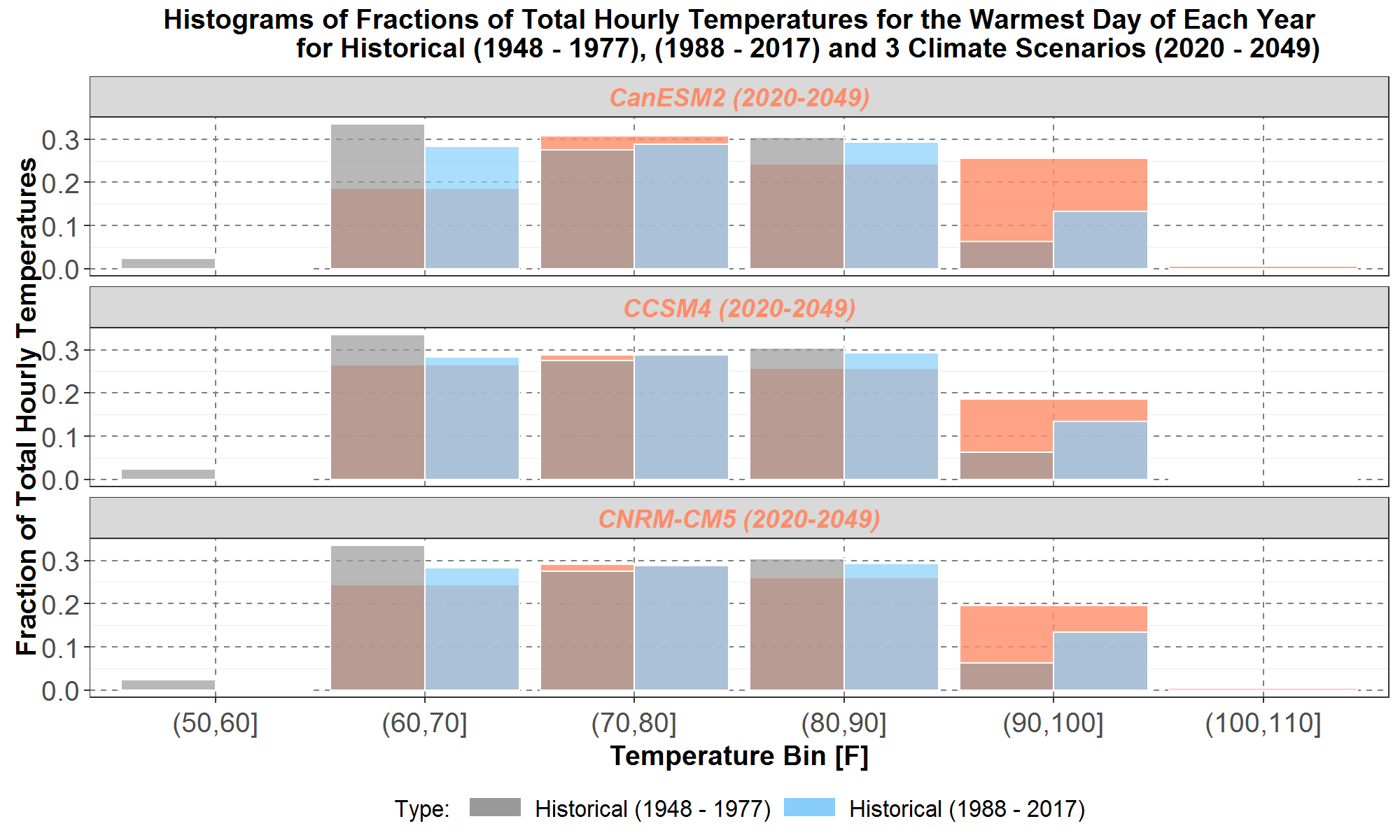
Figure 24: Comparisons of the fractions of total hourly temperatures for the yearly warmest day among the historical first 30-years, from 1948 to 1977, plotted in narrow gray histograms, the historical last 30-years, from 1988 to 2017, plotted in narrow blue histograms, and the three climate scenarios, from 2020 to 2049, plotted in wide peach histograms. The CanESM2, CCSM4 and CNRM-CM5 histograms are plotted at the top panel, the middle panel, and the bottom panel, respectively. On the x-axis are the temperature bins in [F]. The fractions of hourly temperatures are plotted along the y-axis.
It can be seen in Figure 24 that the CanESM2 and CNRM-CM5 histograms in the top and bottom panels respectively have temperatures in the warmest bin (100, 110]. The CCSM4 histogram also has temperatures in the same bin even though its bar is too small to be seen. On the other hand, the historical (1948 – 1977) histogram, as well as the CCSM4 and CNRM-CM5 histograms (although their bars are too small to be visible) have temperatures in the coldest bin (50, 60].
Furthermore, for bins at or below 70F, the gray bars for the historical first 30-years are higher than the blue bars for the historical last 30-years, which in turn are higher than the peach bars for all three climate scenarios.
On the other hand, for bins higher than 90F, the gray bars for the historical first 30-years are lower than the blue bars for the historical last 30-years, which in turn are lower than the peach bars for all three climate scenarios.
Thus, the histograms for the coldest and warmest days for each year in Figures 23 and 24, respectively, are mostly consistent with the warming trend over time discussed in previous sections. However, despite warmer temperatures for the three climate scenarios in general, the coldest temperatures do occur for the CNRM-CM5 scenario.